Picture this: You’ve just finished the latest Technology for Knowledge Management online course. After four engaging weeks, the guest experts, forums, and content already have you excited to demonstrate your new skills to colleagues and employers. But, how do you get credit for being on the cutting edge of online learning? Fortunately, LinkedIn is evolving into something far beyond the mere online resume holder it once was known to be. In fact, LinkedIn is ahead of the curve on acknowledging that the capacity of an employee is not necessarily tied to traditional educational experience alone. Among other features, the employment-oriented social networking platform now includes an interactive section for core competencies, recommendations, and- you guessed it- certificates.

A badge on LinkedIn is no replacement for a university diploma (well, not yet anyway), but certificates can demonstrate mastery of a particular skillset, like the ability to build an SMS campaign in TextIt or to create compelling visualizations in TableauIn the remainder of this post, you will find instructions on how to add your TechChange certificates to your LinkedIn profile. If you haven’t yet taken advantage of our other social media opportunities for alumni, be sure to join our Facebook and LinkedIn groups!

New_LinkedIn-iloveimg-compressed

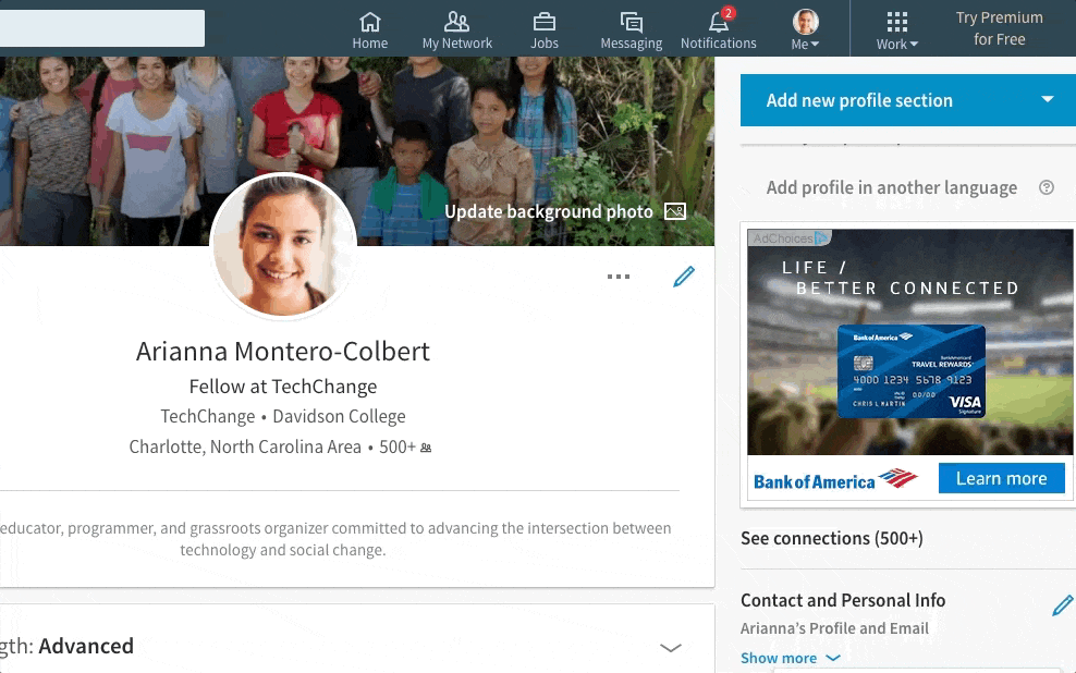
Step 1: Add an “Accomplishments” section to your profile. It can be found on the right side of your profile page. If you already have any certifications listed on your profile, you may instead need to hit the “+” sign next to the “Accomplishments” tab to find this pop up window.

Step 2: Once you’ve selected the option to add a certificate, a pop up window will appear asking you to enter information about your certificate.

The rest of the process is relatively straightforward. You can enter the name of the course you completed for “Certification name”. Under “Certification authority”, a drop down menu will appear once you’ve started typing, where you will be able to find TechChange.

After entering the month and year in which you received your certificate, check the box for “This certification does not expire”. This will make the “To” date disappear. Finally, you’re given the option to publicly link to a PDF version of the certificate. Oftentimes, this isn’t necessary, but if you’re interested, skip to the end of this post for instructions.

Especially if you’re a TechChange veteran, it might be worth adding as a new section to your resume entirely! Employers love seeing qualified job candidates, and these certificates could be that one thing that bumps your resume to the top of the stack.

(Optional) How to add a link to your certificate on your profile:

  1. You’ll need to make sure you have your certificate(s) handy. Make sure you know where it exists on your computer’s file system so you can quickly upload and access it. If you can’t find yours, reach out to us at info@techchange.org and we’ll get you another copy.
  2. Once you have your certificate, you’re going to need to host your file in a publicly available place online. The easiest ways to do that are through Dropbox or Google Drive.
  3. Double check to make sure that you’ve set the viewing privileges to “anyone with the link”!
  4. Copy the link to the “Certification URL” box on LinkedIn. You’re done!

Have any other questions about your TechChange experience? Want to see a tutorial on some other topic related to your course? Haven’t taken a course yet but looking to?

Shoot us an email at info@techchange.org.


TechChange recently hosted 17 leaders from the State Department’s International Visitor Leadership Program, which hosted visitors ranging from Morocco to Zambia to Haiti as part of their program, “Information Technology and Social Media: Power to the People.” The International Visitor Leadership Program is a professional exchange program that hosts foreign leaders for short-term visits to cultivate relationships with their American counterparts. For all of the participants, this was their first visit to the United States.

Isabel Knight and Austin Spivey, both members of the instructional design team, explained the mission of TechChange and showcased some courses they have been working on recently. Austin was excited to get an opportunity to use her French and Arabic skills, as the majority of the leaders were French speakers and some were from Arabic speaking countries.  

The session touched on topics like the challenges of connectivity, as well as ways to make courses more engaging, such as gamification. Many leaders shared the concern that even slow internet is expensive in many developing countries, making distance learning tedious and costly.

The issue of English proficiency was also raised, given that a good understanding of English is necessary for success in many online courses. The TechChange team walked away with a clearer picture of the challenge of accessibility in online learning and a renewed commitment to making its courses more accessible for all.

If you would like to see the slides from their presentation, you can do so here:


From high-tech firms in Silicon Valley to established charities in Geneva, global businesses and nonprofits are struggling to build internal technical skills required to reach organizational goals. But instead of hiring or contracting specialists or turning to external professional development, global organizations are turning to online learning for help.

For example, Airbnb has been struggling to find and hire enough data scientists to meet market demand, and discovered that existing online programs like Coursera and Udacity weren’t sufficiently tailored to their internal data and tools. In response, Airbnb created their own Data University with courses of three levels of instruction not only for engineers, but also non-technical employees who want to take on larger roles as project managers. According to TechCrunch, since launching the program in Q3 2016, Airbnb has seen the weekly active users of its internal rise from 30 to 45 percent with a total of 500 employees taking at least one class. 

Similar advances are happening in international development, particularly regarding Information Communication and Technology for Development (ICT4D), where the benefits of technology are real and measurable in impact.  Catholic Relief Services (CRS)  approach to ICT4D-enabled projects has resulted in a 75% decrease in time needed to conduct emergency assessments, 53% fewer errors in data collection, and a more standardized process for monitoring and evaluation.

But scaling ICT4D solutions requires technical training as well as the availability of tools, which is why TechChange partnered with CRS to design and create an internal course on “Integrating ICT4D Into Projects.” The goal was to better prepare staff to use ICT4D to scale ICT4D usage in programs to improve accountability and responsiveness. This included simulations, case studies and interactions. According to Dr. Kathryn Clifton, an ICT4D Knowledge Management & Communication Specialist at CRS:

“Programs employ staff with varying levels of familiarity with technology.  For some, involvement in our programs may be the first time they have used a smart phone on a repetitive basis.  There is a mindset that needs to accompany the use of technology so that staff understand why it is important and why we are using it.  The mindset needs to go beyond having a neat gadget. An introductory training is important to generate clarity in messaging, purpose, and familiarity with technology so that programs can generate a sustained momentum and level playing field around the use of technology. Without it programs can get off to a wobbly start leaving many wanting to go back to paper.”

Screenshot from CRS "Integrating ICT4D Into Projects" Course

Screenshot from CRS “Integrating ICT4D Into Projects” Course

By offering this course online, we’re also hoping to not only provide a scalable model for pushing information and training to a global CRS staff, but also to help provide data about how staff and partners learn best online across a global organization.

After all, when introducing Data University in a Medium Post, Jeff Feng stated: “Data [is] the voice of our users at scale. Thus, data science plays the role of an interpreter — we use data and statistics to understand our users and translate it to a voice that people or machines can understand.”

On June 20-22, TechChange will return to InterAction Forum 2017! We’re hoping to build on our success from last year (See photos: Day 1, Day 2, Day 3, and Gala and Awards Ceremony), by taking photos of three former Presidents (Bill Clinton, Joyce Banda, and Mary Robinson). But even more importantly, we want to take pictures of our community: Including you!

So, if you’re planning to attend, please tweet using the hashtag #InterActionForum to let us know that you’ll be there. And if you you have some free time in between events during the event, check out our table in the exhibit hall, where we’ll have a photobooth for InterAction Forum attendees, as well as a screen where we’ll show all the pictures that we’re taking throughout the day. To learn more scheduling and list of speakers, check out the Daily Agenda for Forum 2017.

Lastly, if you haven’t bought your ticket yet, there’s still time before the June 2 registration deadline. Click here to register for InterAction Forum 2017 now.

See you soon!

TechChange at InterAction Forum 2016

Here at the start of the summer season, it gives me great pleasure to introduce Kai Fox, the newest member of our team. Currently a senior at Severn High School in Annapolis, Maryland, Kai is working on an independent senior project here at TechChange.

Kai is currently teaching himself JavaScript will be pursuing a degree in computer science and international service at American University next year. He lives on the Chesapeake Bay and enjoys waterskiing and ice cream.

Welcome, Kai!

Already an established graphic designer with the TechChange team, Yohan Perera recently assumed the responsibilities of Creative Director, where he will oversee all animations, illustrations, videography, photography, and any other creative projects.

To learn a bit more about Yohan and what he’s hoping to accomplish in this new role, we sat down and asked a few questions:

Q: What has surprised you most since first joining TechChange in 2014? What are some of the challenges and opportunities that you remember most?

TechChange was a company that intrigued me solely because of its involvement in the development sector and commitment to bring social change through tech. The “start-up” culture was something very foreign to me but how the team at TechChange preserved it was commendable. Everyone respected each other and themselves leading the way to produce creative solutions for global issues through online courses, animations and beautiful graphic assets. Being placed in such an environment presented the opportunity to grow and explore ways to use creativity for development and positive social change. The biggest challenge to this day is figuring out visual representation to some of society’s most complex issues and creative solutions that have never been shown in a visual medium before.

Q: What’s the creative team like to work with on a day-to-day basis? How do you all keep the creativity flowing?

The creative team at TechChange is a family. We keep each other humble and make sure to get work done while we enjoy delicious meals that U St. has to offer. My personal opinion is that creativity comes through continuous exploration, we like to say out loud even the worst of ideas before settling on a direction. As a team we rely on each other to inspire and critique ideas, this helps weed out the bad ideas from the good ones.

Q: You’ve spoken about your passion for social change and your work with Global Unites. How has that influenced your work with TechChange?

My work with Global Unites opened my mind and heart to see the learned hatred and prejudice us as humans have towards each other. This is something common to many societies around the world. The radicalization of young people to commit despicable acts in the name of country, religion, caste, creed and tribe was something that I wanted to combat and be a part of the change. These experiences helped me understand the importance of the projects our clients are involved in. The time to take action to solve the issues in society is now, it makes me happy to see the work that I do being used to influence young people, community leaders and civil society at large, be it in Sub-Saharan Africa, Asia, North America or in remote parts of the world.

Q: You graduated as valedictorian of your class from Full Sail University. What would you go back and tell yourself during your studies?

I would tell myself not to worry about the future, the future will worry for itself. Take action now, be a part of the change now. Keep using your skills to change the lives of people for the better and help set the course of this world in a direction that’ll bring justice to the oppressed and marginalized, love to the unloved, and food for the hungry.

Q: Where do you see educational animations in the ongoing creative direction with TechChange? Could you talk a bit about the team?

I believe we’ve come up with an animation style and storyline that is unique to TechChange. Moving forward we are hoping to raise the bar on the storytelling aspect of the educational animations. Nine times out of ten we are talking about important topics that affect millions of people around the world, telling these stories and the solutions our clients provide in a manner that leads people to action will be the direction we would like to pursue.

Q: What are some of your initial ideas for continuing to advance TechChange’s creative leadership in the development space? Are there any areas you’re particularly excited about?

The development space is saturated with design that has been given little thought and effort. Good messaging should be followed with intentional design. I am excited to see how virtual reality, augmented reality, story-driven videos and animations will influence the development sector in the months to come. I’m confident that TechChange will continue to make motivated efforts to push the bar higher in both quality and storytelling moving forward.

Cross-posted from Samhir Vasdev’s Medium channel.

This tutorial accompanies the Amazon episode of our new series about liberating and visualizing our personal data. Check it out below:

A snapshot of my Amazon order history reveals my heavier spending on Fridays. Full infographic here.

I’m hooked on Amazon.

And I’m sure I’m not alone. So this week, Nick Martin and I dug into our Amazon accounts to explore just how bad we’ve got the Amazon bug. This post walks through the process of finding and cleaning the data we tackled in that episode.

4 out of 5 stars on my data cleaning score test. Check out the full video.

This data gets a 4 out of 5 on my entirely unscientific data cleaning score test. It’s pretty easy to access, and it needs just a bit of fiddling to get in a good state to surface some useful insights.

To follow along, you’ll need accounts at Amazon and Piktochart and a basic understanding of how functions work in spreadsheet tools like Excel or Google Sheets. You won’t need a particularly powerful computer to work with the dataset, and the whole process should take about an hour. In that time, we’ll turn the raw data into this sleek, interactive presentation.

Piktochart offers a robust presentation mode with sleek transitions and interactivity.

Tutorial

A brave , if futile, attempt at organizing and explaining the process I used to get, clean, and visualize my Amazon data.

This is a long and detailed post, so here’s a roadmap in case you want to jump to the part you care about most:

  • Get the data
  • Inspect the data
  • Clean the data
  • Visualize the data
  • Next steps
  • Reflections

First, get the data.

Amazon makes this process outrageously easy. Just visit the Order History Reports page, enter in the date range you’d like to use (I requested everything from 2006 thru 2016), then click “Request Report”.

Look for your Order History Reports to get to the data.

Amazon offers two report types: items and orders. Download and explore both of them to see which suits your interests; I used the items option, mainly because I it had more information about the specific things I purchased. It’s a relatively small file (mine was 128KB, or about as much as a Facebook photo), so it shouldn’t take long to download in most settings.

Once you’ve requested the report, you’ll see it appear in a “Your Reports” box below the order request section. This is nifty because it saves all your previous reports, still available for you to download down the road. Other websites don’t usually keep such easy access to previous reports (LinkedIn, for instance, e-mails you a special download link that eventually expires).

It’s easy to access previous data requests through Amazon.com

The data downloads as a single CSV file, which is a common format to store simple information in a table (here’s a good explanation of the difference between CSV and Excel files).

Next, inspect the data.

Each of the 300+ rows corresponds to a different item that I ordered, and there are 40 columns with fields describing everything from the order date and payment method to shipping address and item category (such as “paperback” and “sports”). The diversity and clarity of the dataset is remarkable.

Also, a quick skim in Excel shows that most cells have content — there aren’t any gaps — and the column titles do a good job of explaining what they represent (this isn’t always the case, and that’s when good metadata comes in handy).

Based on what I saw, I figured it would be useful to learn how my purchase patterns evolve from year to year. But the raw data doesn’t have a column for “year”, so I needed to extract that information from the “order date” column.

Clean the data.

Extracting the year of each item can be done with a formula (School of Datahas a great primer on formulas). Use the TEXT formula in a new “year” column. For example, if the order date in cell A2 was “7/24/2006” and I’d like to put the first three characters of the year into cell B2, I’d put this into B2:

=TEXT(A2,“YYYY”)

to get:

2006

Nice. Now, just double-click the bottom-right corner of the cell B2 (or whatever cell you just ran the formula in) to apply the formula to all cells beneath it. (By the way, this TEXT function is pretty flexible about what you put within the quotes.) For instance, writing:

=TEXT(A2,“ddd”)

would return:

mon

Anyways, now we have a column that shows the year that every order was placed in, and we can surface some insights that reveal milestones and patterns in my own life. For example, my spend plummeted while I was living abroad in 2009, and it spiked in 2011 and 2013, when I moved and renovated my apartment.

Visualize the data.

Let’s use Piktochart to make an interactive presentation that shows the change in my annual spend over time — something like this:

The full presentation has some other nifty charts as well.

To get here, jump over to Piktochart to make an account — it’s free, and you can log in from Google or Facebook (they won’t post anything without your permission).

Next, start out by creating a presentation (you could also create an infographic, or even a printed product ). You can choose from one of many free templates (many more are available with a paid plan); don’t worry about things like fonts and colors since you can customize them later.

Once you open the presentation, you’ll see it’s filled with dummy content. You can dive right in to edit things like text areas, just as you would in Powerpoint. You can also use the menu options on right to add or change graphics images, including pulling from many free icon and photo libraries.

To make a chart, click on a slide within the presentation where you want the chart, then click on the “Tools” menu option on the left, then “Chart”. This will open a new chart editor window. Take a minute to acquaint yourself with the layout; this article and image will help. Start by pasting your data from your CSV file into the data editor in Piktochart.

Importing data is as easy as copy/paste — but you can also use dynamic data sources, like a Google Spreadsheet that changes over time as people submit Google Form responses.

You’ll see the chart area, on the left of the data, animate in real-time with the data you’ve just added. Select the chart type you want (in this case, let’s go with a line chart), and then go ahead and edit any fields you’d like, such as the chart title or axes. I found this process to be easier than in Powerpoint or Excel, which can be a bit tedious when editing these features.

Be sure to take advantage of that little gear icon in the top-right of the data area; this is where you can customize a range of elements like the colors, gridlines, positions, and more. After that, just click “Insert Chart” to see the chart pop into the slide you had selected when you started this process.

Boom! You just made your first online, interactive chart with your own Amazon order history. After taking a minute to bask in your glory, start poking around to see how you can add slides, edit some of the existing content, and change styles like backgrounds.

Finally, like any good interactive chart, you want to be able to share it. There are several easy ways to do that, and they all sit in the “Share” menu option at the top-right of the Piktochart screen. You can share a link directly to the presentation, or export the file to tools like Slideshare. You can also embed the presentation into your website, although this takes a bit of basic familiarity with HTML language. Here’s a good overview of the sharing options. Go show off your data!

Next steps

A data addict’s search for (mostly useless) insights is never over. I’d like to return to this data and see how my item categories evolved over time; I’ve a suspicion my physical book purchases were heavier in my college days, while e-book purchases increased once I finally downloaded a Kindle app a few years ago. If you discover something like this in your data, share in a comment!

I also used Illustrator to design some more visualizations to unlock some other insights from my Amazon history. Check that out here.

If you read this far, you deserve a prize. Kudos.


What does your Amazon history say about you? Have you used Piktochart or other similar tools to visualize this or other info? How was this tutorial? Comment and share!

Is your organization trying to figure out how best visualize program or organizational data? Perhaps struggling to find the best tools to tell your stories better?

After two years of offering our most popular course Technology for Data Visualization, TechChange has decided to go off-line and create an in-person workshop on the topic. For those of you who are in the DC area, this in-person workshop offers a social, hands-on way to better understand data visualization.

Nick-at-2014-UN-Summer-Academy

Participants participate in a human likert scale exercise called “Agree-Disagree.”


The workshop is composed of three fundamental building blocks:

  • Part 1: Building a foundation: Participants learn how to identify elements of successful (and unsuccessful) visualizations and are taught tips and best practices for designing effective products. Participants also explore popular theorists and practitioners of data visualization like Edward Tufte, Jonathan Schwabish, David McCandless and more.
  • Part 2: Telling your story: Participants engage in a guided design workshop using their existing datasets & visualization ideas. Building a dashboard? Working on a donor report? Need to convince an audience of something? This interactive exercise helps refine and stage the story that you want to tell.
  • Part 3: Learning new tech skills: Participants learn how to visualize their data in different platforms: Excel, PicktoChart, Canva and Infogr.am. Facilitators stage a series of mini-demos and exercises to do everything from cleaning and formatting data to building both static and interactive visualizations. This component includes basic exposure to additional tools like Tableau, CartoDB, and PowerBI for further exploration.  
OpenStreetMap-UN-Summer-Academy-2014-demo

Workshops can be tailored to feature a variety of mapping tools and software.

The workshops can be tailored with custom content and designed for a half-day up to a full week.

As part of the workshops we’ve included a number of hands-on interactive activities using human likert scales, balloons, ping-pong balls, stickers galore, emojis, neon hats and more. Plus, if you’re someone who likes to have someone to coach you through navigating a new software, we can provide you with that guidance in real time.

unnamed (2)

So far this year we’ve been busy facilitating workshops for Georgetown University, Jhpiego, Arabella Advisors, and more. Case studies and exercises have focused explicitly on examples like public health, water & sanitation, climate change, financial services for the poor, human disaster response but can be tailored to any sector or industry.

Sign up for one of our monthly in-person workshops at our new training space on 13th and U. St NW Washington DC, or write to us about doing a custom training at your organization on Tech for Data Visualization today. Workshops are offered on the following dates:

  • Friday April 28, 2017
  • Friday May 26, 2017
  • Friday June 16, 2017


unnamed (1)

Nick Martin, the founder and CEO of TechChange and Swarthmore alumnus recently had the exciting opportunity to MC the 2017 SwatTank competition at Swarthmore College! SwatTank is a business competition much like the popular show Shark Tank in which groups of students compete for startup funding from a group of seasoned business leaders as judges. Nick was in charge of keeping the energy of the room up, taking breaks to talk to the person next to you about the presentations, engaging in counting improv games, and asking the contestants about the most difficult parts of their design process while the judges left the room to deliberate.

This year, there were four groups competing for the $3,000 First Place prize: New Dae Farms, Collab, Switchboard, and Zing. Each group of 2-3 students had to pitch their idea in 4 minutes or less, take questions from the judges and the audience about their idea, create a business plan, and provide an informational poster. Each group is assigned an alumni mentor who works in the field each new business is trying to break into, to fill knowledge gaps and provide insight. Both this year and last year, Nick mentored a team.

swattank

The winner of SwatTank, with a high-impact proposal and an impressive amount of preparation, was Switchboard. Switchboard is a project which co-founders Michael Piazza and Eric Wang have been working on for two years, though the project has gone through multiple iterations. The app was originally a text messaging service, where users could text the Switchboard number and they would be paired with another anonymous user using a series of ‘tags’ to enter a ‘room.’ For example, if you were interested in finding somebody else in your linguistics class to help you out with your homework, you could add #ling001 to the end of your text message to Switchboard.

Their next iteration of Switchboard was a mobile app. Surprisingly, this tactic was not as successful for them because as it turns out, the average smartphone owner downloads 0 apps a month on average, and they had trouble getting users to download their app. For comparison, users sent 6,000 messages in the iOS app over the course of 2 months compared to 17,000 messages sent in one week during the first iteration when the platform was SMS-based. So in this round, they returned to the texting model and over the 6 days since their most recent launch, they have had 65 users who have sent over 1,600 messages.

The judges also asked about a potential business model: how were they going to make Switchboard profitable? They decided to go with a freemium model, in which the vast majority of users were able to use the service for free, whereas members who paid $5 would get access to exclusive features and content. Ultimately, they said they were not concerned with making this a super profitable business; their strategy was to keep the service as inexpensive as possible until they could get a larger company to buy them up.

Currently, their product is only available to current Swarthmore students, where graduating seniors would need to get kicked off the platform as soon as the Swarthmore emails that they used to register for Switchboard expired. Down the road, they plan to allow Swarthmore alumni to sign up for an account but those kinds of add-ons are still far in the future.

The second place winner, New Dae Farms, had one of the more zany ideas of the bunch: cricket farming. They proposed using shipping crates to grow and harvest over 3.5 million crickets on Swarthmore and Haverford college campuses, selling them to local restaurants and using them in the dining halls. Though there are other cricket farms, their value proposition was to use these crickets for R&D, since it is difficult for most farms to do controlled experiments, whereas college campuses typically have well-resourced biology labs suited for controlled testing.

The third place winner, Collab, came up with an idea to try to bring more women with children into the workforce: partner with coworking spaces like WeWork to provide daycare services at all of the WeWork locations. Modelled after spaces like CoHatchery in NYC, some of the main challenges were finding competent childcare professionals to keep up with the demand for childcare, as well as coordinating with pre-existing coworking organizations.

In fourth place came Zing, an all-freshman team with the idea to bring solar-powered cell phone charging stations to campuses.They chose to lease these charging stations to colleges to mitigate the upfront cost of the charging stations, with a lease-to-own plan for colleges who chose to buy the charging stations in the future.

swat tank students

SwatTank has been part of a larger effort at Swarthmore to promote opportunities for student entrepreneurship. Hosted by the Center for Innovation and Leadership, there have been more efforts to go on trips to Silicon Valley, as well as business and entreprenurial workshops called Innovation Incubators.

Just last year, Swarthmore Visiting Professor Denise Crossan began offering a new social entrepreneurship class through the Lang Center for Civic and Social Responsibility called Social Entrepreneurship in Principle and Practice. Not every student who participated in this year’s SwatTank took the class, but many who did felt as if the class gave them a leg up in thinking entrepreneurially.

TechChange looks forward to supporting Swarthmore’s rising entrepreneurs in the future and helping merge the ideas of the liberal arts and social entrepreneurship by thinking intentionally about how to innovate in new markets and solve problems creatively. Understanding how to merge passion and profit from a liberal arts perspective is only going to become more and more important in our increasingly technological world where new challenges crop up every day.

To read more about Switchboard, you can do so here. You can also read more about SwatTank here.

Photos courtesy of Laurence Kesterson.

Why do the newest online courses still feel like the same video lectures?

Six years ago, Moody’s declared the MOOC revolution in higher education officially started in Autumn 2011 after Sebastian Thrun released his Stanford class on Artificial Intelligence to over 180,000 students. Based on that assessment of MOOCs (Massively Open Online Courses), Coursera, Udacity, and dozens of other businesses launched to provide free access to university content, soon attracting over 8 million students to register for their courses.

And three years ago, TechCrunch (among others), declared MOOC revolution over after noticing that only half of registered users had watched even one lecture, and only 4 percent stayed long enough to complete a course. Worse, researched showed that rather than disrupting an customer base of students seeking an alternative to college, the majority of MOOC students already had university degrees, while those without access to higher education in developing countries were underrepresented among the early adopters.

While some online education providers have adjusted their model, such as nanodegrees with Udacity, or celebrity lecturers with MasterClassthe fundamental approach hasn’t changed since the early days of Lynda.com and Khan Academy: Students watch a video and take a quiz.

This, we are told, is comparable to a university experience. And, for those who have sat through 200+ student lecture halls, it very well may recreate that experience on topics that they are curious about. But not only is this massive, passive consumption of information boring, but lectures are also far less effective than other, more active forms of learning. And since active learning can as much as a 6% improvement in students grades by including such activities as call and response, or student discussions, the question has to be asked:

Why are we spending so much time and effort moving an ineffective model of learning online?

The most obvious explanation is that these platforms are being built for scale by producing content and then distributing to the widest possible audience, and then learning from that experience what to produce next. This is a Netflix-style approach to education, which may indeed be sufficient for an online audience already educated and looking to satisfy curiosity or acquire new skills. But there is no evidence that we can leverage more entertaining content to produce a superior online learning experience to anything that can be achieved in person.

That’s because educators know to value something that programmers may not: Online education is not best understood as a method by which content is pushed to the largest possible audience through a scalable platform (we already have YouTube), but rather as a constant cycle of facilitated, active learning, which combines platform and content to best suit student needs through regular feedback. 

When I taught a course on Technology for Crisis Response at GWU last semester, it was not the short lecture sessions that the students remembered on course evaluations, but rather the interactive group projects on Text-It where groups had to quickly assemble SMS workflows in a simulated response. And universities already know this is a more effective method of instruction, which is why when they seek to reach mid-career professionals in graduate programs, they quickly discard any lecture-based approach to learning.

But….it’s not easy to take a MOOC-model and simply add forums, or Q&A sessions. Coursera learned that the hard way during the MOOC Mess of 2013, when their attempt to integrate Google Spreadsheets (which has a limit of 50 simultaneous editors) for a class of 41,000 students resulted in an unfixable disaster that led to the course being temporarily suspended. Oh, the Coursera course that was suspended? Fundamentals of Online Education: Planning and Application.

There’s nothing wrong with trying a new approach (and failing) when it comes to better reaching students online. And online platforms should be commended for regular experimentation. But attempting to apply a facilitated approach to a Netflix-style platform is like putting racing stripes on a four-door sedan: It will look terrible and you won’t fool anyone.

And until there is acceptance that the method of online facilitation is at least as important as the scalability of the content, there will never be substantial improvements in the learning experience, only more entertaining videos nobody has time to watch.


Image: By Discott (Own work) [CC BY-SA 3.0 (http://creativecommons.org/licenses/by-sa/3.0)], via Wikimedia Commons