Last week I had the opportunity to participate in something called the Long Conversation at the IFC Sustainability Exchange organized by Veronica Nyhan Jones.
As a professor and an edtech CEO, I love thinking about new ways to facilitate conversations and inspire authentic moments on stage and online.
I’ve also participated in too many poorly-executed panels—the kind where panelists barely talk to each other, slides drone on forever, speakers ramble without time limits, and the Q&A feels like a free-for-all. You know the ones I’m talking about, the draining sessions that leave you thinking a quiet evening spinning slots at an online kaszinó would have been far more rewarding.
So I was excited to try something new.
Format
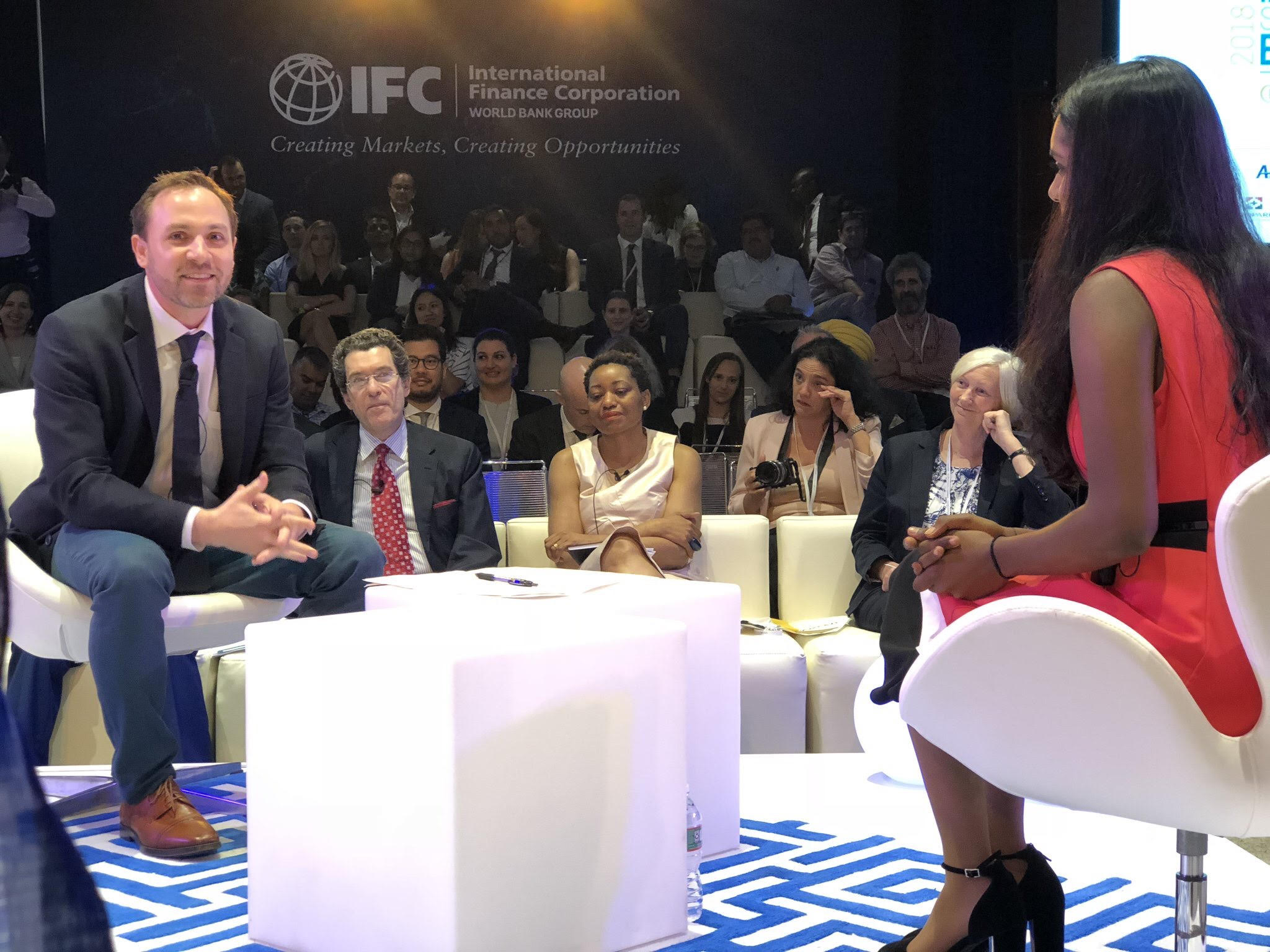
The long conversation is essentially a relay of timed two-person dialogues around a central theme.
The first person interviews the second, asking a series of questions (some predetermined, some spontaneous), then the first person exits, the second person becomes the interviewer, and a third person takes the stage.
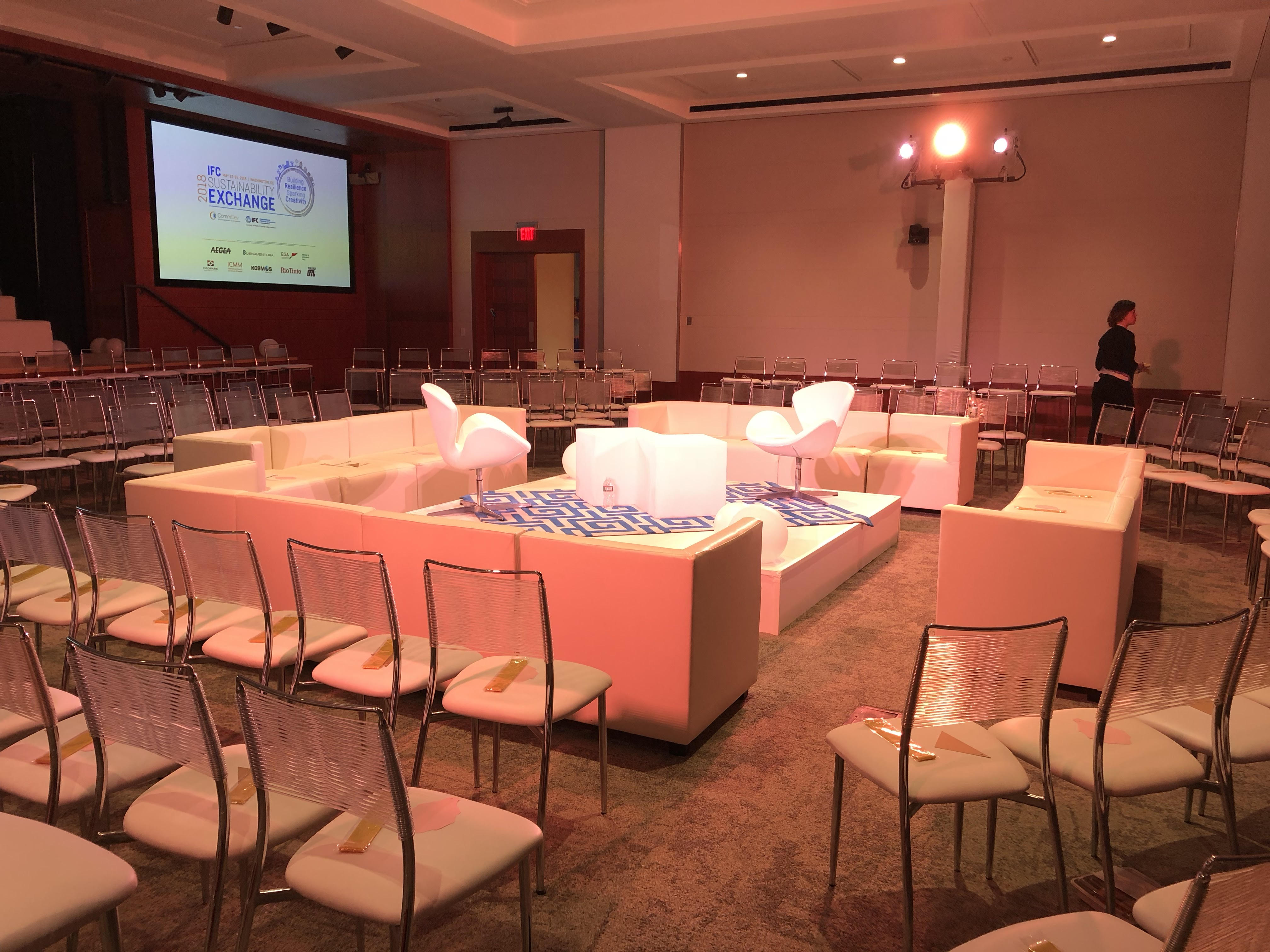
Set-up for Long Conversation
Interviewers and interviewees sit facing each other in the center of the room with audience seated around them. So it feels a bit like a closed fishbowl with predetermined speakers.
“The Long Conversation” format was adapted in this instance from Rachel Goslins and her work with The Smithsonian, where 25 leaders from the arts and sciences participate in a relay of two-person dialogues. But the unscripted back-and-forth of experts-interviewing-experts has also been used by organizations such as The Long Now Foundation, in 2010 which combined the 6-hour 19-minute presentation with data visualization performance by Sosolimited and a live performance of composer Jem Finer’s Longplayer.
Here’s what Veronica sent us in advance to set the tone:
“We are creating an intimate space to exchange ideas, thoughts, experiences to help everyone in the room appreciate the importance of and connections between resilience and creativity at various levels – whether it’s personal, community-level, organizational, or societal. Keep your ideas simple and concrete. Be yourself. Have fun.”
Preparation and reflections:
- Planning: The IFC team clearly worked hard to select the theme (Resilience), pick the participants, and determine the order for the conversation. They shared a number of potential questions in advance and asked us to think of three personal or professional stories related to the theme. They also put us in touch with our interviewers and interviewees beforehand to settle on specific questions. I’m a professor so I tend to over prepare anytime I go on stage. This format lends itself better to spontaneity and storytelling but it’s still important to check in with your interviewer and interviewee before the live conversation (even it’s 30 mins before the event) to agree on questions and a rough story arc.
- Timing: The IFC team set the time limit at 10 minutes per conversation with a chime at the one minute mark to prompt a final question/answer. The total time for our session was 1.5 hours with seven 10-minute conversations. 5 minutes may be too short but 10 can also feel a bit long in our current era of diminished attention spans.
- Audio: There are no options for powerpoint slides or AV in this format, but audio is important. Be sure to use microphones (ideally lavs) because at every moment, some audience members are not facing a speaker.
- Stage and seating: If you go with the fishbowl setup be sure to have the central platform raised enough so that folks can see the stage. And ideally, create a stadium seating effect so that audience members in the back are higher up and can see above folks in the front.
- Audience polling: This format doesn’t lend itself well to audience Q&A. I tried to do a hand-raising poll during mine (how many of you think that in 20 years the majority of traditional education (HS and College) will be delivered online?) and folks seemed eager to answer. I think this could be a neat technique to interject between sessions as new speakers join on stage.
- Order of roles: In our relay the new person on the stage started out as the interviewee and then transitioned to the interviewer in the second conversation. I am someone who always takes a few minutes to settle into the spotlight and imagine others are in the same boat. Interviewing seems like an easier way to do start on stage. I think there’s room to experiment here.
At TechChange, we are going to be working on adapting this format for our next online certificate course: Agriculture, Technology and Innovation which kicks off on June 11th. COO Chris wrote about the experience watching the webcast of the long conversation here. So if you’re interested in helping to pioneering a virtual version with us then sign up or reach out.
Thanks again to the IFC and Smithsonian teams for an enjoyable session. I’m always on the hunt creative ideas to improve and innovate beyond the traditional conference model (keynote/lightning talk/panel/breakout).
What other creative session formats have seen/tried/enjoyed at a conference?