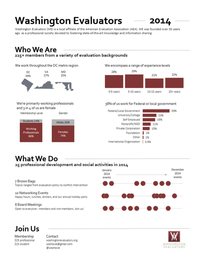
Information technology has greatly benefited the agriculture sector. You’ve probably read multiple articles that say ‘mobile phones empower farmers,’ but I wanted to ask the farmers themselves. Last year, I conducted a research on how rural farmers in Tanzania were using Tigo Kilimo. To learn why farmers were using this SMS based agricultural service, I spoke to 10 farmers who use the service and 5 farmers who did not.

How does Tigo Kilimo work?
Tigo, one of the most popular mobile network operators in Tanzania, launched their mAgri service Tigo Kilimo in April 2012. Tigo Kilimo is an SMS-based value added service that provides information about weather, crop prices, and agronomy techniques to small-scale farmers. By October 2013, Tigo Kilimo already had over 40,000 subscribers. Users access the service by dialing *148*14#. After completing registration, which is free, one can consult a USSD (Unstructured Supplementary Service Data) menu and select the desired information. An SMS containing the required information is subsequently sent to the customer. Tigo now offers free and unlimited access to all kinds of agricultural information to its customers.Tigo Kilimo demo

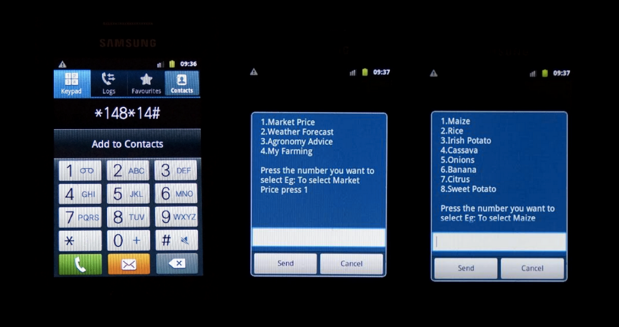
So, why are farmers in Tanzania using Tigo Kilimo?

1. Access to information increases productivity
Access to relevant and up-to-date information is crucial for farmers to plan farming activities and to choose which kind of crops to grow. Respondents requested information via Tigo Kilimo in particular during the cropping season. Short and long term information on weather is one of the most important information in the producing stage. Farmers risk loss without appropriate weather predictions, for example, when seeding too early or choosing unsuitable crops. Combining weather information and agronomy advice provided by Tigo Kilimo enabled farmers to increase their overall productivity.

2. Improves the welfare of farmers and their families
Farmers limit their revenue when selling their crops to middlemen and customers without timely market price information. The use of Tigo Kilimo has reduced the cost of market price research: farmers obtain prices for different crops in different markets and can strategically decide what to grow and where to sell. Market prices received through Tigo Kilimo serve as a point of reference for negotiating. Farmers are still willing to bargain with buyers but cannot be fooled by customers or middlemen.

Generated surpluses were saved or used for family issues and household needs, thereby increasing security and stability towards unpredictable external events. Additional income was invested in education as well as in the expansion of economic activities.

3. Empowers female farmers
Female respondents stated that Tigo Kilimo helped them to gain not only financial independence but also knowledge acquisition. Since most agricultural information and extension services are targeted at male farmers, women happen to lack valuable agricultural information. Domestic workload reduces the time to research the required information. Tigo Kilimo allows women to request and read agricultural information whenever and wherever they want. However, it is important to remember that the effective use of Tigo Kilimo requires regular access to a mobile phone, which is less likely among women.

4. The benefit extends to the community
All of the farmers I spoke to stated that they shared information obtained through Tigo Kilimo with others in the community. The acquired knowledge is shared with community members such as neighbors, family members and friends who cannot access Tigo Kilimo due to lack of education or income. Information is discussed during group meetings, which encourages knowledge exchange. Tigo Kilimo can improve the social capital of a community since additional knowledge is transmitted by “infomediaries” to community members without access to it. Tigo Kilimo users also promote the service among their social network, convincing non-users to subscribe to the service.

Tigo Kilimo marketing

What are farmers’ suggestions for mAgri services like Tigo Kilimo?

  • Include farmers in the design process: Including farmers in the designing process of mAgri services would help to identify farmers’ needs. The indigenous knowledge from farmers into the service would help to better serve the community by providing information on the relevant crops.
  • Simplify the subscription process: Some of the farmers had heard about Tigo Kilimo but didn’t use it because they failed to subscribe. If the subscription process was simpler, they would also benefit from the service.
  • Expand their marketing to rural areas: Some of the farmers had never heard of services like Tigo Kilimo. By advertising their services to more farmers, Tigo Kilimo could really benefit more farmers.

While Tigo Kilimo’s reach may be restrained by hurdles like poor road infrastructure, the unavailability of farming inputs, lack of access to mobile devices, its benefits are undeniable. Tigo Kilimo has provided many farmers with relevant and up to date agricultural information, positively influencing their agility, security, and income.

What has your experience been with mAgri services? Do you know of other mAgri services that are benefiting farming communities? Tweet at us @TechChange or comment below.

Interested in learning about other ways mobile phones are being used in international development? Sign up for our Mobiles for International Development course that begins early next year!

About author

sophie stolle headshot

Sophie is an alumna of TechChange’s Mobiles for International Development course. She is an Entrepreneur in Residence in the field of product management for a Berlin internet startup. Sophie arrived in the Berlin startup scene three years ago and is very passionate about business solutions that make the world a better place. She loves Kiswahili and has been staying in Kenya and Tanzania for more one year where she is exploring the local (social) startup scene there. She has been working as product manager for an e-commerce company in Berlin. Sophie is about to get her Bachelors’ degree in African Studies and Economics with a thesis focusing on the impact of a mobile-based agricultural information service on rural livelihoods in Tanzania.

Today, we’re excited to share an interview with TechChange alum Ladislas Hibusu! Ladislas has completed 5 courses and is currently taking his sixth. Learn more about his journey and how TechChange has impacted his career below.

1.  What got you interested in taking TechChange courses?

I first heard of TechChange from a colleague who was a TechChange alum. At the time, I was grappling to understand my new role as a Global Health Corps (GHC) fellow at a local NGO that was dealing with behavior change. My new position meant that I had to have certain skill sets if I were to succeed. It was around that time that my colleague shared TechChange’s TC111: Technology for Monitoring and Evaluation course. After reviewing the course content, I jumped at the opportunity to sign-up.

2.  After completing your first course with TechChange, what made you enroll in more courses?
After taking TC111: Technology for Monitoring and Evaluation, I was particularly fascinated with the themes, exercises, case studies, featured articles and reading materials but most importantly the top-notch industry experts from the live sessions who provided great insight on real-time trends. The recorded videos have also been a useful tool for expounding on themes such as mHealth, mAgric, mEducation, mFinance and other topics. The industry experts such as Joel Selaniko gave great insight into their area of expertise. However, TechChange facilitators like Norman, Kendra and Jennifer will tell you that what I am particularly passionate about are the great tech tools and platforms that are a big piece of the course. The unique nature of the tools and the way the recorded and live demos are presented is something anyone wanting to go further in their career could not resist.
I have positioned myself as a competitive data engineer not with a degree in an engineering field, but with the willingness to learn and lean on the shoulders of the experts that these TechChange courses have introduced me to.

3.  How have TechChange courses impacted your career?
The most significant impact that TechChange courses have offered me are the skills that have translated into making me competitive in the job market. While taking TC111, I was engaged as a Data Quality Consultant in an end-line evaluation of the project impact. Immediately after, I was hired as an independent Technical Monitoring and Evaluation consultant with two reputable international NGOs. Sooner rather than later, all I will need in my work life will be my eyes, head, hands, a mobile phone, laptop with Internet connectivity and the appropriate state of the art software. I will have earned my reputation of “getting jobs done” beyond the hire’s expectation.

4.  What is your advice for other participants taking a TechChange course? How can they get the most out of it?

Research broadly: Go beyond the course content, especially in their areas of interest, as this will enable them to know exactly what to ask from the expert speakers in order to get the maximum benefit.

Utilize the networks/connections: TechChange connects us to global experts and thought leaders in their own areas. For instance, I found that the project that one of the experts and TechChange alum Mira Gupta was working on was similar to what initially drove me into taking the TechChange courses. Engage with other participants too as they have a wealth of experience on this topic. I have received valuable resources out of the TechChange platform from the colleagues I met via the courses, which have been a great boost to my career.

————————————-

About Ladislas

Ladislas Headshot

Ladislas Hibusu is a researcher and a Monitoring and Evaluation consultant. Over the years, he has come to love making research inquiries and helping students and companies on baseline, mid-line and end-line evaluation of their project impacts. He has also worked on the technology side of data documentation. Before working with Jhpiego as a consultant, he was a Global Health Corps fellow in the 2013/14 year and also consulted with Futures Group Global Inc. as a Data Quality Consultant. After receiving his college degree in Library and Information Studies and Demography, he spent time working as a Librarian and life coach at an organization that helps orphaned and vulnerable children realize their dreams. Ladislas can be found on Twitter at @tracykhibusu

————————————-

How has TechChange’s course affected your career? We would love to hear your story too! Reach out to us at info@techchange.org

Have you ever wondered how visualizations like the One Million Tweet Map are able to stay continuously up to date? Or have you wished you knew how to access data from The World Bank’s Open Data project or Data.gov? If so, then you might want to dive into learning about APIs.

In the run-up to TC311: Technology for Data Visualization, I’ve been getting excited about data and APIs. In this brief introduction, we’ll learn the basics of what APIs are, and then how to use Postman, a Google Chrome plugin that can help us access data from APIs. We’ll wrap up by using Postman to retrieve data from the World Bank’s open data API.

So What is an API Anyway?

API stands for Application Programming Interface. At its core, an API allows web servers to communicate with other servers, web browsers, mobile apps, wearables, and almost any other technology you can imagine. APIs allow these devices to transfer data in a predictable way that can be automated.

One way to think about APIs is like an automated telephone directory. For example, if you call the Washington, DC Government’s Information Hotline (311), you won’t immediately speak with a person. First, you’ll be asked if you would like to communicate in English or another language, then you might be asked which service you need to talk about, and then you’re referred to a live person who has the information you need.

APIs operate similarly, except that instead of dialing numbers into a phone to get our information, we use our web browser and a language called HTTP to make a request for data. Just like calling 311 and pressing 1 to speak to someone in English (or 2 for Spanish), we can provide an API with different pieces of information (called parameters) that tell a web server to give us the right information.

The Anatomy an API Call

So how do we actually go about retrieving data from a server? Just as phone numbers follow a specific format (e.g. country code, area code, region, etc.) our API call needs to be made in a specific format. On the internet, this is called HTTP (Hyper-Text Transfer Protocol), and you’ll probably recognize it from the URL bar in your browser.

Screen Shot 2015-05-28 at 11.03.52 AM

Example of HTTP in your the browser’s URL bar.

In fact, if you know how to type a URL (Universal Resource Locator) for a website, you already know some basic HTTP. If you take a look at the screenshot above, you can probably guess that going to https://www.google.com/maps will take us to Google Maps. If you look for a bit longer, you might recognize those numbers after the @ sign as latitude and longitude coordinates. In this example, those coordinates are the parameters that we’re giving the Google Maps API to tell it to display a specific piece of information: a map centered on our current location.

We can think of API calls as being comprised of two pieces: the URL, and parameters (in reality there’s a bit more going on, but we’ll keep things simple for now). In general, a URL represents the location of a web page, and the parameters capture information that we can give to the server when we’re on that page. Let’s go through a few examples:

Screen Shot 2015-05-29 at 10.52.16 AM

Here, we’re sending our request to Google Search with the parameter ‘q’ (for query, as in ‘search query’) equal to ‘techchange’. As you might have guessed, this tells Google’s server to execute a search for Techchange and return our results. Lets take a look at another example:

Screen Shot 2015-05-29 at 10.52.05 AM

In this case, our parameter ‘t’ (for time) is set to ’30s’ which tells YouTube’s server to play our video, beginning 30 seconds in.

While the specifics of every API are different, the combination of a URL and certain parameters are the basic elements that we need to make an API call. Next up, we’ll see how to use what we’ve learned to make an actual request.

Making an API Call

Want to make an API call to the World Bank right now? You can! Just copy and paste this link into a new browser Window:

http://api.worldbank.org/countries/br/indicators/NY.GDP.MKTP.CD?date=2006

You should get some data back that looks like this:

Screen Shot 2015-05-28 at 12.37.32 PM

Pretty simple, right? We just made a call to World Bank’s API and got the GDP of Brazil for 2006 back as data. Lets break down how we got there:

  1. We called up World Bank’s API (https://api.worldbank.org)
  2. We specified that we wanted to get the data by country (/countries/), and the specified brazil (the /br/ in our URL)
  3. Next, we specified GDP using the World Bank’s indicator code: /NY.GDP.MKTP.CD/
  4. Then, we told the server that we wanted to filter using the date parameter (?date=2006).
  5. Like magic, the server gave us back the information in an XML format. If we look under <the wb:value> tag, we can see that Brazil’s GDP in 2006 was about $1.089 trillion.

Now, this was a pretty simple request, but you can imagine that if we were typing out really long URLs to access an API, we might want a better tool than our browser’s URL bar.

TechChange’s Tech Team uses Postman to work with APIs. Open Google Chrome and click here to install Postman as an extension from the Chrome Web Store (it’s free!).

Once it’s installed, click on the Apps button in the top left corner of your browser. It looks like this:

Screen Shot 2015-05-28 at 12.56.34 PM

Then click on the Postman icon:

Screen Shot 2015-05-28 at 12.59.44 PM


You’ll now have a better interface for making API calls. It should look like this:

Screen Shot 2015-05-28 at 1.04.54 PM

Making API Calls with Postman

Let’s try re-doing our World Bank API call with Postman. Click on the line labeled “Enter request URL here” and paste in our URL:

http://api.worldbank.org/countries/br/indicators/NY.GDP.MKTP.CD?date=2006

You’ll notice that Postman recognizes the parameter after the ‘?’ on our URL (date=2006) and has displayed it right below our full request. Click the blue “Send” button to make the call and you’ll see the data returned below:

Screen Shot 2015-05-28 at 7.14.57 PM

We’re not doing anything differently from before when we simply entered the URL into our browser, but Postman makes this entire process easier, especially when it comes to experimenting with different parameters.

Playing with Parameters

Now that we have a basic sense of how to make an API call, let’s start giving the API more information so that we can customize the data we receive. Unfortunately, we can’t just start typing nonsense for our parameters and expect much to happen. For example, if we ask for the GDP of Brazil and specify food=pizza instead of date=2006, the server won’t be able to filter the results.

This is where API documentation is hugely helpful. An API’s documentation tells people accessing the data the parameters that are valid when they make an API call. Let’s look at the documentation for the World Bank’s API here.

Under the request format section, you’ll see that one of the things we can do is select a date range using a colon:

Screen Shot 2015-05-28 at 7.43.00 PM

So by passing in date=2004:2014, we can ask the API for a decade of Brazil’s GDP. Let’s do that in Postman:

Screen Shot 2015-05-28 at 7.46.29 PM

As you can see, the server understood our API call and returned 10 GDP values from 2004-2014 (cut off in the screenshot).

We can also pass in multiple parameters at the same time. The World Bank API returns data in XML by default, be we can change this to JSON (Java Script Object Notation – another data format) by specifying format=JSON. Here’s what that looks like:

Screen Shot 2015-05-28 at 8.02.50 PM

We can do all sorts of things from here on out, like specifying a language, listing multiple countries, and even choosing other indicators (The World Bank tracks a lot more than GDP).

Here’s an example of what an API call looking for cell phone adoption in Kenya, Tanzania, and Uganda (ken;tz;ug in the URL) looks like for 2013:

Screen Shot 2015-05-28 at 8.12.57 PM

Bringing it All Together

We’ve learned how to get data from an API, but why is this better than just using an Excel spreadsheet as a data source? Sometimes, Excel might actually be the easiest way to go, but the advantage of an API is that it provides a stream of information that is automatically updated and in a predictable format. Rather than having to manually generate a new graph from a spreadsheet every time the World Bank releases a new set of GDP measurements, we could write a script to gather the most recent information by calling the API.

In fact, if you search “GDP Brazil” in Google, you’ll be presented with a live (well, updated yearly) graph that is pulling data from the World Bank’s API:

Screen Shot 2015-05-28 at 8.33.03 PM

So what’s next? Well, there are plenty of APIs available to draw data from. As of 2015 there were more than 13,000 APIs listed in Programmable Web’s API Directory, with 3,000 of those APIs were added in the past two years. Using tools like AJAX and JavaScript chart libraries, even simple web applications can create live visualizations that help users understand the data.

Of course, we haven’t even touched on how to think through creating data visualizations. If that topic interests you, be sure to check out TC311: Technology for Data Visualization.


Imagine a tool where you have text and a computer automatically highlights key themes. No need to do complex coding, no word counts that are used to explore the text — just keywords and phrases identified. This is exactly what the tool Textio does for job descriptions. It automatically provides an effectiveness score and identifies words and phrases that affect whether applicants will apply for a job: they identify words through color coding that can act as a barrier or incentive, ones that affect applicants based on gender and repetitive terminology. [Editor’s note: TechChange participated in a closed-beta test of the tool and we will write a separate blog post about Textio and hiring practices. This is not a sponsored post.]

This tool not only has great implications for hiring, but utilizes simple visualizations to analyze qualitative data. As Ann Emery and I have been preparing for the Technology for Data Visualization course, we discuss how best to address the topic of data visualization for qualitative data. While there have been data visualizations featured in art museums (e.g., Viégas and Wattenberg’s Windmap), most visualizations are designed to convey information first.

Textio is using a custom algorithm to do a type of sentiment analysis. Typically, sentiment analysis will analyze how positive or negative a text is based on a word’s meaning, connotation, and denotation. Textio, on the other hand, focuses on how effective words or phrases are at getting people to apply for jobs and whether those applicants are more likely to be female or male. Once their specified level of effectiveness or gendered language for a word or phrase is reached, they highlight it with colors based on whether it is positive or negative and/or masculine or feminine. The gender tone of the entire listing is shown along a spectrum.

Acumen, a tool created at Al Jazeera’s 2014 Hackathon: Media in Context, is another take on how to visualize sentiment analysis. With a focus on trying to uncover bias in news articles, they highlight how positive or negative an article is in relation to other articles on the topic. A separate analysis tab shows shows the two sentiment ratings on a spectrum and ‘weasel words,’ words that are indicative of bias in reporting. The viewer also has the option to highlight the weasel words in the news article.

Both Textio and Acumen are great examples of how qualitative data visualization can be used to aid in the analysis of text. Neither example is immediately suited for generalized needs and require programming knowledge to create a particularized purpose, which myself and Kevin Hong will discuss in a forthcoming blog post. Instead, they can be used as examples of how qualitative data can be visualized to help inform decision making.

Have you used Textio or Acumen? Share your thoughts with us below or by tweeting us at @techchange!

Data visualization requires more than design skills. You need both technical and critical thinking skills to create the best visuals for your audience. It is important to match your visualization to your viewer’s information needs. You should always be asking yourself: “What are they looking for?”

1. Understand your audience before designing your visualization
The first and most important consideration is your audience. Their preferences will guide every other decision about your visualization—the dissemination mode, the graph type, the formatting, and more. You might be designing charts for policymakers, funders, the general public, or your own organization’s leaders, among many others.

What type of decisions do your viewers make? What information do they already have available? What additional information can your charts provide? Do they have time (and interest) to explore an interactive website, or should you design a one-page handout that can be understood at a glance? A chart designed for local government leaders wouldn’t be appropriate for a group of program implementers, and vice versa.

2. Your audience determines the type of visualization you prepare
Spend some time thinking about your dissemination format before you sit down at the computer to design your visualization. The days of 100+ page narrative reports are long gone. Nowadays viewers want visual reports, executive summaries, live presentations, handouts, and more.

  • Visual Reporting
    Traditional M&E reports are 80% text and 20% graphics. Ready to break the mold? This visual report, State of Evaluation 2012 from Innovation Network, is about 20% text and 80% graphics.State of Evaluation 2012
  • One-Page Annual Reports
    If you know your viewers won’t read more than a page or two, try a one-page annual report. These “reports” focus on just the highlights of what was accomplished within the past year and leave out the lengthy narrative sections. Here is an annual report I created for the Washington Evaluators:
    Washington Evaluators
  • Online Reporting
    Maybe your viewers would respond better to a different reporting style altogether—an online report. These website-based reports can include images, videos, interactive visualizations, and more. My favorites include Datalogy Labs’ Baltimore report and the University of Chicago’s computer science report.

3. Remember that the key is to keep your audience engaged
If you are sharing results in client meetings, staff retreats, conferences, or webinar, try breaking up your charts into several slides so the chart appears to be animated. This storyboarding technique ensures that your audience is looking where you want, when you want.

  • Draw Attention to key charts with handouts
    If you are getting ready to share your M&E results during a meeting, rather than printing your full slide deck, select 3 to 5 key charts and print those slides on a full-page. Your full slide deck will likely end up the trash can as soon as the meeting ends, but your curated handouts will get scribbled on, underlined, and saved for future reference. I often see these handouts taped above meeting attendees’ desks weeks and months after my presentation.
    emery_handouts
  • Tweeting your results
    If you are planning to tweet a chart or two, be sure to adjust your charts to fit a 2:1 aspect ratio. Otherwise, your carefully crafted visualization will get chopped in half because when you are scrolling through your Twitter feed, the images automatically display about twice as wide as they are tall.

That’s all for my top tips to keep in mind when creating your visualization! How do you engage your team when creating and presenting reports for your organization? What types of communications modes are you currently using to share your visualizations? Tweet at us @TechChange and join the conversation!

Interested in learning more about how to best present findings for your team or organization, join me and Norman Shamas in TechChange’s brand new Technology for Data Visualization and Analysis online certificate course. The course begins on June 1, and you can register with code ‘DATAVIZ50′ for a $50 discount! Click here to register

About author

Ann K. Emery
Ann K. Emery is a co-facilitator for Technology for Data Visualization and Analysis course. Through her workshops, webinars, and consulting services, she equips organizations to visualize data more effectively. She leads 50 workshops each year both domestically and abroad. Connect with Emery through her blog.

Image Source: AidData

How do you analyze data you collect from surveys and interviews?

One way to analyze data is through data visualizations. Data visualization turns numbers and letters into aesthetically pleasing visuals, making it easy to recognize patterns and find exceptions.

We understand and retain information better when we can visualize our data. With our decreasing attention span (8 minutes), and because we are constantly exposed to information, it is crucial that we convey our message in a quick and visual way. Patterns or insights may go unnoticed in a data spreadsheet. But if we put the same information on a pie chart, the insights become obvious. Data visualization allows us to quickly interpret the data and adjust different variables to see their effect and technology is increasingly making it easier for us to do so.

So, why is data visualization important?

Patterns emerge quickly

Cooper Center's Racial Dot Map of the US
Cooper Center’s Racial Dot Map of the US

This US Census data (freely available online for anyone) is geocoded from raw survey results. Dustin Cable took the 2010 census data and mapped it using a colored dot for every person based on their race. The resulting map provides complex analysis quickly.

It is easy to see some general settlement patterns in the US. The East Coast has a much greater population density than the rest of America. The population of minorities is not evenly distributed throughout the US with clearly defined regional racial groupings.

Exceptions and Outliers are Made Obvious

San Luis Obispo, CA

As you scan through California, an interesting exception stands out just north of San Luis Obispo. There is a dense population of minorities, primarily African-Americans and Hispanics. A quick look at a map reveals that it is a men’s prison. With more data you can see if there are recognizable patterns at the intersection of penal policy and racial politics.

Quicker Analysis of Data over Time


Google Public Data Explorer

Google’s dynamic visualizations for a large number of public datasets provides four different types of graphs, each with the ability to examine the dataset over a set period of time. It is easy to see patterns emerge and change over time. Data visualization makes recognizing this pattern and outliers as easy as watching a short time-lapsed video.

What are some of your favorite data visualizations examples or tools, tweet at us @TechChange or share in the comments section below.

If you are interested in learning about how to better visualize and analyze data for your projects, join us in our new online course on Technology for Data Visualization and Analysis. The course begins on June 1, so save your seats now!

Meet Jennifer, she took her first TechChange course on Technology for Conflict Management and Peacebuilding in October and is now facilitating multiple TechChange courses.

Drawn by our teaching model, after completing her course, she wanted to become involved as a facilitator for our courses. She is currently co-facilitating TC111: Technology for Monitoring and Evaluation with Norman Shamas, and facilitating TC105: Mobiles for International Development. Jennifer will also be facilitating TC109: Technology for Conflict Management and Peacebuilding in the coming months, bringing her full-circle in her participant-to-facilitator involvement with TechChange.

Prior to joining TechChange, Jennifer participated in several research symposiums and conferences like the Institute for Qualitative and Multi-Methods Research, the Association for the study of the Middle East and Africa Annual Conference and more. She has also served as a guest speaker for the American Red Cross and has mentored several high school and undergraduate students regarding school-sponsored and independent international development and peacebuilding start-ups.

Jennifer is an emerging comparative politics scholar and methodologist focused on answering questions related to individual and community involvement in conflict, post-conflict, and peace processes. She holds a Bachelor’s in Political Science from the Colorado College, a Masters in Public Health from Indiana University, and is a Doctoral Candidate in Political Science with the University of New Mexico.

Did you see Facebook’s Safety Check feature recently? Did you use it?

Following the recent earthquake in Nepal, Facebook activated “Safety Check“, a feature that helps friends and relatives quickly find out whether their loved ones are safe. Safety Check was originally launched in October 2014 and was mainly based on experiences gained during the 2011 earthquake and Tsunami in Japan.

The idea is very simple: In case of a large scale emergency, Facebook can use the information it is constantly collecting about its users to determine who is likely to be in the affected area. It then asks these users to confirm whether they are safe and shares that information with their facebook friends. Alternatively, people can also report their facebook friends as being safe and those marked safe can see who marked them. People can also say “I’m not in the area”.

Safety Check is a dormant Facebook feature that is only activated when necessary. One thing that I had been curious about since the launch was how well Facebook would be able to determine whether someone was in the affected area.

According to the original press release:
“We’ll determine your location by looking at the city you have listed in your profile, your last location if you’ve opted in to the Nearby Friends product, and the city where you are using the internet.”

Indeed I quickly heard from two former colleagues who were in Nepal: One of them lives permanently in Kathmandu but was actually on a plane when the earthquake happened. In his case, Facebook assumed he was still in Nepal, because his phone was off at the time of the quake. In the absence of current information, Facebook took his home city and/or his last location, which was at the airport, to include him in the group of affected people.
The other person I know normally lives in the UK but was in Nepal on a trip. In his case, Facebook used the IP address of his last login to estimate his location.


Users see how many of their Facebook friends are
in the affected area and how many are safe.

Why this is relevant
Anyone who has ever been in a situation where family members or close friends are in danger, knows that finding out what happened to them is one of the first things on your mind. Not knowing is not only a source of great anxiety, but it can actually be dangerous if you yourself are also close to the affected area:

Think of a father who knows that his daughter was at a shopping mall downtown when the earthquake struck. If he doesn’t know what happened to his child, he will probably run to the shopping mall to find out. By doing so he can put himself at risk and he will not be at home to look after the other children when a strong aftershock occurs. He will also try to call his daughter every 5 seconds, thereby accidentally helping to crash the phone network.

On the other hand, we have now seen in a number of disasters that internet connections frequently remain functional (if slow) even when phone and SMS networks are down – to a large part because many people open their WiFi networks to let others use the internet.
Using social media is also much more efficient since one “I am safe” update will reach all of one’s friends, making multiple calls unnecessary, thus reducing further load on the telecommunications infrastructure.

facebook safety check blogpost photo 2
The application also shows clearly whether people have
reported themselves as safe or whether others have done so for them. 

Why this is better
Of course, there are also other systems to find out whether friends and family are safe. Google, for example, has its “Person Finder“. The Red Cross Red Crescent Movement has been providing tracing and restoring family links services for many years and local government authorities, as well as embassies, are also very much involved in these tasks.

However all of them require that a (distressed) user finds out about these services and actively registers or gets in touch with them. That is a lot to ask of someone who just survived a disaster. Facebook’s Safety Check on the other hand is part of the normal Facebook application that most people are already familiar with. This reduces the barrier to share and receive information significantly which in turn reduces the load on the other, more sophisticated, systems like the Red Cross’ tracing program. Facebook’s Safety Check can provide clarity in many of the easy cases, freeing up resources for the difficult ones.

What do you think about Facebook’s Safety Check? Let us know by commenting below or tweeting at us @TechChange. This post originally appeared on Social Media 4 Good

Interested in learning about other ways technology is being used in disaster response? Join us in our upcoming online course on Technology for Disaster Response that begins on June 22.

About author

Timo Luege
Timo Luege, TC103: Technology for Disaster Response Facilitator

After nearly ten years of working as a journalist (online, print and radio), Timo worked four years as a Senior Communications Officer for the International Federation of Red Cross and Red Crescent Societies (IFRC) in Geneva and Haiti. During this time, he also launched the IFRC’s social media activities and wrote the IFRC social media staff guidelines. He then worked as Protection Delegate for International Committee of the Red Cross (ICRC) in Liberia before starting to work as a consultant. His clients include UN agencies and NGOs. Among other things, he wrote the UNICEF “Social Media in Emergency Guidelines” and contributed to UNOCHA’s “Humanitarianism in the Network Age”. Over the last year, Timo advised UNHCR- and IFRC-led Shelter Clusters in Myanmar, Mali and most recently the Philippines on Communication and Advocacy. He blogs at Social Media for Good.

Technology has been known to facilitate anonymous harassment online, but in India a non-profit organization is using mobile apps to fight harassment on the streets. I came across Safecity in my Mobile Phones for International Development course, and since I plan to return to India and pursue my career in promoting gender equality, the case study of Safecity reducing gender-based violence (GBV) caught my attention.

How Safecity Works
Safecity is a non-profit organization in India that offers a platform for individuals to anonymously share their stories of sexual violence or abuse. This crowdsourced self-reported data is then displayed on a map of India to show hot spots and patterns of violence in various parts of the country. Safecity collects this data through its website, social media platforms, and via email, text or phone to increases awareness of the various kinds of GBV, ranging from catcalling to groping to rape. It also allows Indian individuals, law enforcement agencies, neighborhoods, businesses, and the society at large to access this data and to use it to take precautions and devise solutions.

Safecity reports
Safecity reports

Why Safecity Works
As one of the founders of Safecity put it, the three main reasons that rape and other sexual harassments are underreported in India is because people are afraid to report it, the police manipulate the data, or because victims are deterred by the delayed justice system. This, along with the cultural stigma attached to talking about sexual harassments, makes anonymity for victims very important. Allowing for anonymous reporting, Safecity has collected over 4000 stories from over 50 cities in India and Nepal since it launched in December 2012.

How Safecity is Using Mobile Apps
Along with collecting and visualizing data, Safecity promotes a variety of phone applications to help sexual minorities feel safe in public spaces:

GeoSure (provides personalized travel safety content via mobile)
Nirbhaya: Be Fearless (emergency app that sends a distress call or emergency message to a specified contact or group)
SafeTrac (allows automatic monitoring and tracking of your journey)

Safecity also promotes services like Taxshe, a safe all-female driver service, and KravMaga Chennai, a self-defense teaching service.

Challenges and Looking Ahead
As with many ICT4D solutions, access to the technology remains an important barrier. Safecity and its advertised applications, products and services seem to only reach a very specific target audience (urban populations with access to modern technology), leaving behind illiterate populations from rural areas with no access to technology. With their missed dial facility, Safecity is hoping to reach out to women with limited access to technology by recording their reports of abuse and harassment over the phone and suggesting appropriate interventions.

I look forward to seeing how Safecity uses this form of community engagement and crowdsourced data to not just report, but reduce GBV in India. This course introduced me to a new and unique way to address the pervasive issue of GBV in India and I look forward to utilizing the tools and lessons learned in making India a gender equitable country one step at a time.

Interested in learning about other ways mobile tools are helping communities address different problems? Join us in our upcoming Mobiles for International Development online course that begins on May 11.

Author Bio

Nikita Setia Headshot

Nikita Setia is a M.A. candidate at the Elliott School of International Affairs in the International Affairs Program, concentrating in development. She previously earned her B.B.A in Economics, International Business, and Management at Northwood University in Midland, Michigan.

It may be difficult to see the relevance of 3D Printing beyond maker labs, but its potential to help in international development, and especially humanitarian response should be explored further.

In 2013 alone, there were more than 334 natural disasters around the world resulting in more 100,000 deaths. While the numbers decreased in 2014, in 2015 we are already seeing the devastating effect of the earthquake in Nepal. Not only do natural disasters claim lives, they also disrupt the supply chain, making it difficult for those affected to access basic goods and services. While it may not be applicable in the immediate aftermath of a disaster, 3D printing can help with recovery from a disaster by filling the gap in the supply chain.

3D printing is changing what you can produce and where you can produce it, making it a solution that could meet the needs of people after a humanitarian crisis.
Here is why:

Low cost
3D printers are no longer out of our reach. As they are becoming more sophisticated and affordable and many patents are expiring, there are now a wide range of consumer 3D printers available for purchase. Field Ready launched a pilot in Haiti where they test-manufactured a variety of umbilical clamps, enough to supply a local clinic for a month. Along with that, they also printed a prosthetic hand, items to repair and improve the printers, butterfly needle holders, screwdrivers, pipe clamps, and bottles. Being able to 3D print medical equipment on site can save costs in purchasing and transporting them from outside, allowing the funds to be used for other important resources that need to be delivered.

Portable
Not only can 3D printers manufacture basic supplies at a low cost, they are also portable so they can be easily transported anywhere there is a need. Many supplies and materials are delivered to disaster affected areas from off-site, creating wait time and possibilities of the supplies getting damaged in transit. It can be a great relief to know that you can print basic necessities like medical tools, or materials to construct a shelter on-site before more permanent supplies are delivered to you.

Immediate correction
Communication can be difficult during a crisis, and sometimes relief delivery of supplies may not fit the requirements of the needs. In this case, it takes more time and money to correct the situation. With a 3D printer, you can immediately change the design of the product you are imagining and test print multiple versions in a short time until you end up with your desired final product.

While the solutions may sound exciting, we have to be mindful of the fact that disaster-stricken places may not have resources needed to run 3D printers. Electricity, human capital, and availability of raw materials are just a few potential barriers. So, organizations like Field Ready are exploring solar powered 3D printers and have already tested a basic curriculum to teach locals how to design items and use the printers. While there is more to learn on what is possible with 3D printing, the possibilities it offers for humanitarian response are endless.

We will be exploring topics like this and other ways 3D printing is being used for social good, as well as hear from experts who are already using 3D printers in this context and can see its potential for society, in our upcoming course on 3D Printing for Social Good.

There is still time to apply, so I hope you can join us!