The global development industry is generating a lot of data on the ‘developing’ world–data that has not always been available. As technology has made data collection easier and scalable, many in the development industry have already established that monitoring (i.e., data collection) is much easier than evaluating (i.e., data insights). However, both aspects of M&E require good methodologies to ensure the data are accurately represented.

Despite making my living working with data, I am somewhat of a data skeptic. Specifically, I am skeptical of the notion that numbers and data are truth. Much like geographer Doreen Massey’s conceptualization of space as a product of social relations, data embodies social relations and biases. In other words, it is difficult to guarantee the neutrality of data and numbers in terms of how they are collected, what they show, and how they are analyzed. All of this information is subject to human bias – whether intentional or unintentional – with the way humans label data, the limitations of finite data samples, and the human-designed technology that might reinforce biases.

The way humans label data
Does the way we identify data represent cultural bias? In some ways, yes. Labels can be culturally problematic in the way we classify data and the way people interpret those classifications. For example, when collecting demographic information for a survey, limiting gender to two categories, we can reinforce our own notion of gender categories and unintentionally bias the data. India and Nepal, for example, both recognize a third gender on official documents. M&E data in these countries however, do not always reflect this change. Mortiz Hardt, a researcher at IBM, notes five ways that big data is unfair. Along with different cultural understandings and the consistent, if unintentional, representation of social categories (e.g., race and gender), Hardt notes sample size as a problem.

Limited sample sizes of data
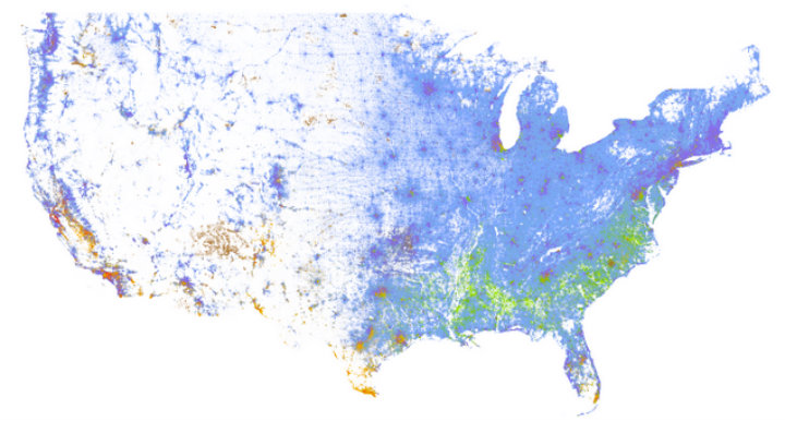
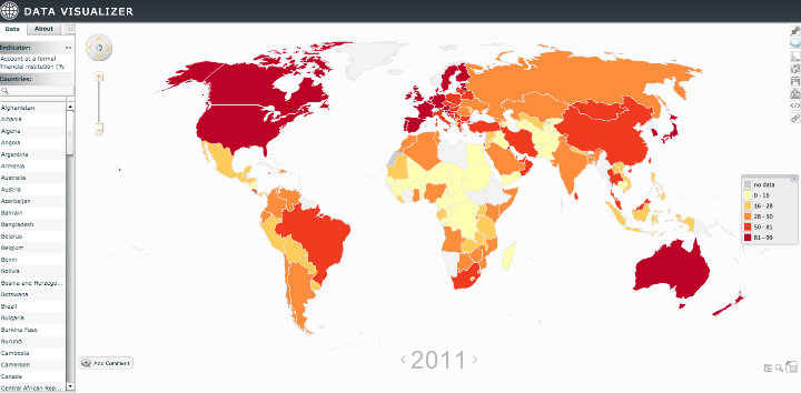
The issue of certain groups not being represented in the data is a particular problem for global development. A recent study by the Global Web Index highlights that geolocation can lead to groups in the ‘developing’ world not being counted by web analytics. Virtual private networks (VPNs), which are a common tool for accessing blocked sites, and shared devices are some of the main culprits. Additionally, issues of privacy can change responses and skew the data and limit the sample size of quality data. For example, in some societies, even if a woman owns a cell phone, she is not always free to respond without having her calls and text messages monitored.

Are we training machines to mimic our cultural biases that are in data?
This human bias within data is of particular concern for predictive modeling and big data, both of which are starting to enter development as seen in report reports by UN Pulse and the World Economic Forum. But an algorithm for predictive modeling is just training a machine based on the data that it’s given. So if the data are biased, the prediction will be biased. According to Wired Magazine article with Danielle Citron, a University of Maryland law professor, humans can trust algorithms too much, in that “[…]we think of them as objective, whereas the reality is that humans craft those algorithms and can embed in them all sorts of biases and perspectives.”

So what does data bias mean for global development and M&E professionals?
Global development needs to continue being data-driven. This is emphasized by one of the principles for digital development being focused on data driven decision making. It is equally important we recognize and understand the biases we incorporate into datasets and the biases of the datasets of the datasets we use.

At the end of the day, Tech for M&E begins with the humans behind the data. With the vast amounts of data provided with modern digital data collection tools, M&E practitioners need to understand how they can act as gatekeepers to ensure that we note the bias we are embedding in our data.

===

Interested in this topic on data in global development and measuring results? Join our top selling online course on Technology for Monitoring & Evaluation, which begins April 20, 2015.

On September 25 and 26, over 200 development practitioners and technologists filled FHI 360’s conference rooms and hallways in Washington D.C. to discuss the intersection between technology and monitoring and evaluation (M&E). Some of the conference attendees included participants and guest experts in TechChange’s ongoing online course on Tech for M&E and it was great meeting so many these online course participants in person and offline.

Supported by the Rockefeller Foundation, GSMA, and FHI 360, the M&E Tech Conference was a two-day conference held in D.C. (followed by another one event in New York) to discuss the emerging role of technology in M&E and its implications to everyone involved in the international development industry. The release of the discussion paper, Emerging Opportunities: Monitoring and Evaluation in a Tech-Enabled World kicked off the first panel, followed by two days of great panel discussions and engaging break-out sessions. The event also featured a panel facilitated by TechChange online course facilitatorKendra Keith on “What’s Next in Visualizing Data for Better Decision Making?” and a lightning talk on ‘How to Use APIs for Real-Time M&E’ that I presented.

In case you didn’t make it to the D.C. M&E Tech conference, here are a few key takeaways from the event.

1. Technology is not a substitute for good M&E methodologies

One of the panelists perfectly summed up the current state of technology in M&E from a technology perspective: it is not always clear why the M [monitoring] is associated with the E [evaluation]. While technology has made data collection and reporting easy, making sense of the data and how it affects programming still requires newer tools and M&E methodologies.

Good M&E requires capturing and analyzing both quantitative and qualitative data. While there are emerging M&E tools (e.g., SenseMaker) and techniques (e.g., natural language processing), cost and expertise continue to make capturing and analyzing qualitative data difficult. As mixed methods–using both qualitative and quantitative data — are discussed more in an M&E setting, practitioners still have a great deal of work to do.

Kerry Bruce speaks at the first panel

Kenneth M. Chomitz, Kerry Bruce (a guest speaker for TechChange’s Tech for M&E course), and Maliha Khan discuss the current state of Tech for M&E

Mobile phones have been a hot topic in development, but one of the lightning talks revealed a surprising fact: Mobile surveys are not as effective as we think they are. The average response rate for surveys conducted in-person was 77% compared to 1% for mobile phone surveys. While the comparison may not be fair, it is worth noting that the introduction of any technology also requires M&E.

2. Technology introduces new data issues to M&E regarding responsibility, security, and selectivity biases

During the first panel, one of the panelists mentioned that the next “scandal” in development will be about revealing sensitive data. While not a new topic in development, data responsibility becomes increasingly important with the introduction of technology. Unfortunately, data security was primarily relegated as a panel (Whose Data? Whose Privacy?) and a shout out as one of the 9 Principles for Digital Development. This panel also marked the release of the Responsible Development Data Guide, a resource I co-authored, that focuses on protecting digital data and beneficiary privacy in international development.

Linda Raftree and Michael Bamberger lead a break-out session

Linda Raftree (a regular TechChange guest expert) and Michael Bamberger lead a break-out session discussing the emerging opportunities and challenges of using ICTs for M&E

Another common problem that arises with introducing technology to M&E is selectivity bias. Digital surveys tend to be limited to digitally literate populations with access to technology. Yet, even digital literacy and access to technology doesn’t guarantee a truthful response. For example, the panel on data privacy shared that women often didn’t respond truthfully to mobile surveys because their husbands or family members often monitored their personal phones.

Technology also biases researchers and evaluators towards quantitative methods and data. Qualitative data collection, analysis, and visualization software has not kept pace with tools for quantitative data.

3. Data matters more than ever in development

Recognizing the challenges and opportunities technology brings to M&E, the event included many conversations on data. There were break-out sessions on topics like data visualization, leveraging big data, how mobile phones can help in M&E, data security issues, and more.

Data visualization

The data visualization panel showed that there are a lot of new techniques to visualize data. Network visualization is a fantastic way to view a system (e.g., an organization or a program). It’s a simpler way to see where multiple links connect and understand where they need to be strengthened. Mapping allows for easier analysis of aid efficacy. Development Gateway presented their Aid Management Platform with its mapping feature that is aimed at governments in countries with development programs. In particular, they highlighted the success in Malawi and their public facing site with an interactive map. Excel–the tool that most people have and use to create pie charts–can be used to create some outstanding visualizations.

Neal Lesh of Dimagi presents at a Lightning Talk

Neal Lesh of Dimagi presents trends in mHealth systems from over 175 CommCare projects

Open data

Most importantly, we are all looking forward to the day when open data is the standard. Many organizations spend a lot of time and money collecting the same data. If open data was the standard, available data can be used as baselines and potentially show impact after a project. Open data can also push for data structure standards (e.g., IATI) and allow data to be decentralized with application programming interfaces (APIs) connecting the data sources.

The challenges technology introduces to monitoring and evaluation, like data security and access, are topics we are also currently discussing in our Tech for M&E online course with a class of 100 students from all over the world. Due to popular demand, we are offering the next Tech for M&E course in January 2015.  If you are interested in joining the discussion, apply before November 1 to get $100 off the full price of the course during this early bird discount period for the next Tech for M&E course.

If you did attend the event, what did you take away from the conference? Did you attend the conference in New York? Share some of your highlights and insights!

In his 2006 TED talk, Hans Rosling used data visualizations to deconstruct his students’ assumptions about the ‘developed’ and ‘developing’ dichotomy of countries. He looked at the patterns and demonstrated how they were easily recognizable and showed something contrary to the original belief. Pattern recognition is the core power of data visualization and more companies are embracing the notion of  “putting humans back in the decision making process”.

Good data visualizations make patterns and outliers easy to recognize and aesthetically pleasing. The data are “liberated” from numbers and letters into a form that can be easily analyzed and understood by everyone.

Here are some great examples of liberating data through data visualizations

1. Microsoft’s SandDance Project

Microsoft recognized the importance of humanizing data with the SandDance project in terms of designing the data exploration experience using “natural user interaction techniques.”

SandDance

2. Cooper Center’s Racial Dot Map of the US

US Census data is made freely available online for anyone to transform into a complex and understandable visualization. The data is available geocoded and as raw survey results. Last summer Dustin Cable took the 2010 census data and mapped it using a colored dot for every person based on their race: blue is White; green, African-American; red, Asian; orange, Hispanics; and brown, all other racial categories. The resulting map provides complex analysis quickly.

USA Racial Dot Map

At a glance, it is easy to see some general settlement patterns in the US. The East Coast has a much greater population density than the rest of America. It slowly gets less dense until the middle of America where there is extremely low density until the West Coast. Cities act as a grouping point: density typically decreases in relation to the distance from a city. The population of minorities is not evenly distributed throughout the US with clearly defined regional racial groupings.

San Luis Obispo, CA

As you scan through California, an interesting exception stands out just north of San Luis Obispo. There is a dense population of minorities, primarily African-Americans and Hispanics. A quick look at a map reveals that it is a men’s prison. With more data you can see if there are recognizable patterns at the intersection of penal policy and racial politics.

3. Google Public Data Explorer

Google has created dynamic visualizations for a large number of public datasets. There are four different graph types, each with the ability to examine the dataset over a set period of time. With the additional element of time, new patterns can emerge.

Examining the World Bank’s World Development Indicators data set to compare fertility rate and life expectancy a pattern emerges: as life expectancy increases, fertility rate decreases. However, some notable exceptions occur. In 1975, Cambodia has a life expectancy slightly over 20 years, less than half of most countries with a similar life expectancy. It is also the year the Khmer Rouge took power leading to mass killings in Cambodia.

This exception to the normal pattern shows how strong of an impact a single event made. Data visualization makes recognizing this pattern and outliers as easy as watching a short time-lapsed video.

I’ve always believed that data are more than just collected information. Data have a purpose and are meant to be analyzed. New technologies have made visualizing data easier than ever and the data are more accessible to everyone.

What are some of the best data visualizations that you have seen, or maybe even created yourself? Please feel free to share in the comments or tweet @normanshamas or @TechChange.

Want to learn more about data visualization and analysis? Enroll now in TechChange’s new online course on Technology for Data Visualization and Analysis  that runs June 1 – June 26, 2015.

In the last decade, new technology has made advances in data storage and analysis to leverage the greater volume of data available. The digital universe made up of all the data we create and copy will only increase in the future. The International Data Corporation and EMC’s research says that the digital universe is doubling in size every two years and by 2020, will contain nearly as many digital bits as there are stars in the universe (reaching 44 trillion gigabytes).  We now live in a period of time defined by data: Data scientists are the new must hire position yet, McKinsey & Co.’s research says that by 2018, the U.S. will experience a shortage of 190,000 skilled data scientists.
McKinsey research on data scientists in different industriesWhat industries are the data scientists working in now

Government surveillance through internet data has been in the news since Edward Snowden’s leaks, and the popularity of sites such as FiveThirtyEight has popularized data journalism. International development donors have recognized this and are demanding more data from implementing partners and placing greater emphasis on monitoring and evaluation (M&E). While M&E is used to cover a wide variety of activities–from reporting to research–at its core, it is a way to ensure international aid programs are providing effective interventions.

Much like how the data revolution has sparked innovative software for the private sector through NoSQL data storage, software and technological innovation for M&E is beginning in international development. A reflection of conversations during Tech Salon’s M&E discussion show that M&E tend to be afterthoughts to program design because of fear of failure and the lack of funds. However, today technology and M&E are increasingly being requested in international development.

Here are a few reasons why we need to better integrate technology, M&E, and international development.

Greater Transparency

The US government has embraced the data revolution by providing open access to some of its data. This access provides not only greater transparency, but also greater scrutiny over spending and its efficacy. Anyone can easily see how much money the US government is spending on foreign assistance and engage in dialogue on whether the money is being spent properly and effectively. Initiatives such as the International Aid Transparency Initiative (IATI) work towards greater transparency across all donors and have established one standard for donors to report information on monetary flows in development.

Using technology-enabled M&E effectively will allow development implementers to prove program efficacy more quickly and easily. Programs can adapt activities on the basis of real time M&E, providing more benefit to beneficiaries. Global indicators can be used to show impact throughout multiple projects. Visualizations, such as maps, can present the wealth of data collected into an easily understood form.

World Bank Data Visualizer: Formal Financial InstitutionWorld Bank Data Visualizer world map

Proving impact and greater accountability helps USAID and other clients justify spending money on development programs to their stakeholders. In turn, the clients can keep funding programs and continue helping people throughout the world.

Data responsibility

Snowden’s revelations have brought the conversation of data responsibility and privacy to the general audience. For development practitioners, as donors request more and more data, we need to think about how to collect the data while protecting the beneficiary. It is important to consider what technology is appropriate for M&E as well as the metadata that it might reveal.

Utilizing technology-enabled M&E is more than including mobile phones into the process. It requires considering what data needs to be collected and whether it can do any harm to a beneficiary if the wrong person gains access to it. Technology and their limitations need to be understood to design data collection and any limitations for data analysis.

Put simply, technology is a tool for the M&E practitioner, not a solution on its own. The concerns about data responsibility are not new to development, but understanding the technology is.

Technology makes practitioners’ lives easier

Most importantly, technology-enabled M&E eases the work of practitioners. Imagine working in the field to collect information and instead of using pen/pencil and paper, you are using a tablet with a data collection app. This app allows you to work without internet connectivity and sync data when connectivity is available. You don’t have to worry about entering any geographic information, because it is either associated with a service location (e.g. school, community center) or the tablet saves your location for each entry.

M&E software companies, such as DevResults and SurveyCTO, create these tools so practitioners can focus on helping beneficiaries instead of recording and transcribing data. Field practitioners no longer need to record the same information in multiple locations and continually check to ensure no transcription errors occurred. Headquarters staff can use different types of data visualizations to more effectively develop theories of change and write reports much quicker.

By providing greater transparency, data responsibility, and making the the practitioners’ lives easier, technology is allowing practitioners to focus less on administrative tasks and more on effective program design.

To learn more about integrating technology and M&E in international development, sign up for our upcoming Technology for Monitoring and Evaluation online course.


Norman Shamas

Norman Shamas is the course facilitator for TechChange’s Technology for Monitoring and Evaluation online course. He also currently works as a data architect and wrangler to analyze foreign aid data at Creative Associates International. Previously he worked as a graduate student instructor at the University of Minnesota, where he studied identity from theoretical, social science, and policy perspectives. He has extensive experience in Israel and the West Bank where he has worked as an archaeologist and led dialogue groups. Norman speaks Hebrew and Persian and reads numerous dead languages. Norman enjoys telling stories, whether in words, images, or numbers. He has more than five years of experience teaching online and in person and facilitation in the US and abroad.