Education is a powerful tool for diversity. From Howard Zinn’s A People’s History of the United States, which tells narratives marginalized from most American history curricula, to using teach-ins as a form of education as activism, education plays an important role in building empathy and understanding that can promote greater diversity.

Teaching is not neutral
Recognizing that teaching isn’t neutral or unbiased is key to the understanding of education as reflective of diversity. Education inherently embodies an understanding of diversity that the educator has. Whether this educator is a teacher in a formal school, a conference facilitator, or even the media, their biases can work to make their classroom (in all different forms) an inclusive space or a space of marginalization.

Everyone learns differently
Bias in teaching is commonly discussed with the different ways people learn–the three cognitive types of learners: auditory, visual, and kinesthetic. Auditory learners gain information most effectively through listening and speaking activities. Visual learners prefer seeing or reading information. Kinesthetic learners learn by doing. An educator selects course learning activities that embody their own understanding of how people learn; this can be inclusive with activities from the varying learners types or marginalizing and focus on only one type of learner.

Because people tend to fit into multiple learning styles, teaching has adapted to incorporate different activities for different learning styles. Techniques such as active learning are being incorporated into lectures as a way to engage different types of learners and help students be more active. So even though everyone might be able to learn from a traditional lecture, it doesn’t mean that they learn most effectively that way, or that a lecture is creating an inclusive space of learning.

Education can marginalize voices
Recognizing education as an act of diversity means more than taking different learning styles into account. The topics that are discussed or omitted are also important. Omission of marginalized and non-elite narratives in the US history curriculum has been a critique from members of marginalized groups, like the rappers Tupac or Dead Prez, or American historians, like Howard Zinn.

Teaching and education are heavily steeped in social and cultural hierarchies. Paolo Freire brought to light how education can be used as a force of oppression (whether used by the ones with power, or the ones rebelling against the power) in his 1968 publication (first published in English in 1970), Pedagogy of the Oppressed. Education can play a role in keeping marginalized groups marginalized.

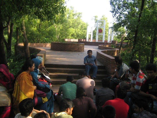
Outdoor classroom

So, what can you do as an educator?
The role of an educator is not simply to overcome embedded oppressions, but to actively create an inclusive space of learning. By intentionally selecting various topics and being aware of how course design can marginalize voices is a good starting point.

It also includes structuring the course and assessments (if there are any) in a way that considers social diversity. When I was a graduate student instructor at the University of Minnesota, I had the pleasure of working with Katherine Brink who expanded my thoughts on how designing assessments can hinder students from learning, despite a desire to learn.

For example, time can be a barrier for students who are working part- or full-time and/or need to take care of family members while going to school. Requiring group work can be a burden to those without copious amounts of free time due, in part, to the difficulties of scheduling. As a conscious educator, you can structure group work and collaboration time during the class time to reduce the burden of logistics. Other factors, such as finances, family, and mental health, can all affect a learner’s performance. The course and its assessments need to take these into account as well.

The role of an educator is to create a space of radical inclusion. A space where each individual learner and their unique identities can not only be engaged, but flourish.

Education, Diversity, and the Digital
Technology has expanded the reach of education and the ‘classroom.’ Online courses bring together diverse group of learners from different cultural backgrounds and different educational systems into one learning environment.

Technology provides exciting new opportunities for collaboration and learning. But it also brings new forms of marginalization in the form of access to technology and affordable access to online data transfers. These are new hierarchies that educators in the digital age need to consider and help break down.

While I would love to offer concrete solutions and advice for digital educators, this is a new area that needs to be explored further. As we expand the reach of teaching, we need to remember that technology cannot replace a good educator.

What do you think about the role of education as a tool for diversity? Comment below or tweet at @NormanShamas or @TechChange!

This is the third post in our Digital Pedagogy series, where we will share how we are trying to make online social learning even better with new learning activities. Check out the previous posts here.

 

Digital safety training is a social awareness issue. We are typically taught at a young age how to interact in society, but rarely are we taught how interact in the digital space. With more than three billion people around the world coming online, it is crucial today that we all understand how to interact online. In our recent virtual chat series, Mark Surman of Mozilla stressed that as more people come online exclusively through their smartphones through initiatives like internet.org, many remain unaware of the internet itself, so internet safety may not even cross their minds or becomes an ‘extra’ feature that they might not be able to afford.

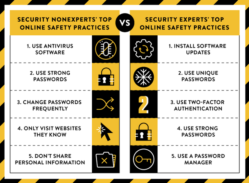
Google recently conducted a study comparing digital security practices between experts and non-experts. The study included over 500 surveys of security experts and non-experts and the results are a useful examination of how expertise or knowledge reflects in practice of navigating in the digital world.

Here are my takeaways from the Google report:

Passwords, Passwords, Passwords

Both groups (experts and non-experts) highlight the need for strong passwords as one of the top 3 things to stay safe online — something malware creator Hacking Team needed a lesson on.
The experts mentioned the need for updates, unique passwords, and two-factor authentication. They highlighted the use of password managers as a way to have both strong and unique passwords.
The non-experts, on the other hand, highlighted using antivirus, changing passwords, and visiting known sites as some of their top advice other than strong passwords.

Importance of a secure connection

One of the results that I found most interesting is the fact that experts and non-experts overall recognized the value of verifying the site they are visiting by looking at the URL.
But, experts were far more likely to check if the site was connected through a secure connection, using HTTPS.
Non-experts, however, didn’t check for a secure connection. Modern browsers make recognition easy through lock icons and color coding. One explanation is that non-experts didn’t know how to check or what it means. As Google noted in the full research paper, this is interesting because verification of the site URL and secure connection (HTTPS) are right next to each other! Why wouldn’t you check both as once?

Google Report FindingsPhoto credit: Google Online Security Blog

Two-factor authentication

Google’s survey results suggest a knowledge gap for non-experts: two-factor authentication. As noted above, two-factor authentication was one of the top recommendations by experts and a growing trend in digital safety because it offers an additional, second way of verifying identity after a password. Unfortunately, setting up two-factor authentication is up to the web service provider, and not us, the end users.

While not one of Google’s conclusions, the report highlights a need for greater digital literacy training to improve digital safety. And here at TechChange we agree.

So, what does this mean for TechChange’s Digital Safety Course?
For our upcoming Digital Safety course, we are providing comprehensive training to empower the you to make informed decisions. This means that we will cover digital literacy topics, such as how the Internet and mobile networks work, as well as providing in-depth tool studies.

Most importantly, we will provide an analytical framework to assess risk and determine what tools or approaches make the most sense for a particular location and situation. What works to keep someone safe in the US wouldn’t work in countries where encryption is regulated. Lhadon Tethong, a leader in the Free Tibet movement, notes that providing basic user education to understand the risks of technology to make informed decisions is key. Whether for your personal accounts, and for your organization, especially if you are working with sensitive data, it is crucial that all your information is safe online.

We begin our Basics of Digital Safety online course on August 17! More than 30 participants from around the world have already signed up. Read more details here and join us!

While many people were watching the final match of the Women’s World Cup last week, the Hacking Team was hacked. Hacking Team, an Italian digital security company, provided surveillance software to law enforcement agencies. Their clients are government agencies, but they have been accused of selling to oppressive regimes, despite embargoes like the Wassenaar Arrangement. Last week’s hack proved that they have in fact sold software to Sudan and a number of other oppressive regimes, including Ethiopia, Azerbaijan and Saudi Arabia.

Why should you care about these hackings? And if a digital security company can get hacked, what can you and I do to prevent ourselves from becoming victims as well?

The power of a strong password is not a myth
Passwords are an important aspect of digital safety because they act as a form of authentication, often times as the only method. It’s important not just for individual accounts, but also for bigger organizations. So, how strong were the Hacking Team’s passwords?

Apparently, not strong enough. Their Twitter account was hijacked and used to spread the cache of files published in the hack. The Twitter password was one of many passwords that were stored in files that anyone with access could read (i.e., in plain text). I can presume this was how their Twitter account was compromised.

Poor policies around how passwords are selected and stored are what led to the publishing of passwords for the Hacking Team and one of their software engineers, Christian Pozzi. As lampooned by security professionals on Twitter, the majority of the passwords Pozzi used were variations on the word ‘password.’

What’s the major takeaway here? That the best practices of choosing strong passwords, not reusing passwords and storing them safely are just as important as we’re always told.

A strong password isn’t enough: Get to know your software
With the exception of having a long password, not everyone agrees on what constitutes a strong password. If you know your password has been compromised, you can be notified and immediately change it. But not all threats to one’s digital data are as transparent and easy to address. You especially need to be aware of what kind of software you have installed on your computers.

Hacking Team Hacked blog photo

In the world of cyber warfare, there are holes in software that are discovered but remain undisclosed and unpatched. They are known as “zero-day exploits” (0-day) because they are released on or before the day an exploit is publicly revealed. It essentially means that some person or some organization/agency might be able to install malicious software without you, the software provider, or any defensive software (e.g., antivirus) knowing.

This issue is serious because there is a thriving market where people can purchase these exploits, which disincentivizes security researchers from disclosing their findings.

Hacking Team used 0-day exploits to hide their surveillance software. As of today, three 0-day exploits for flash have been revealed from Hacking Team’s files. How can you avoid this yourself? Always make sure that you upgrade your flash player and keep it updated. Or better yet, consider having it set to run selectively by using the option “click to run” when on a website that requires flash.

The more software you have installed (especially out of date and/or unnecessary software), the more chances there are for exploits to be used to compromise your system. This is even truer on mobile phones, which receive fewer software updates.

In addition to removing unnecessary software and keeping necessary ones updated, it is crucial to understand the limitations of software you are using. While not a new vulnerability, Hacking Team also had a Skype decoder to listen in on Skype calls. The published files revealed that they had this software from around 2006. Understanding the software you are using is essential to prevent having a false sense of security.

In the now immortal words of the Hacking Team “If your company hasn’t been #hacked, it will be.”

If your organization works with personally identifiable data,it is crucial to make sure the data is safe. Learn more about digital safety in our brand new upcoming course, Basics of Digital Safety. The course begins on August 17, lock in early bird rate now!


This is the second post in our Digital Pedagogy series, where we will share how we are trying to make online social learning even better with new learning activities. Check out the previous post here.

As an educator, I’m always looking for new and more effective learning activities that fit with my philosophy of learning. Teaching in this digital age is very exciting with the availability of new tools for different types of activities and distance education. Despite these advances and advantages of online learning, it is not always easy or possible to adapt in-person activities into an online environment.

My role at TechChange focuses on our online facilitated courses that we run. All of these courses run for four weeks and are based on our learning model, which uses social learning and game mechanics. Course completion is assessed by interaction (indicated through TechPoints) as opposed to grades.

Introduction to Collaborative Syllabus Building

With all of our courses, we try to be as responsive to the participants’ learning goals as possible. One of the first questions we ask participants in the first week of a course is whether or not we have missed something in the general content or direction of the course. We then try our best to incorporate these topics and resources into weeks three and four.

As we were designing our upcoming course on Mapping for Social Good, we found ourselves discussing the topic of content and scope once again. With mapping, there is a lot that can be discussed, from the very technical (there are masters programs just in digital mapping/GIS) to the ways mapping has been and can be used for social good. Instead of having the course facilitators decide on the content and potentially miss key topics that the participants want to cover, we have implemented a learning tool called collaborative syllabus building (will now be referred to as CSB in this post).

CSB is an activity used effectively in classrooms to improve motivation and performance of students by asking the learners to provide input on the curriculum, grading, course activities, and/or course expectations. For an in-person class this often occurs before the course starts or during the first few weeks.

Collaboration for setting topics is not confined to academia. Unconferences (also called OpenSpace Conferences) have become popular for their participant-driven focus. Typically, the unconference has no set syllabus and the participants set the agenda and sessions. Instead of having a conference organizer decide what the participants want to hear or learn, the participants vote by their attendance.

Educators and facilitators are already using technology to aid this collaborative participant-led process. For instance, educators have used Moodle to administer a survey prior to a course or a wiki for the collaboration. There are a number of other collaboration tools that can be used for this purpose. Most often, these tools are used in conjunction with in-person or hybrid (online and in person) events.

Digital Pedagogy post photo

Adapting CSB for TechChange

At the core of social learning, a key component of TechChange’s learning model, is the idea of collaboration. We decided to adapt CSB for our 4-week online courses and will be trying it out this week for our mapping course!

In order for CSB to be effective, the course participants need to feel comfortable enough to ask questions about the topic. So with all of our CSB activities, we will be providing a short introduction to the topic and forums for participants to explore the content before the course begins. Having enough time to incorporate feedback and allow participants from diverse time zones provide input, we will run the CSB activity for a week prior to the course beginning.

For the syllabus itself, we will have learning objectives and course activities that we feel we need to cover in order to discuss the content. The rest of the syllabus, including additional learning objectives and course activities, will be based on what the participants want. While we can’t promise that everything participants recommend will make the syllabus, we will do our best and share the final syllabus at the beginning of the course.

We’re very excited to be trying out CSB this week with Mapping for Social Good! Have you used CSB in an online course before? Tell us how it went by tweeting @NormanShamas and @TechChange or comment below!

This post is kicking off a monthly series where we’ll discuss how TechChange uses digital pedagogy for its platform and learning model and explore how the #edtech industry is being disrupted as a whole. Join the conversation on Twitter using the hashtag #digpedseries and with @techchange and @normanshamas.

As someone whose job title includes the word pedagogy, but doesn’t work in academia, I find myself often explaining what it means. This isn’t to say that people don’t know about it or aren’t thinking about how to teach, but the different terms used to refer to teaching and people who teach act as barriers to sharing knowledge. My passion lies in teaching, whether I’m called a teacher, instructor, trainer, facilitator, organizer, or any other term. This series is my way of helping bridge these conversations to so we can further improve education online.

Many people can appreciate or see the effects of good pedagogies. For example, learners might be engaged and retain content better. Course activities may be designed in a way to develop critical thinking skills that go beyond the content. Or quite simply, the course may just make learning more fun. In this post and throughout the series, we’ll be covering different types of pedagogy and learning models and how they affect the ever-evolving online education space.

So, what IS pedagogy?

Pedagogy is the philosophy behind and practice of creating a learning environment. It informs the structure of the course and how outcomes are evaluated. To put it simply, it’s the “why” and “how” of learning.

At its core, pedagogy is an intentionality towards learning and instruction. It is a recognition that course design matters just as much, if not more, than content.

In online education, pedagogy is trying to provide access to great educational experiences and environments instead of just access to educational content.

What about pedagogy and online education?

Here at TechChange, we’re building off the experience and research of in-person and blended learning. We work to contribute to the conversation by analyzing how online tools and environments can be used in a learning environment and push the boundaries by trying to bring what works in highly interactive in-person courses to an entirely online environment.

We treat our participants not as passive students to be lectured to, but active participants in defining the course curriculum and sharing information. Students sharing their own knowledge and work becomes an important source of knowledge and we work towards creating a flipped classroom by the end of the course.

Academics have started to look more closely at how online social tools can be used in education. Rhizomatic learning, the idea that the ‘community is the curriculum,’ has emerged as one of the conversations around critical pedagogy online. While rhizomatic learning has embraced how the internet and online social networks can be used for learning inside of a classroom, few people are thinking about how it can improve learning outside of academia and traditional learning models, such as the one TechChange has created. Additionally, journals such as Hybrid Pedagogy are using new social technology to advance digital conversations on and provide trainings around digital pedagogy.

As a company, TechChange exists at this exciting intersection of digital pedagogy and technology. We are working to create the best online software for high quality educational experiences with elements of pedagogy built into the platform, and we’re excited to see what the future holds.

Last Friday marked the beginning of a new series of conversations around online pedagogy here at TechChange. Each month we will be talking about a new aspect of pedagogy and how it applies to online education, then sharing those insights through our blog and on Medium. Follow along with us and send any ideas you have for topics you’d like to see us cover to info@techchange.org.
We hope you’ll join this conversation by sharing your thoughts with us on Twitter using the hashtag #digpedseries and interacting with us at @techchange and @normanshamas.

Imagine a tool where you have text and a computer automatically highlights key themes. No need to do complex coding, no word counts that are used to explore the text — just keywords and phrases identified. This is exactly what the tool Textio does for job descriptions. It automatically provides an effectiveness score and identifies words and phrases that affect whether applicants will apply for a job: they identify words through color coding that can act as a barrier or incentive, ones that affect applicants based on gender and repetitive terminology. [Editor’s note: TechChange participated in a closed-beta test of the tool and we will write a separate blog post about Textio and hiring practices. This is not a sponsored post.]

This tool not only has great implications for hiring, but utilizes simple visualizations to analyze qualitative data. As Ann Emery and I have been preparing for the Technology for Data Visualization course, we discuss how best to address the topic of data visualization for qualitative data. While there have been data visualizations featured in art museums (e.g., Viégas and Wattenberg’s Windmap), most visualizations are designed to convey information first.

Textio is using a custom algorithm to do a type of sentiment analysis. Typically, sentiment analysis will analyze how positive or negative a text is based on a word’s meaning, connotation, and denotation. Textio, on the other hand, focuses on how effective words or phrases are at getting people to apply for jobs and whether those applicants are more likely to be female or male. Once their specified level of effectiveness or gendered language for a word or phrase is reached, they highlight it with colors based on whether it is positive or negative and/or masculine or feminine. The gender tone of the entire listing is shown along a spectrum.

Acumen, a tool created at Al Jazeera’s 2014 Hackathon: Media in Context, is another take on how to visualize sentiment analysis. With a focus on trying to uncover bias in news articles, they highlight how positive or negative an article is in relation to other articles on the topic. A separate analysis tab shows shows the two sentiment ratings on a spectrum and ‘weasel words,’ words that are indicative of bias in reporting. The viewer also has the option to highlight the weasel words in the news article.

Both Textio and Acumen are great examples of how qualitative data visualization can be used to aid in the analysis of text. Neither example is immediately suited for generalized needs and require programming knowledge to create a particularized purpose, which myself and Kevin Hong will discuss in a forthcoming blog post. Instead, they can be used as examples of how qualitative data can be visualized to help inform decision making.

Have you used Textio or Acumen? Share your thoughts with us below or by tweeting us at @techchange!

Image Source: AidData

How do you analyze data you collect from surveys and interviews?

One way to analyze data is through data visualizations. Data visualization turns numbers and letters into aesthetically pleasing visuals, making it easy to recognize patterns and find exceptions.

We understand and retain information better when we can visualize our data. With our decreasing attention span (8 minutes), and because we are constantly exposed to information, it is crucial that we convey our message in a quick and visual way. Patterns or insights may go unnoticed in a data spreadsheet. But if we put the same information on a pie chart, the insights become obvious. Data visualization allows us to quickly interpret the data and adjust different variables to see their effect and technology is increasingly making it easier for us to do so.

So, why is data visualization important?

Patterns emerge quickly

Cooper Center's Racial Dot Map of the US
Cooper Center’s Racial Dot Map of the US

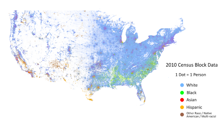
This US Census data (freely available online for anyone) is geocoded from raw survey results. Dustin Cable took the 2010 census data and mapped it using a colored dot for every person based on their race. The resulting map provides complex analysis quickly.

It is easy to see some general settlement patterns in the US. The East Coast has a much greater population density than the rest of America. The population of minorities is not evenly distributed throughout the US with clearly defined regional racial groupings.

Exceptions and Outliers are Made Obvious

San Luis Obispo, CA

As you scan through California, an interesting exception stands out just north of San Luis Obispo. There is a dense population of minorities, primarily African-Americans and Hispanics. A quick look at a map reveals that it is a men’s prison. With more data you can see if there are recognizable patterns at the intersection of penal policy and racial politics.

Quicker Analysis of Data over Time


Google Public Data Explorer

Google’s dynamic visualizations for a large number of public datasets provides four different types of graphs, each with the ability to examine the dataset over a set period of time. It is easy to see patterns emerge and change over time. Data visualization makes recognizing this pattern and outliers as easy as watching a short time-lapsed video.

What are some of your favorite data visualizations examples or tools, tweet at us @TechChange or share in the comments section below.

If you are interested in learning about how to better visualize and analyze data for your projects, join us in our new online course on Technology for Data Visualization and Analysis. The course begins on June 1, so save your seats now!

By Norman Shamas and Samita Thapa

In a previous post, we wrote about why global development practitioners need to be data skeptics. One of the many reasons that we need to be skeptical about the data we are collecting is the biases that are incorporated in the data. The data bias is especially significant when it comes to gender data. Women and groups that don’t identify with binary genders are largely missing or misrepresented in global development data.

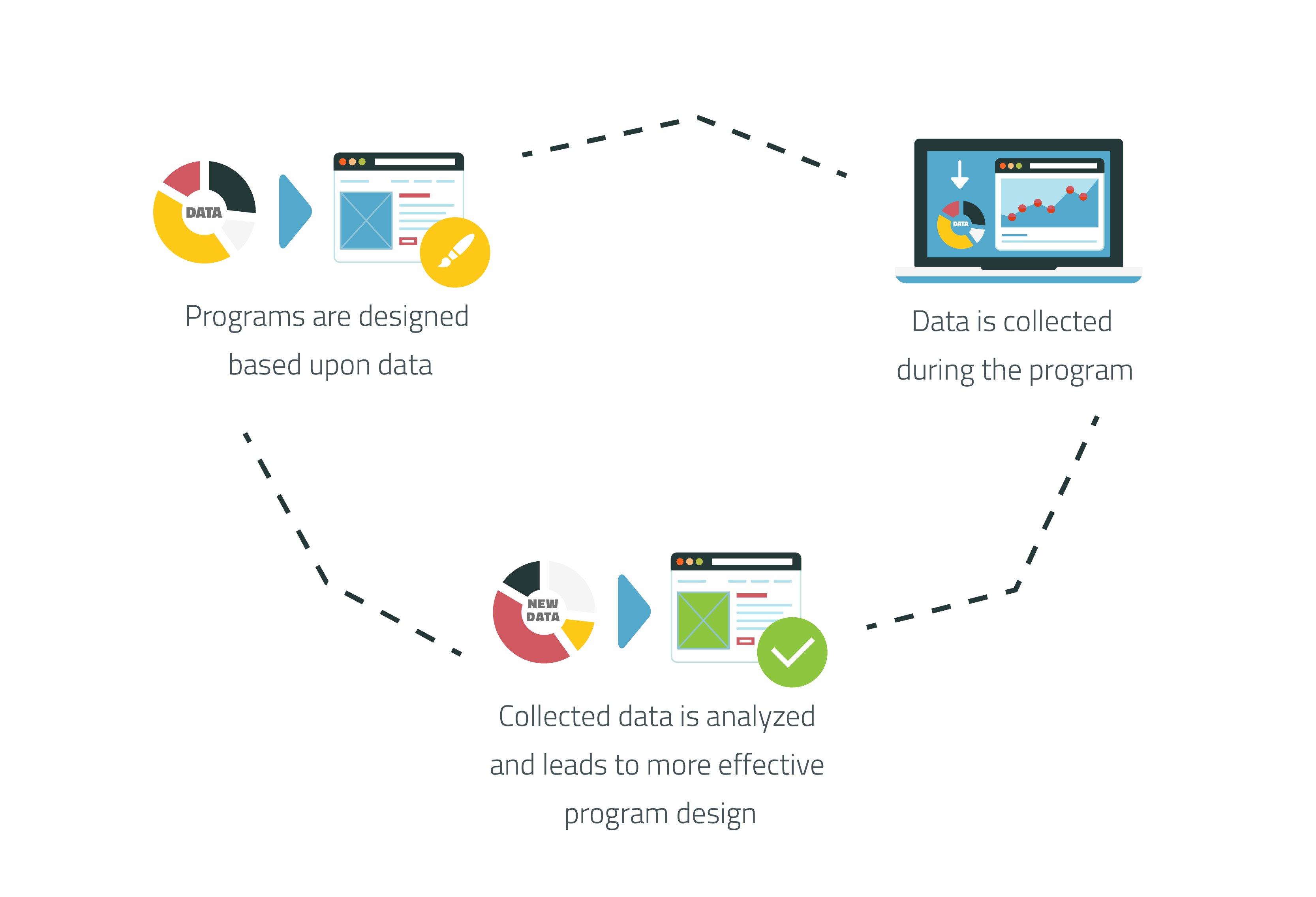
Data is a crucial component of any program or intervention. It justifies the need for a specific program, show its effectiveness, and allows us to improve it through evaluation. But this important information tells us little if more than half of the population is missing or misrepresented, so we need to start looking at data with a gender lens.
data in the program cycle

Data on women raises awareness of women related issues

With 62 million girls not attending school worldwide, the U.S. government was able to justify their “Let Girls Learn” initiative. This initiative was announced in February and is aimed at making education a reality for girls around the world. USAID is one of the agencies involved in the government-wide initiative and have presented their approach with data to support it.

But there is still a problem getting good data on women. GSMA’s 2015 Bridging the Gender Gap Report highlights two systemic barriers to mobile ownership and usage for women:

  1. lack of disaggregated data and
  2. lack of focus on women as a market.

However, we need better gender data for more than just the economy. Oxfam conducted a household survey on the gendered effects of the December 26, 2004 tsunami that hit several Asian countries. Women were found to be more severely affected than men. Despite the need for better gender data in the field, it is not always happening. Lack of data on women leads to lack of awareness of issues related to women and consequently, lack of programs designed to tackle those issues.

Survey design can promote non-binary gender inclusion

The problem of gender and data bias gets even more complex when we talk about non-binary genders. Twitter, for example, determines its users’ gender based on data it analyzes from tweets. There are only two gender options: male and female, and users cannot choose to opt out from automatic gender assignment or manually choose their gender. By the simple fact that Twitter is using a gender binary of male/female, individuals who do not identify with a binary (e.g., transgender individuals) or have anatomically mixed sexual characteristics (i.e., intersex individuals) are ignored in the data.

It is important to ask questions about gender on a survey to improve interventions. Instead of restricting gender to a binary, a third option to opt-out or define oneself as ‘other’ can be instituted. When appropriate, additional questions can be used to determine whether practice and self-identification fit into pre-defined categories.

Data must represent local gender categories

It is also important to localize the survey where gender categories and practices may vary. India acts as a good case study for the difficulties in language for demographic purposes. India initially provided three gender options: male, female, and eunuch on its passport forms. However, these three categories marginalized other transgender populations, so in 2014 Indian courts changed the category of ‘eunuch’ to ‘other’ on the election ballots. This simple change in language not only promotes the human rights of India’s non-binary gender individuals, but also provides better data on its non-binary gender communities.

The hijra are a transgender community that has existed in South Asia for over 4,000 years. Along with a few ‘Western’ countries, at least four South Asian countries — Nepal, India, Pakistan, and Bangladesh — recognize a third gender in some legal capacity.

Global development is moving forward with programming for non-binary gender communities. The Swedish International Development Cooperation Agency put out an action plan for working with lesbian, gay, bisexual and transgender (LGBT) issues from 2007-2009. Last year USAID announced its LGBT Vision for Action, a general roadmap of how the donor would support non-binary gender communities. As programming for non-binary gender communities continues and increases, we need to think closely about the language we use and how we collect data on gender to create effective, data-driven interventions.

With development becoming more data driven, the data we collect and the biases we include in the data are having a larger impact. Technology can make these biases more entrenched through features like data validation. Even though data validation is important for survey collection–it limits responses to particular choices or data types (e.g., phone numbers)–it also restricts options based on the choices of the survey creator and can marginalize groups whose identities are not included or allowed as a valid option. Going forward, we need to be careful we are not unintentionally marginalizing other groups or genders with the data we collect.

Interested in engaging in similar conversations around data and tech in M&E? Join us and more than 90 other international development practitioners in our upcoming course on Technology for Monitoring and Evaluation.

Monjolo energy-meter sensor created by University of Michigan’s Lab11. Image credit: Umich Lab11

How can remote sensors and satellite imagery make monitoring and evaluation easier and more accurate than pen-and-paper surveys?

In my most recent post on many of the technology tools for M&E we discussed in the inaugural round of TechChange’s Technology for M&E online course, the course participants and I shared several of the current digital data collection tools. These tools include Open Data Kit (ODK), Magpi, SurveyCTO, Taro Works, Mobenzi, Trackstick, and Tangerine.

Generally speaking, global development recognizes the benefits of mobile data collection–as Kerry Bruce said in the first course, mobile data collection is a “no brainer.” But what kind of cutting-edge technologies like remote sensors and satellite imagery are available for collecting large amounts of data more efficiently and accurately?

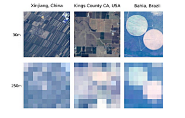
In this upcoming round of the course, we will be highlighting these cutting-edge technologies, how they have been used in development, and how they can change data collection methods. Satellite imaging is being used to remotely monitor illegal mining, urban development, and deforestation in real-time. Remote sensors provide accurate, real-time measurements for the adoption of water pumps or cookstoves by detecting motion and reading temperature.

We’re very excited to have presentations from the Center for Effective Global Action (CEGA) in the upcoming TC111: Technology for Monitoring and Evaluation course. CEGA is a global development research network that works to create actionable evidence for policy makers and program designers. They also design and test new technologies to find new solutions to the problem of poverty.

satellite imagery

CEGA is researching how remote sensors and satellite imaging can help create more accurate measurements. We have three researchers on this topic joining us in the course: Guillaume Kroll from CEGA’s Behavioral Sensing program; Dan Hammer, a Presidential Innovation Fellow working with the White House and NASA to increase access to satellite imagery for the non-profit sector; and Pat Pannuto who researches sensors at Lab11 and is working on numerous projects with CEGA.

Dan Hammer was the Chief Data Scientist at World Resource Institute’s Data Lab and worked to analyze deforestation from satellite images. In a recent article, Guillaume highlights how remote sensors are reshaping the way we collect data and highlights CEGA’s success with stove usage monitors in Darfur. Pat presented at the Development Impact Lab’s State of the Science on how remote sensors can be used for data collection and monitoring (slides available here). Pat is trying to “solv[e] the ‘last inch’ problem: bringing connectivity and computing capability to everything” and thinking about how connected devices (the Internet of things) can impact global development.


Patrick Pannuto: “Sensing Technologies for Data Collection & Monitoring”

Interested in learning more about the cutting edge technology for M&E including remote sensors and satellite imagery? Join our upcoming course on Technology for Monitoring and Evaluation.

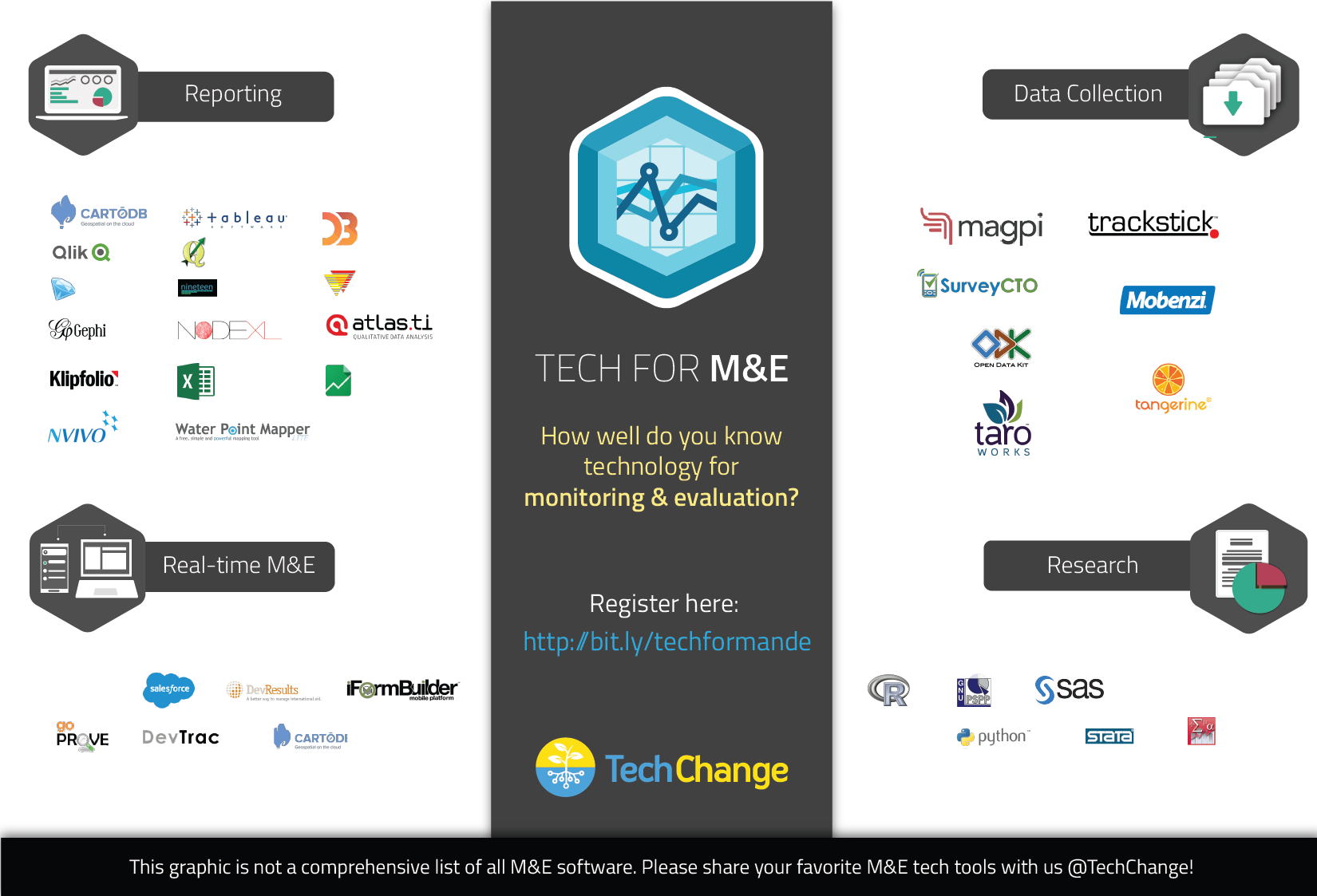
With the rapidly growing field of monitoring and evaluation, there are many technology tools that are designed to help the many roles of M&E practitioners. The fastest growing area has been digital data collection, which currently uses mobile phones and portable GPS systems. Reporting has become easier with all the tools for data visualizations and data cleaning. There are also many research options with statistical software and programming languages for data entry, documentation, and analysis. In addition, real-time M&E tools let you do program and data management with real-time project updates. What we found in the course was that there are tech tools that integrate multiple aspects of M&E.

Here are several of the tools we discussed in the inaugural round of our Technology for M&E online class last fall, as crowdsourced by over 100 IT experts and M&E practitioners based in over 30 countries. In the next iteration of this course, we’ll be covering some of the latest tools including satellite imaging, remote sensors, and more.

What M&E technology tools do you use? How has your experience been with these tools listed? Are there great tech tools for M&E that we missed? Please share with us in the comments or tweet us @TechChange.

Interested in learning about these tools more in depth? Join us for our popular Tech for M&E online course that runs 14 September – 9 October.