It’s not every day that you get up from your desk, walk out of your office, and travel 8,353 miles to check in on a project. But in October that’s exactly what Delanie, Emily, and I did when we went to visit Malaria Consortium in Uganda.

As we walked out the office in Washington D.C., I started a timer on my phone to see what the door-to-door travel time would be. 26 hours later we were in the back of a hired car, dodging the mini-buses that barrel down the road between Entebbe and Kampala.

Why we returned to Kampala
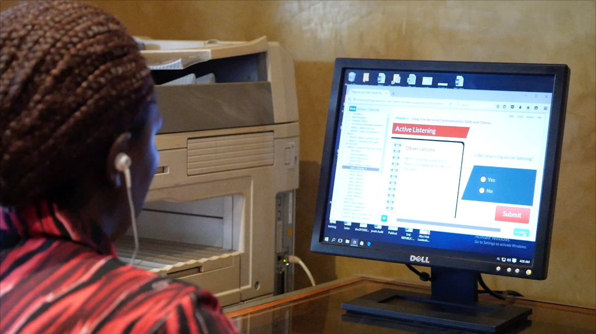
We were in Uganda to check in on one of TechChange’s biggest projects: the “Diagnose and Treat Febrile Illnesses” eLearning course. Last year, we built a course for Malaria Consortium, one of the world’s leading non-profit organizations specializing in the prevention, control, and treatment of malaria. The course was meant to train private sector health workers and Rapid Diagnostic Testing sales representatives in Uganda and Nigeria.

In many malaria-endemic countries like Uganda and Nigeria, the disease has been prevalent for so long that pharmacists and doctors would give malaria treatment to any patient presenting symptoms of fever. Not only is this false diagnosis harmful for the patient, it also leads to the waste of costly treatments that don’t help the patient get better – in fact, their condition could become even more serious. Incorrect diagnoses can even be fatal: pneumonia is the leading cause of death for children under 5 in Sub-Saharan Africa, but it is often misdiagnosed as malaria.

Screen Shot 2015-12-01 at 2.16.19 PM

An e-learning solution to train health workers
The goal of the elearning training is to reach roughly 5000 health professionals in both Uganda and Nigeria and provide in-depth training on how to diagnose diseases that can present fever-like symptoms, like malaria, pneumonia, typhoid, and others. The two-day training provides a hybrid learning experience with off-line elearning modules and in-person trainings, created with local content to make the training as culturally-relevant as possible.

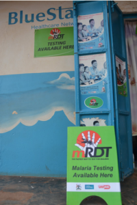
The training teaches healthcare workers the basics of how the malaria parasite works, how to conduct a malaria Rapid Diagnostic Test (RDT), how to diagnose patients for other illnesses, and how to provide treatment depending on the results they find.

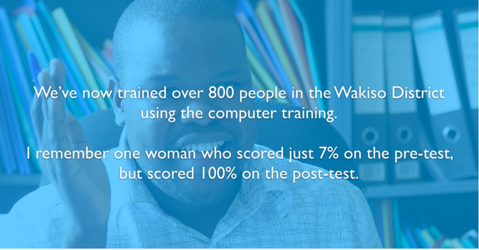
It’s been a year since the training was implemented, so we were curious to see how the training fared. Was a computer-based training actually useful to trainers? Did students enjoy the training? Were there better learning outcomes?

Training 5

So, how is the training going so far?
We found that even with minor technical considerations, the training was a stunning success! Yes, there were certain drawbacks to having a computer-based training compared to a traditional lecture format. Among the biggest disadvantages were the possibility of power-outages, finding computers with adequate RAM and processing power to play the training, and also updating Adobe Flash (one of the requirements to run the training). However, with the help of an in-country technical setup team, these issues were controllable.

What do the trainers think?
Most importantly, trainers told us that the benefits of the blended learning style far outweighed any drawbacks caused by being dependent on computers. Students and trainers alike told us that the format allowed students to learn the content at their own pace, compared to a lecture where the instructor may move too quickly or slowly through content.

Malaria Consortium

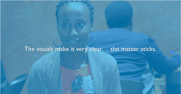
What do the students think?
Students also told us that the interactive format made the learning experience much better than a lecture accompanied by slides. The visual nature of the training came up again and again as an aspect of the training that helped students learn.

Malaria Consortium

Students who had completed the pilot program took the training to heart. One pharmacist referred to the training as she told us about about her neighbor, who had recently come into her shop asking for antimalarials to treat his fever – but, his test result was negative, so she advised him to seek treatment at a health facility. After visiting the clinic, he stopped by the pharmacy to let her know that he had been diagnosed with Typhoid fever; if the pharmacist had misdiagnosed the fever and provided treatment for malaria, it would only have allowed his case of Typhoid to get worse.

This is just one anecdote of many. While concerns about electricity and infrastructure remain very real, it is exciting to see the training accomplishing it’s goals. We are excited to continue supporting and improving the delivery of this training with Malaria Consortium!

Is your organization looking to train your teams online? Besides online facilitated courses, we also also create custom offline computer trainings that can be used in settings where internet connectivity is a non-starter. See our different projects on our Enterprise page and feel free to reach out to us enterprise@techchange.org.

A few weeks ago I touched on how you might use APIs to access data for visualizations. The response was great, but it definitely wasn’t lost on me that there’s a steep learning curve associated with getting started on using an API. Fortunately, you don’t necessarily need to be a programmer in order to make use of some great API combinations.

As a quick recap, an API is a way that servers on the internet can communicate with each other to exchange data and ask each other to do different things. For example, you can connect your Facebook account with Twitter so that whenever you post to Facebook, you also tweet out your status. The ability to configure different web applications (like Facebook and Twitter in our example) to interact with each other has led to the advent of what some folks call “The Programmable Web.”

Now, web applications like If This Then That (IFTTT) and Zapier are working to make the APIs that power the programmable web accessible to non-programmers. We’ll be focusing on IFTTT here, but you should also definitely check out Zapier’s guide to APIs.

In IFTTT, you create API “recipes” by picking a trigger API (let’s say you receive an email in your Gmail inbox with a certain heading) and then associating it with an action API (lets say Twitter). IFTTT has over 100 web applications that it can integrate, so the possibilities are huge.

ifttt_servicesWhen you make the recipe live, IFTTT acts as the intermediary and connects these two services on your behalf, so that (for example) when you get an email saying that someone has followed you, your Twitter account automatically tweets a thank-you note.

GmailTwitterThat’s it! At its core, IFTTT is just an engine for taking inputs from one web app, and then outputting information in another app. (If you’re interested in the example recipe above, register for IFTTT and follow this link). Integrating Gmail and Twitter is great, but can the programmable web do more? You bet it can. Here is a list of my top 5 IFTTT recipes that you can use to save time:

1) Send yourself emails for new Craigslist postings from any search you’re interested in

craigslist-gmailCraigslist is a great social marketplace, but let’s face it, nobody wants to spend hours combing through their listings. Looking for a new bike, piece of furniture, or new office space? Now you can get emails when something matches your search criteria and avoid repetitive browsing.

2) Log your work hours on Google Calendar when located at work

location-calendarThis IFTTT recipe uses your phone’s location to determine if you’re at work, and then adds a new appointment to a Google Calendar that lasts for as long as you’re at work. If you hate keeping track of your hours, this recipe could be super helpful.

3) Email me my new iPhone photos

photos-emailIf you’d rather get your photos off your phone as soon as you take them, this recipe is fantastic. It’s especially useful for events, where you might want to send photos that you take to another team member so that they can post the best photos you send.

4) Email me / add event to my calendar when the U.S. Congress does something

nyt-email sunlight-calendarWell, depending on your definition of “does something” this may take a while to trigger. But IFTTT does offer several fantastic integrations for both The New York Times and Sunlight Foundation. For example, you can get an email alert when congress schedules a vote, or have the vote added to your calendar. Triggering an event when the president signs a bill into law is also possible. While not necessarily helpful to everyone, if you’re working on policy issues in the US, this recipe could be essential to your work.

5) Transcribe a voicemail and email it to me

call-to-emailThis recipe allows you to call IFTTT, leave a voicemail, and then have the transcribed version be send to your inbox. A great way to take notes, although the transcription service is still a little rough around the edges. If you’ve heard about this feature with Google Voice, you can now get similar functionality with IFTTT for free.

That’s it for the roundup! I’ve left out some other cool integrations with smart devices and wearables, simply because they’re not as relevant to everyone. If you’ve made if this far, I’d love to hear your ideas for API integrations in the comments, or feel free to tweet @techchange and @charlieweems.

Have you ever wondered how visualizations like the One Million Tweet Map are able to stay continuously up to date? Or have you wished you knew how to access data from The World Bank’s Open Data project or Data.gov? If so, then you might want to dive into learning about APIs.

In the run-up to TC311: Technology for Data Visualization, I’ve been getting excited about data and APIs. In this brief introduction, we’ll learn the basics of what APIs are, and then how to use Postman, a Google Chrome plugin that can help us access data from APIs. We’ll wrap up by using Postman to retrieve data from the World Bank’s open data API.

So What is an API Anyway?

API stands for Application Programming Interface. At its core, an API allows web servers to communicate with other servers, web browsers, mobile apps, wearables, and almost any other technology you can imagine. APIs allow these devices to transfer data in a predictable way that can be automated.

One way to think about APIs is like an automated telephone directory. For example, if you call the Washington, DC Government’s Information Hotline (311), you won’t immediately speak with a person. First, you’ll be asked if you would like to communicate in English or another language, then you might be asked which service you need to talk about, and then you’re referred to a live person who has the information you need.

APIs operate similarly, except that instead of dialing numbers into a phone to get our information, we use our web browser and a language called HTTP to make a request for data. Just like calling 311 and pressing 1 to speak to someone in English (or 2 for Spanish), we can provide an API with different pieces of information (called parameters) that tell a web server to give us the right information.

The Anatomy an API Call

So how do we actually go about retrieving data from a server? Just as phone numbers follow a specific format (e.g. country code, area code, region, etc.) our API call needs to be made in a specific format. On the internet, this is called HTTP (Hyper-Text Transfer Protocol), and you’ll probably recognize it from the URL bar in your browser.

Screen Shot 2015-05-28 at 11.03.52 AM

Example of HTTP in your the browser’s URL bar.

In fact, if you know how to type a URL (Universal Resource Locator) for a website, you already know some basic HTTP. If you take a look at the screenshot above, you can probably guess that going to https://www.google.com/maps will take us to Google Maps. If you look for a bit longer, you might recognize those numbers after the @ sign as latitude and longitude coordinates. In this example, those coordinates are the parameters that we’re giving the Google Maps API to tell it to display a specific piece of information: a map centered on our current location.

We can think of API calls as being comprised of two pieces: the URL, and parameters (in reality there’s a bit more going on, but we’ll keep things simple for now). In general, a URL represents the location of a web page, and the parameters capture information that we can give to the server when we’re on that page. Let’s go through a few examples:

Screen Shot 2015-05-29 at 10.52.16 AM

Here, we’re sending our request to Google Search with the parameter ‘q’ (for query, as in ‘search query’) equal to ‘techchange’. As you might have guessed, this tells Google’s server to execute a search for Techchange and return our results. Lets take a look at another example:

Screen Shot 2015-05-29 at 10.52.05 AM

In this case, our parameter ‘t’ (for time) is set to ’30s’ which tells YouTube’s server to play our video, beginning 30 seconds in.

While the specifics of every API are different, the combination of a URL and certain parameters are the basic elements that we need to make an API call. Next up, we’ll see how to use what we’ve learned to make an actual request.

Making an API Call

Want to make an API call to the World Bank right now? You can! Just copy and paste this link into a new browser Window:

http://api.worldbank.org/countries/br/indicators/NY.GDP.MKTP.CD?date=2006

You should get some data back that looks like this:

Screen Shot 2015-05-28 at 12.37.32 PM

Pretty simple, right? We just made a call to World Bank’s API and got the GDP of Brazil for 2006 back as data. Lets break down how we got there:

  1. We called up World Bank’s API (https://api.worldbank.org)
  2. We specified that we wanted to get the data by country (/countries/), and the specified brazil (the /br/ in our URL)
  3. Next, we specified GDP using the World Bank’s indicator code: /NY.GDP.MKTP.CD/
  4. Then, we told the server that we wanted to filter using the date parameter (?date=2006).
  5. Like magic, the server gave us back the information in an XML format. If we look under <the wb:value> tag, we can see that Brazil’s GDP in 2006 was about $1.089 trillion.

Now, this was a pretty simple request, but you can imagine that if we were typing out really long URLs to access an API, we might want a better tool than our browser’s URL bar.

TechChange’s Tech Team uses Postman to work with APIs. Open Google Chrome and click here to install Postman as an extension from the Chrome Web Store (it’s free!).

Once it’s installed, click on the Apps button in the top left corner of your browser. It looks like this:

Screen Shot 2015-05-28 at 12.56.34 PM

Then click on the Postman icon:

Screen Shot 2015-05-28 at 12.59.44 PM


You’ll now have a better interface for making API calls. It should look like this:

Screen Shot 2015-05-28 at 1.04.54 PM

Making API Calls with Postman

Let’s try re-doing our World Bank API call with Postman. Click on the line labeled “Enter request URL here” and paste in our URL:

http://api.worldbank.org/countries/br/indicators/NY.GDP.MKTP.CD?date=2006

You’ll notice that Postman recognizes the parameter after the ‘?’ on our URL (date=2006) and has displayed it right below our full request. Click the blue “Send” button to make the call and you’ll see the data returned below:

Screen Shot 2015-05-28 at 7.14.57 PM

We’re not doing anything differently from before when we simply entered the URL into our browser, but Postman makes this entire process easier, especially when it comes to experimenting with different parameters.

Playing with Parameters

Now that we have a basic sense of how to make an API call, let’s start giving the API more information so that we can customize the data we receive. Unfortunately, we can’t just start typing nonsense for our parameters and expect much to happen. For example, if we ask for the GDP of Brazil and specify food=pizza instead of date=2006, the server won’t be able to filter the results.

This is where API documentation is hugely helpful. An API’s documentation tells people accessing the data the parameters that are valid when they make an API call. Let’s look at the documentation for the World Bank’s API here.

Under the request format section, you’ll see that one of the things we can do is select a date range using a colon:

Screen Shot 2015-05-28 at 7.43.00 PM

So by passing in date=2004:2014, we can ask the API for a decade of Brazil’s GDP. Let’s do that in Postman:

Screen Shot 2015-05-28 at 7.46.29 PM

As you can see, the server understood our API call and returned 10 GDP values from 2004-2014 (cut off in the screenshot).

We can also pass in multiple parameters at the same time. The World Bank API returns data in XML by default, be we can change this to JSON (Java Script Object Notation – another data format) by specifying format=JSON. Here’s what that looks like:

Screen Shot 2015-05-28 at 8.02.50 PM

We can do all sorts of things from here on out, like specifying a language, listing multiple countries, and even choosing other indicators (The World Bank tracks a lot more than GDP).

Here’s an example of what an API call looking for cell phone adoption in Kenya, Tanzania, and Uganda (ken;tz;ug in the URL) looks like for 2013:

Screen Shot 2015-05-28 at 8.12.57 PM

Bringing it All Together

We’ve learned how to get data from an API, but why is this better than just using an Excel spreadsheet as a data source? Sometimes, Excel might actually be the easiest way to go, but the advantage of an API is that it provides a stream of information that is automatically updated and in a predictable format. Rather than having to manually generate a new graph from a spreadsheet every time the World Bank releases a new set of GDP measurements, we could write a script to gather the most recent information by calling the API.

In fact, if you search “GDP Brazil” in Google, you’ll be presented with a live (well, updated yearly) graph that is pulling data from the World Bank’s API:

Screen Shot 2015-05-28 at 8.33.03 PM

So what’s next? Well, there are plenty of APIs available to draw data from. As of 2015 there were more than 13,000 APIs listed in Programmable Web’s API Directory, with 3,000 of those APIs were added in the past two years. Using tools like AJAX and JavaScript chart libraries, even simple web applications can create live visualizations that help users understand the data.

Of course, we haven’t even touched on how to think through creating data visualizations. If that topic interests you, be sure to check out TC311: Technology for Data Visualization.


Taking the  2014 annual report from the U.S. Government’s largest food security initiative and condensing it into an engaging 3-minute video is no easy task. But that’s exactly what the creative team at TechChange did when it partnered with Feed the Future last month. In just four weeks, TechChange worked with Feed the Future to develop the script, storyboard, narration and artwork that culminate in the video below:

As an outreach tool, the video will help Feed the Future raise awareness of the importance of global food security. Across the world, 800 million people suffer regularly from hunger, making food security one of the biggest challenges that the world faces today. However, with programs such as the U.S. Government’s Feed the Future initiative, we’re on the path to ending world hunger.

Through the Feed the Future program, the U.S. has been partnering with small-scale farmers, researchers, local and country leaders in developing countries, and both local and multinational corporations to embrace technology in scaling solutions to farming and food production challenges. This program is also helping to make developing countries more resilient in the face of natural disasters.

Through measurable results striving toward reaching the Millennium Development Goal of reducing world hunger by half by 2015, Feed the Future is making some important strides. For example, in Bangladesh, rice farmers improved fertilizers, boosted crop yields, and ultimately increased sales from $33 million to $57 million. In 2013, Feed the Future helped nearly 7 million farmers and food producers  improve their productivity and yields  on more than 4 million hectares of land… and reached more than 12-and-a-half million children through nutrition interventions.

For more information on Feed the Future, please visit feedthefuture.gov

In preparation for our new Office Warming Party today, our creative team decorated our office with a special chalkboard mural. Check out our new time-lapse video documenting the creation of our chalk mural here:

Have you ever wanted to learn how to create your own time-lapse video? To learn more about how we created ours, read on to follow the five steps the TechChange creative team took to produce this video:

Step 1: Establish how long you want your final video to be.

We wanted to keep the video short and sweet at 1 minute.

Step 2:  Figure out  how long your time-lapse will last

Most videos run at between 24-30 frames per second. This means that for 60 seconds of final video, we would need a minimum of 1,440 still shots from the camera in order to fill each frame with a photo (24 frames/second x 60 seconds = 1,440 frames).

Step 3: Estimate how long it will take to film all the action you’re trying to capture.

We needed to make sure that Rachel, Pablo, and Alon would be able to finish in the amount of time that it would take our camera to shoot those 1,440 exposures. If we were to shoot at one-second intervals, our camera would only be running for 24 minutes. Now, our creative team is fast, but not that fast.

By estimating that it would take the team two hours (120 minutes) to complete the chalk mural, we can solve for 1,440* interval = 120 minutes to get that interval = 0.083 minutes, or about 5 seconds between shots.

Step 4: Set up your camera and film

To create the time lapse, we mounted our Panasonic GH3 onto a tripod and set it to take one photo every five seconds for 1,440 shots.

Step 5: Import your still image series into video and edit

After setting the camera to take these exposures, we imported the 1,440 stills into PremierePro by using the option to import an image sequence, rather than as individual stills. This import method is quick and matches one photo to each frame of the video sequence. Lastly, we cropped the video so that it would fill a 16:9 aspect ratio, added music, and edited in the TechChange logo animation.

Come check out the chalk mural in person tonight, May 7, 2014, at the TechChange Office Warming Party! RSVP here. We can’t wait to see you!

As Syria’s civil war draws close to its third anniversary, actionable data for foreign aid workers remains scarce. Although the conflict has seen the birth of civilian reporting agencies (warning, graphic content) which have uploaded more YouTube videos than CBS News, CNN, Fox News, ABC News and the Associated Press combined, basic questions about where humanitarian aid is most needed and which delivery routes are safest remain unanswered.

It was this lack of information that drew Caerus Associates to partner with First Mile Geo to research opinions about living conditions, safety, and resource access from residents in Aleppo, Syria. Formerly the source of 35% of Syria’s manufactured goods, Aleppo has become a major conduit for humanitarian aid crossing the border to Syria from Turkey. Working with teams based on the ground in Syria, Caerus Associates and First Mile Geo were able to obtain essential data from each of Aleppo’s 56 neighborhoods. The study represents the single most detailed project conducted on the Syrian conflict, showing time-series data with neighborhood-by-neighborhood results over a period of four months.

Field teams conducted bi-weekly data collections on the locations of roughly 180 security checkpoints, as well as the conditions of bakeries throughout the city. Field teams also collected data about political perceptions, service access, and the presence of key groups on a monthly basis. The result is a collection of highly detailed maps that show everything from the price of bread in a neighborhood to the presence of armed groups. Of course, maps and data need to be accompanied by analysis and context, which are provided in an accompanying report that shares just a few of the following key findings:

  1. The Islamic State of Iraq and Syria (ISIS), an Al-Qaeda affiliated group is taking over Aleppo. While ISIS was a marginal player, controlling only one neighborhood in September of 2013, it now controls 10 neighborhoods – more than any other than any other armed opposition group in Aleppo. ISIS’ reputation for kidnapping aid workers and disrupting humanitarian operations make the neighborhoods it occupies in the east of Aleppo particularly dangerous to access.

Screen Shot 2014-02-25 at 4.24.54 PM.png

  1. The Syrian Government may be actively restricting basic services to opposition-held neighborhoods in Aleppo. Residents who participated in surveys conducted with First Mile Geo reported an average of 6 hours per day of electricity in opposition-held neighborhoods, while those living in government-held areas reported an average of 12 hours per day. Additionally, more than 40% of bakeries – a key source of food in opposition-held Aleppo are closed compared to just 10% of bakeries in government-held areas. The study confirms what many in the humanitarian-aid communities have feared since the beginning of the conflict: the most inaccessible areas of Aleppo are also the ones most in need of humanitarian assistance.

formatted_screenshot.png

First Mile Geo worked with organizers on the ground in Aleppo to survey which bakeries (bread that bakeries produces is a staple food in Aleppo) were still functional.

  1. Lastly, there is little consensus among Aleppines regarding who is the legitimate representative of Syrians. While the just 12% of Syrians felt that the Assad regime was legitimate, less than 2% of the participants said that the Syrian opposition (the “Etilaf”) represented the Syrian people. The majority of Syrians felt that “No One” represented them. Most importantly, these opinions were held evenly across all neighborhoods and did not correlate with whether whether or not a resident lived in a government or opposition-held area. Without a strong mandate from the Syrian people, it’s unclear what (if any) influence is wielded by parties negotiating for peace in Geneva.

Beyond providing key insights about realities on the ground in Aleppo, this study also highlights the importance of geographically oriented information. Even within the geography of one city, the disparities between basic services and safety can vary dramatically between neighborhoods and even city blocks. As developing countries continue to urbanize at a rapid pace, geographic methods such as those used by First Mile Geo will continue to grow in importance for humanitarian organizations looking vulnerable populations.

Interested in digital mapping of Syria or other challenging contexts in international development? Sign up now for our upcoming Mapping for International Development online course which runs May 26 – June 20, 2014. Would you like to access First Mile Geo’s data for your own use? Read their blog post to learn more.