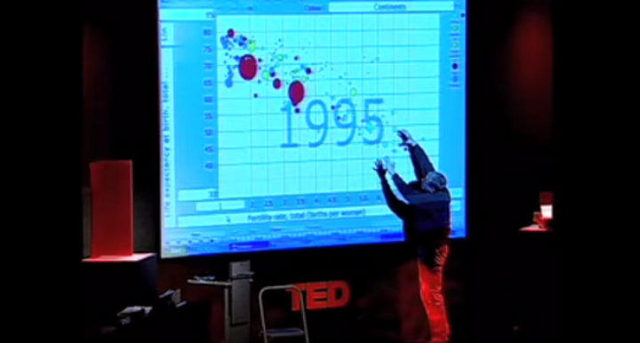
In his 2006 TED talk, Hans Rosling used data visualizations to deconstruct his students’ assumptions about the ‘developed’ and ‘developing’ dichotomy of countries. He looked at the patterns and demonstrated how they were easily recognizable and showed something contrary to the original belief. Pattern recognition is the core power of data visualization and more companies are embracing the notion of “putting humans back in the decision making process”.
Good data visualizations make patterns and outliers easy to recognize and aesthetically pleasing. The data are “liberated” from numbers and letters into a form that can be easily analyzed and understood by everyone.
Here are some great examples of liberating data through data visualizations
1. Microsoft’s SandDance Project
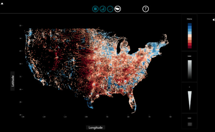
Microsoft recognized the importance of humanizing data with the SandDance project in terms of designing the data exploration experience using “natural user interaction techniques.”
2. Cooper Center’s Racial Dot Map of the US
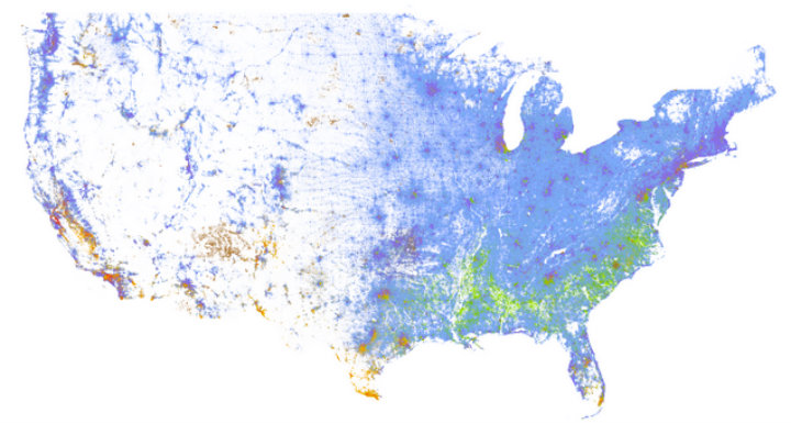
US Census data is made freely available online for anyone to transform into a complex and understandable visualization. The data is available geocoded and as raw survey results. Last summer Dustin Cable took the 2010 census data and mapped it using a colored dot for every person based on their race: blue is White; green, African-American; red, Asian; orange, Hispanics; and brown, all other racial categories. The resulting map provides complex analysis quickly.
At a glance, it is easy to see some general settlement patterns in the US. The East Coast has a much greater population density than the rest of America. It slowly gets less dense until the middle of America where there is extremely low density until the West Coast. Cities act as a grouping point: density typically decreases in relation to the distance from a city. The population of minorities is not evenly distributed throughout the US with clearly defined regional racial groupings.
As you scan through California, an interesting exception stands out just north of San Luis Obispo. There is a dense population of minorities, primarily African-Americans and Hispanics. A quick look at a map reveals that it is a men’s prison. With more data you can see if there are recognizable patterns at the intersection of penal policy and racial politics.
3. Google Public Data Explorer
Google has created dynamic visualizations for a large number of public datasets. There are four different graph types, each with the ability to examine the dataset over a set period of time. With the additional element of time, new patterns can emerge.
Examining the World Bank’s World Development Indicators data set to compare fertility rate and life expectancy a pattern emerges: as life expectancy increases, fertility rate decreases. However, some notable exceptions occur. In 1975, Cambodia has a life expectancy slightly over 20 years, less than half of most countries with a similar life expectancy. It is also the year the Khmer Rouge took power leading to mass killings in Cambodia.
This exception to the normal pattern shows how strong of an impact a single event made. Data visualization makes recognizing this pattern and outliers as easy as watching a short time-lapsed video.
I’ve always believed that data are more than just collected information. Data have a purpose and are meant to be analyzed. New technologies have made visualizing data easier than ever and the data are more accessible to everyone.
What are some of the best data visualizations that you have seen, or maybe even created yourself? Please feel free to share in the comments or tweet @normanshamas or @TechChange.
Want to learn more about data visualization and analysis? Enroll now in TechChange’s new online course on Technology for Data Visualization and Analysis that runs June 1 – June 26, 2015.

