By Sairah Yusuf, TC141: Mapping for International Development (Fall 2013) alumna
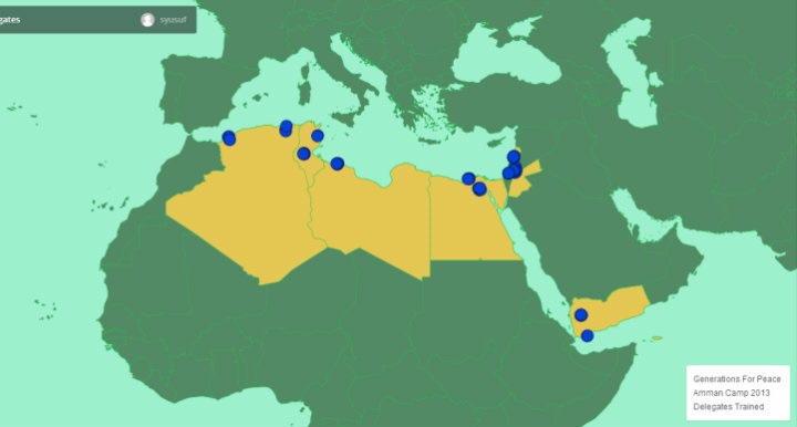
Before taking this Mapping for International Development course last fall, I had absolutely no previous background on mapping tools, so everything about digital mapping was new to me. For my course final mapping project, I created a digital map of the countries and locations of participants of an international training camp held by Generations For Peace (GFP) in November 2013 (Amman Camp 2013). Given my involvement in evaluating the impact of this training, I wanted a way to visualise the effectiveness of the training.
Here are the steps that I took for my introductory experience in creating a map for my work at Generations For Peace:
Step 1: Define the purpose of your map
Throughout the course, the importance of defining the purpose of your digital map as a first step emerged with debates regarding representation and privacy concerns. My aim with this map is to understand the cascading effect over time of these Generations For Peace volunteers, who will be passing on their skills to new volunteers in their home countries in the Middle East. By maintaining this map from November 2013 to November 2015, I hope that it will be possible to visually demonstrate the geographical impact of this training.
Step 2: Select your dataset
I used data from Amman Camp 2013, including the home country of each individual trained and the geographical reach of the training. I felt that this data was simple enough to work with, given that this was my first exposure to mapping. That said, I had to create the dataset from scratch, entering street addresses/locations for each participant.
Geocoding data in the MENA region proved to be the biggest challenge because geocodes for most street addresses (which were predominantly in Arabic) could not be found in the APIs I used. In addition, we had trainees from the occupied Palestinian territories at the GFP Camp. I struggled with pinpointing their locations on the map since the occupied Palestinian territories did not show up as a country option in many of the geocoding tools I tried. I had to get around this by tagging individuals from this region as hailing from Israel and then manually changing the name later to reflect their location. This issue was important to deal with because I did not want any of these trainees to view the map I had created and feel like I had misrepresented where they were from in any way due to geo-political sensitivities.
Step 3: Select your mapping tool or software
The Mapping course featured a variety of tools including Google Maps Engine, MapBox, Ushahidi, OpenStreetMap, CaerusGeo, and Palantir. I chose the Mapbox/TileMill combination over other options because I felt it allowed me to customise my map more – I could colour in different countries and introduce different levels of interactivity within the map.
Step 4: Choose your design
My design choices were partly shaped by wanting to keep my map easily readable, using block colours and simple labels, and also to keep my map customisation as simple as possible since this was my first mapping exercise. I also wanted the countries in question to stand out quite clearly.
By introducing dots in different colours for new individuals these volunteers train in their own countries, over the course of 2 years, for example, this would show how much of a geographical “spread” the training from Nov ’13 had. It would also help distinguish between volunteers with different levels of training. For example, as time goes on and individuals complete GFP programmes and further training, it is possible to change the colour of the dots representing those who were trained at the original Camp to red, demonstrating their status as a GFP “Pioneer.” Any new volunteers they train can be represented in “blue.” The idea is therefore to improve this map and maintain it over a period of time to represent these changes.
Filling out more details in the second click feature can provide relevant information about each individual – what they’ve done in the past and what programmes they are working on now, for Generations For Peace.
Takeaways:
Basic mapping software can actually be quite accessible, even with very little technical training. However, there’s definitely something of a “glass ceiling” in its use, after which more technical expertise is required. Overall, Mapping for International Development was a really great course, and I’ve already recommended it to others! This online course covers debates in the field in some depth, but also focuses on mapping tools in the field in enough detail to have a platform to build on afterwards.
—
Are you new to digital mapping as well? Would your work benefit from geographically visualising projects and impact? Register now for our online course on Mapping for International Development.


