The TechChange course on Mobiles for International Development starts on June 18. Sign up now!
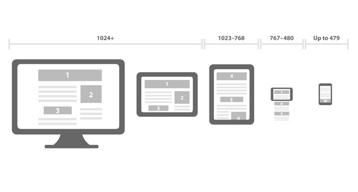
Have you ever been stuck on the mobile version of a website and were unable to go where you wanted just because you were surfing on your smartphone? One solution gaining prominence is called responsive design, which uses proportional measurements and other techniques to display appropriately-sized content on any device from large displays to smartphones. We are pleased to announce that we have launched our new fully-responsive website with the mobile device in mind. Not sure what responsive design is? Try resizing this window wider and narrower and watch what happens, or if you have a smartphone, try loading our site on it.
1. Mobiles matter and your audience uses them
It’s no secret that we’re big fans of mobile tech (re: Blog Posts of ours: Thoughts on Mobile Money for Development, FrontlineSMS and Technological Responsibility, Risk and Rewards of Mobile Technology in Governance Deployment), and mobile internet users are projected to surpass desktop users by 2015. Furthermore, Jon Evans of TechCrunch predicted that in five years most Sub-Saharan Africans will have smartphones and Vodafone recently announced that they will make a high-end low cost smartphone specifically designed for consumers in developing economies. We tweet more than a dozen articles every day on new innovations in mobile tech, from the developing world to higher education. That’s why when we redesigned our website to represent our online identity, we designed it with mobile in mind. This isn’t just on principle; we’ve seen our mobile traffic increase 175% from the same period last year.
2. Because it can save your organization time and money over the long run
There are many ways to approach mobile, and in the end we decided that a responsive design approach made the most sense for our needs. Building a responsive site based off a common codebase limits the hours needed to update code for each mobile platform out there (iOS, Android, Blackberry, Windows Phone 7, and more). While tools exist to streamline these processes and create cross-platform mobile apps, like PhoneGap and Appcelerator, this approach seemed overkill for our site. Furthermore, even if you do develop a native app, with the increase of mobile web use, your site will be much easier to find, navigate, and utilized by web searchers.
We’re obviously not the first organization to do this (and we’re a little embarrassed it took us this long to catch up), but we are huge believers in the potential for responsive design to broaden reach and shorten development times (over the long run) and we are happy to be a resource for others considering a move in this direction.
3. Because it forces you to re-evaluate your priorities
We decided to take a “mobile first” approach to responsive design, which emphasizes designing for the smallest and most constrained canvas and then building upwards. We felt that this would be a good way to sift through the many pages and multitudes of text on our former site and pull out what was absolutely necessary and most relevant to our users. There are many many reasons to go mobile first, but we found that this process helped clarify our mission and focus.
The last point is that we didn’t do it alone. We read forums, checked ideas, circulated betas, and then asked for feedback from tech communities to help us keep building our model. That’s why we’d like to close with asking you, the reader, for your feedback if/when you get a chance to check out our site — either on a mobile device or otherwise. Also feel free to ask us any questions by emailing info@techchange.org!
After all, any technology is only as powerful as the community that uses it.


