Qatar-based Al Jazeera may be completely responsible for the lack of productivity amongst university students, in many different disciplines, all over the world. Walking through the halls of a local university you may hear, at any one point, one student saying to another “Al Jazeera ate my homework.”
The reason for this is what the LA Times has coined Al Jazeera’s ‘CNN moment’ (referring to the network’s coverage of the Gulf War, which catapulted it into popularity). Al Jazeera’s around the clock news and live updated coverage of the protests and revolutions throughout the Middle East and Africa, has in many ways changed the rules of the media game. Al Jazeera has led news media outlets down a path that forces all others to be very conscientious of not only what they report but also in keeping up with real-time events.
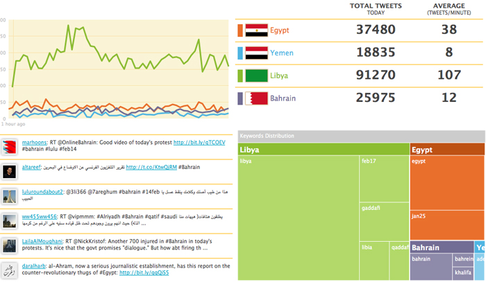
With the speed, quantity, accuracy and availability of data coming out of Al Jazeera it’s no wonder many students and followers of the network are becoming overwhelmed. It’s not just the articles, or the videos, or the pictures, it’s also the millions of tweets that keep us glued to the events. Seeing that there is an overwhelming amount of up to the minute information available, Al Jazeera has launched its very own Twitter Dashboard. Using the heading ‘Region in Turmoil’ Al Jazeera has built the dashboard so that users can see a more compressed but still comprehensive illustration of what is being tweeted.
The dashboard is built around four sections. One section on the dashboard provides real-time updates on the total number of tweets produced concerning developments in Egypt, Yemen, Libya and Bahrain. These numbers are recorded and include a tally of total tweets for the day as well as an average of tweets per minute. Complementary to these numbers is a line graph that provides a visual representation of the tallies.
Another section of the dashboard displays the hashtag distribution for each country garnishing the most attention in the Twittersphere. In this area, users are able to expand and contract the distribution graphic to suit their particular region of interest. The fourth section on the dashboard contains a real-time Twitter stream of all tweets related to the four countries that are highlighted by the dashboard.
With the speed in which events in Egypt, Yemen, Libya and Bahrain change, this Twitter Dashboard is just one more tool through which observers, activists, concerned groups and the like, can organize their thoughts, make sense of the twitter trends as they happen, and gather a more holistic understanding of the tweets coming at them. In sum, it provides an at-a-glance visual representation of how, when, and where people are using twitter to discuss events.
It’s important to note that Al Jazeera is not the only, nor is it the first, to create instantaneous tweet visualizations. Others such as iaman25 , HyperCities Egypt and the Guardian have also combined tweets and infographics to present a picture to others of events as they are unfolding on Twitter. While they share some similarities, they are also unique in their own way. HyperCities Egypt, created by three tech enthusiasts from the UCLA Digital Humanities collaborative, combines GIS technology with Twitter feeds to provide an immediate map of tweets, and locations. And the Guardian’s project presents an interactive map, combined with a tweet deck that includes tweets from Libya, Egypt, Jordan, Syria, Iran, Bahrain and Yemen.
There is no doubt that Twitter is changing the way in which users participate in, and consume news and information. The work of Al Jazeera and others on customized Twitter Dashboards only goes to show that there is a need, a demand, and a value in the real-time information provided by Twitter and its users. The world is clearly watching Twitter.


