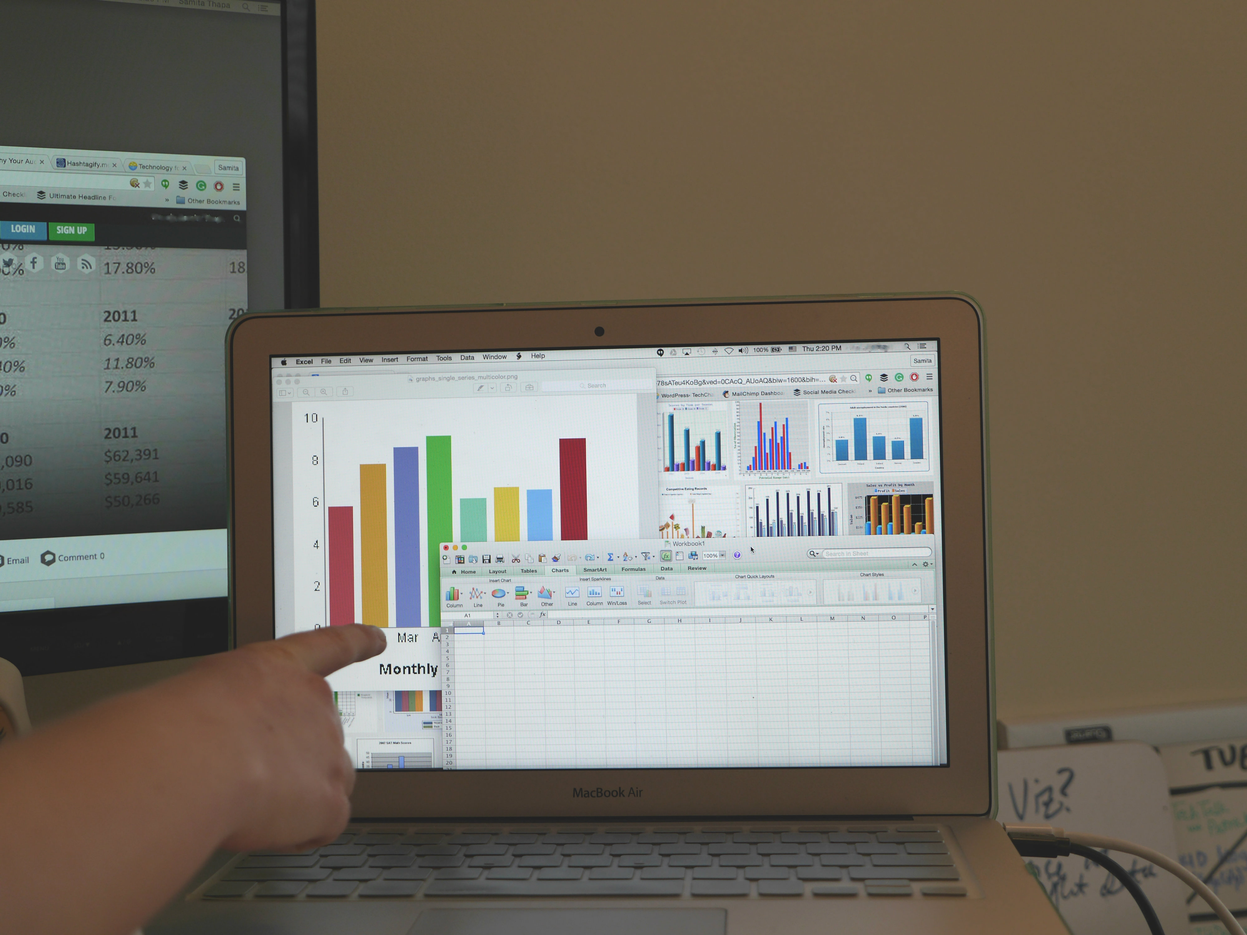
Data visualization requires more than design skills. You need both technical and critical thinking skills to create the best visuals for your audience. It is important to match your visualization to your viewer’s information needs. You should always be asking yourself: “What are they looking for?”
1. Understand your audience before designing your visualization
The first and most important consideration is your audience. Their preferences will guide every other decision about your visualization—the dissemination mode, the graph type, the formatting, and more. You might be designing charts for policymakers, funders, the general public, or your own organization’s leaders, among many others.
What type of decisions do your viewers make? What information do they already have available? What additional information can your charts provide? Do they have time (and interest) to explore an interactive website, or should you design a one-page handout that can be understood at a glance? A chart designed for local government leaders wouldn’t be appropriate for a group of program implementers, and vice versa.
2. Your audience determines the type of visualization you prepare
Spend some time thinking about your dissemination format before you sit down at the computer to design your visualization. The days of 100+ page narrative reports are long gone. Nowadays viewers want visual reports, executive summaries, live presentations, handouts, and more.
- Visual Reporting
Traditional M&E reports are 80% text and 20% graphics. Ready to break the mold? This visual report, State of Evaluation 2012 from Innovation Network, is about 20% text and 80% graphics.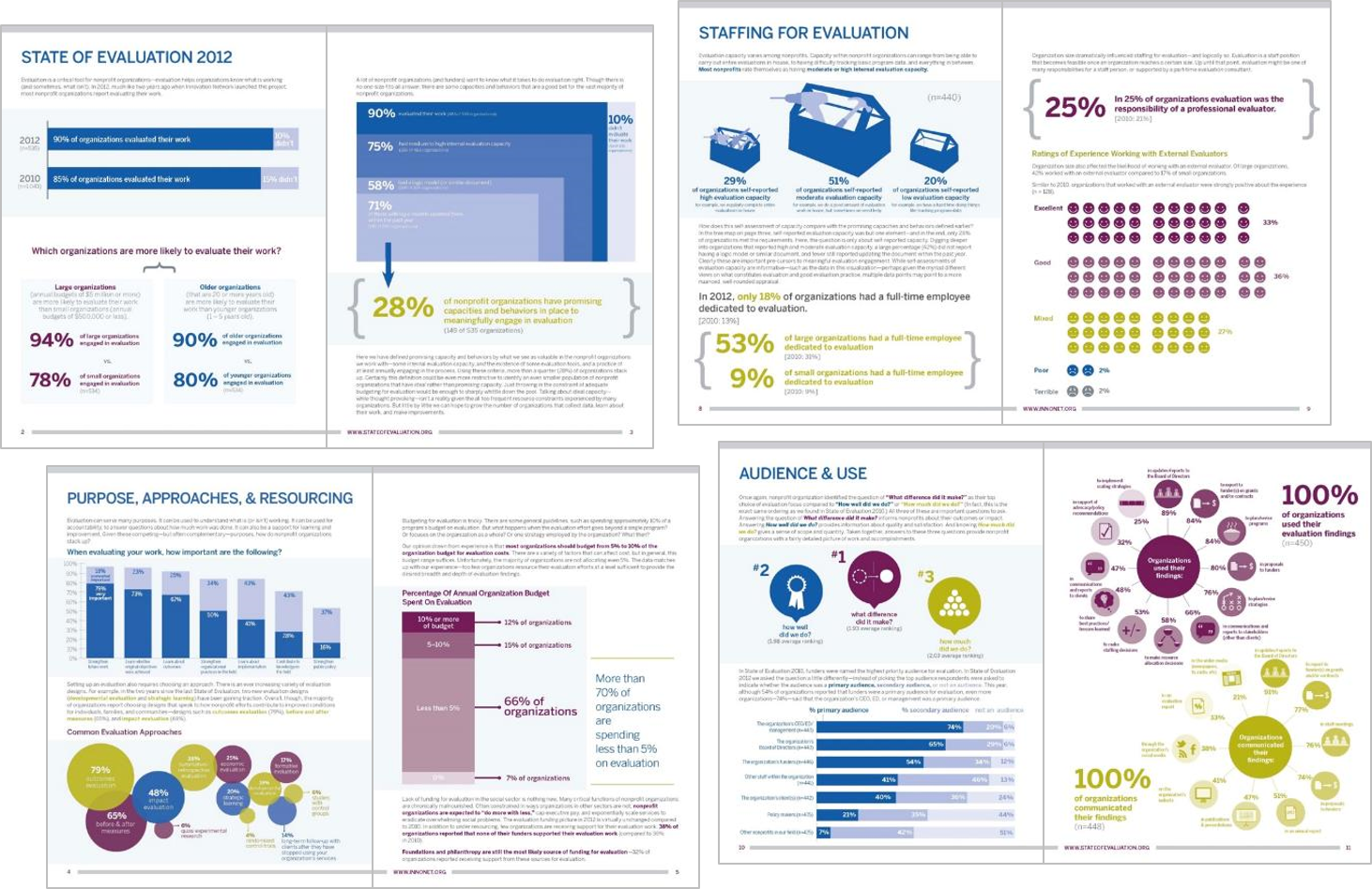
- One-Page Annual Reports
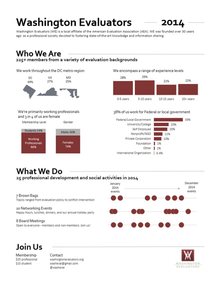
If you know your viewers won’t read more than a page or two, try a one-page annual report. These “reports” focus on just the highlights of what was accomplished within the past year and leave out the lengthy narrative sections. Here is an annual report I created for the Washington Evaluators:
- Online Reporting
Maybe your viewers would respond better to a different reporting style altogether—an online report. These website-based reports can include images, videos, interactive visualizations, and more. My favorites include Datalogy Labs’ Baltimore report and the University of Chicago’s computer science report.
3. Remember that the key is to keep your audience engaged
If you are sharing results in client meetings, staff retreats, conferences, or webinar, try breaking up your charts into several slides so the chart appears to be animated. This storyboarding technique ensures that your audience is looking where you want, when you want.
- Draw Attention to key charts with handouts
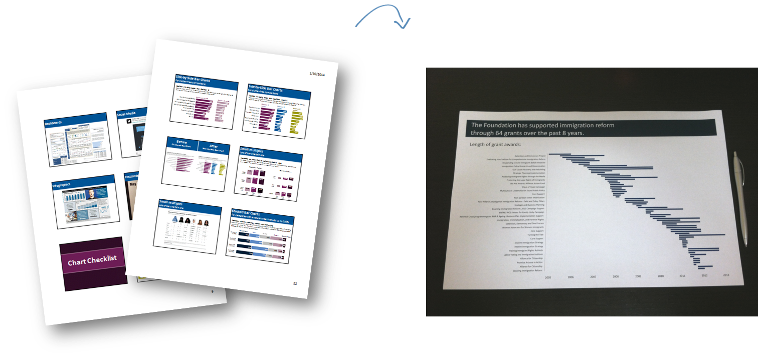
If you are getting ready to share your M&E results during a meeting, rather than printing your full slide deck, select 3 to 5 key charts and print those slides on a full-page. Your full slide deck will likely end up the trash can as soon as the meeting ends, but your curated handouts will get scribbled on, underlined, and saved for future reference. I often see these handouts taped above meeting attendees’ desks weeks and months after my presentation.
- Tweeting your results
If you are planning to tweet a chart or two, be sure to adjust your charts to fit a 2:1 aspect ratio. Otherwise, your carefully crafted visualization will get chopped in half because when you are scrolling through your Twitter feed, the images automatically display about twice as wide as they are tall.
That’s all for my top tips to keep in mind when creating your visualization! How do you engage your team when creating and presenting reports for your organization? What types of communications modes are you currently using to share your visualizations? Tweet at us @TechChange and join the conversation!
Interested in learning more about how to best present findings for your team or organization, join me and Norman Shamas in TechChange’s brand new Technology for Data Visualization and Analysis online certificate course. The course begins on June 1, and you can register with code ‘DATAVIZ50′ for a $50 discount! Click here to register.
About author

Ann K. Emery is a co-facilitator for Technology for Data Visualization and Analysis course. Through her workshops, webinars, and consulting services, she equips organizations to visualize data more effectively. She leads 50 workshops each year both domestically and abroad. Connect with Emery through her blog.

