Four Lessons Learned for Creating Interactive PDFs
|
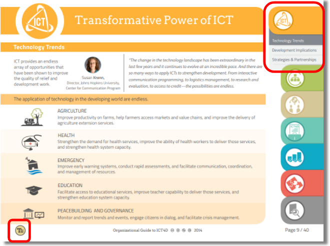
In 2014, The World Bank revealed that one-third of their PDF reports had never been downloaded, and another 40 percent had been downloaded fewer than 100 times. Recognizing that government agencies, nonprofit organizations, and ICT4D as a whole are addicted to the PDF format, TechChange sought to create a digital-first, interactive PDF that would be designed for how these reports are actually read, rather than how the authors typically intend. The result was the Organizational Guide to ICT4D, which was released later that year as the cornerstone of the 2014 ICT4D Conference.
As the community prepares to convene once more at the 10th Conference on ICT4D coming up on May 8-10 in Lusaka, Zambia, we wanted to share lessons learned over the last four years, starting with the Sustainable Development Goals Playbook, which was released at the 2015 ICT4D Conference (note: we also created that conference’s launch video).
Lesson 1: Simplify Navigation
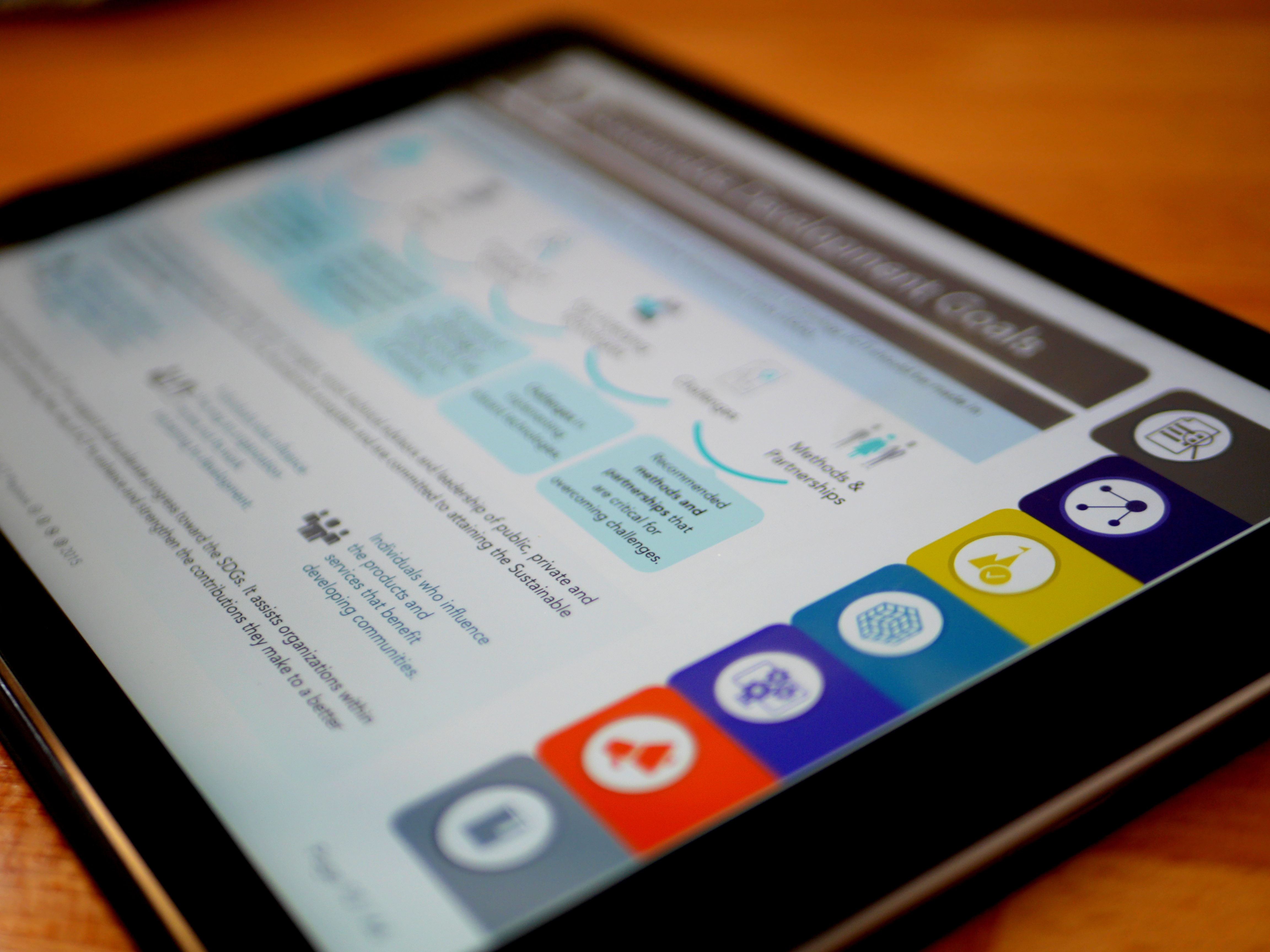
The color-coded, right navigation bar in our interactive reports was created to free users from scrolling through pages of nondescript text. Instead, learners could quickly tab through relevant sections to get to their desired information and then jump around as needed. But adding the text to the navigation (image below) created two problems: Cluttered text and redundant headings.
After observing users engaging with the PDF, we realized that users were not reading the tabs (top right red box) at all, but rather quickly navigating back to the Table of Contents (“bottom left red box) and then navigating to the desired section or page from there. Not only was removing the text simplifying navigation and improving readability, but it came at zero expense to user navigation, provided that the color and icons served to identify the current section and topic.
Lesson 2: Design a Series
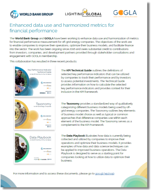
Although we had iterated on our design between ICT4D Conferences, the reality is that we had designed each as a one-off, even though the style guide was kept relatively unchanged over the two years. In contrast, designing for a conference report series, such as during the Global Off-Grid Solar Forum and Expo, we were able to produce three reports for a major conference in Hong Kong, from 22-24 January 2018.
Working closely with The World Bank, IFC Lighting Global, and DevDesign, we created a consistent, modern identity (hello, gradients) where each report would have a unique identity consistent with event and partner branding, but also look attractive when presented in unison. We also produced a short flyer (below) so that participants were aware of the other reports and could easily decide if they wanted to read more. If you’d like to take a look for yourself, all three reports are available online!.
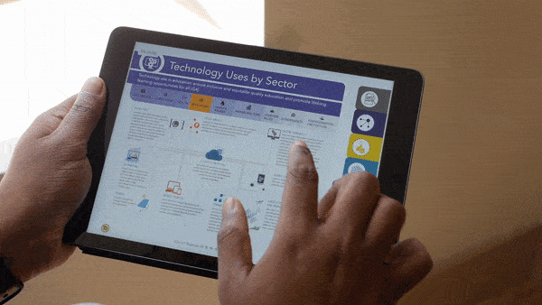
Lesson 3: Design Once, Use Everywhere
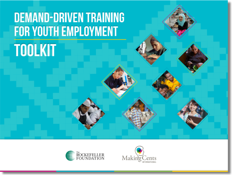
There are finally a few decent PDF readers out there for mobile, but the reality is that the same strengths of a PDF in keeping a consistent experience run directly counter to a positive mobile reading experience. As such, we’ve found that the style guide, text, graphic assets, and themes can quickly be repurposed once they’ve been developed for a PDF. One example is our work with Making Cents International, where we were able to provide all original assets in the PDF to a third-party web designer, who then created a mobile-friendly site for content delivery. That way, information is not only locked in a PDF, but also incorporated into a coherent online identity with additional insights about visitors and users.
Curious to learn more? Go ahead and check out the Demand-Driven Training for Youth Employment Toolkit online and compare it to our original PDF toolkit (pictured below).
Lesson 4: Embrace Constraints
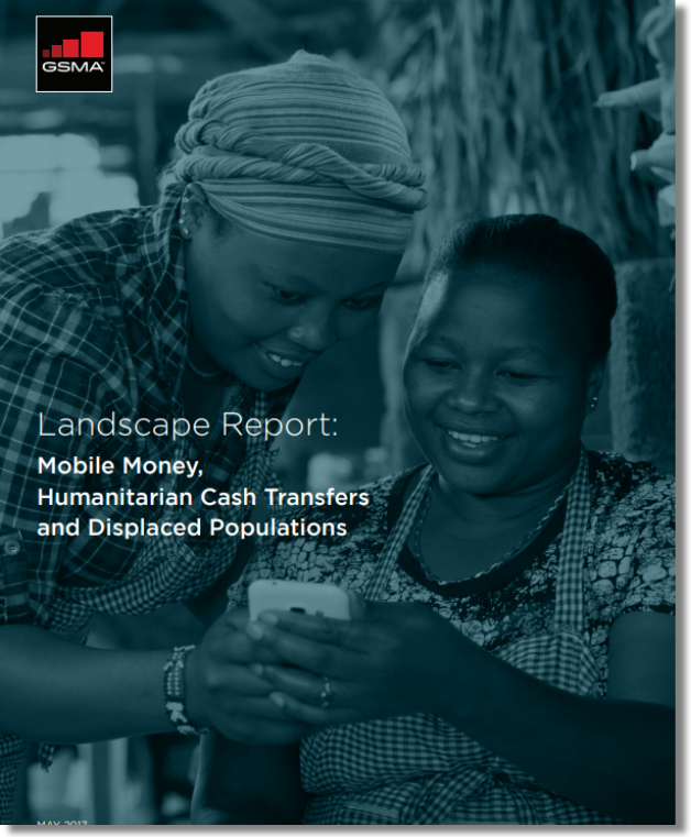
Lastly, we’ve re-learned that reports don’t have to be interactive to be engaging. PDFs can be made beautiful for embracing their constraints as well as expanding the possibilities. For example, we’re very proud of our design for the GSMA Landscape Report: Mobile Money, Humanitarian Cash Transfers, and Displaced Population, (below) which was created in a tightly controlled branding and styling format that precluded any interactive components.
When we were able to remove the navigation bar, we were able to continue applying many of these lessons learned back to our traditional report style. This helped us focus on upgrading infographics, charts, tables, and the core components of a readable and informative report.
Even after seven years of designing partner PDFs, we’re still learning how to make important information more engaging. If you would like to share any of your lessons learned or examples of stellar reports, please do share with us on Twitter @techchange. And if you’d like to learn step-by-step how to make your own interactive PDFs, please do consider enrolling in our next Online Learning for International Development course.
Because when it comes to international development, some information is too important to be boring and unread.
My current focus on tourism development led me to explore how some of the tech tools discussed in the Mobiles...
I truly enjoyed the four-week TechChange course on Agriculture, Innovation and Technology thanks to Nick, wonderful guest speakers and brilliant...
For those interested in Technology for Peacekeeping consider taking our online certificate course, Technology for Conflict Management and Prevention, starting July...