Cross-posted from Samhir Vasdev’s Medium channel.
This tutorial accompanies the Amazon episode of our new series about liberating and visualizing our personal data. Check it out below:
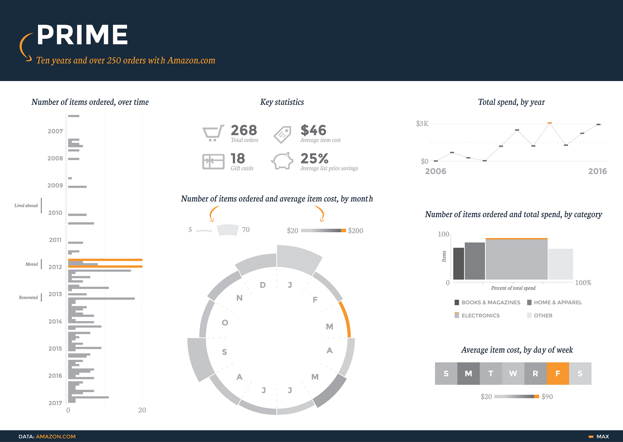
I’m hooked on Amazon.
And I’m sure I’m not alone. So this week, Nick Martin and I dug into our Amazon accounts to explore just how bad we’ve got the Amazon bug. This post walks through the process of finding and cleaning the data we tackled in that episode.

This data gets a 4 out of 5 on my entirely unscientific data cleaning score test. It’s pretty easy to access, and it needs just a bit of fiddling to get in a good state to surface some useful insights.
To follow along, you’ll need accounts at Amazon and Piktochart and a basic understanding of how functions work in spreadsheet tools like Excel or Google Sheets. You won’t need a particularly powerful computer to work with the dataset, and the whole process should take about an hour. In that time, we’ll turn the raw data into this sleek, interactive presentation.

Tutorial
A brave , if futile, attempt at organizing and explaining the process I used to get, clean, and visualize my Amazon data.
This is a long and detailed post, so here’s a roadmap in case you want to jump to the part you care about most:
- Get the data
- Inspect the data
- Clean the data
- Visualize the data
- Next steps
- Reflections
First, get the data.
Amazon makes this process outrageously easy. Just visit the Order History Reports page, enter in the date range you’d like to use (I requested everything from 2006 thru 2016), then click “Request Report”.
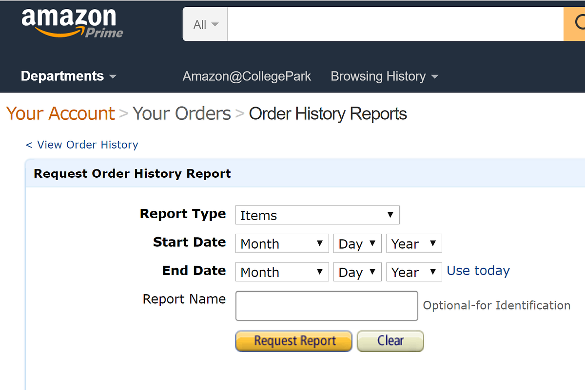
Amazon offers two report types: items and orders. Download and explore both of them to see which suits your interests; I used the items option, mainly because I it had more information about the specific things I purchased. It’s a relatively small file (mine was 128KB, or about as much as a Facebook photo), so it shouldn’t take long to download in most settings.
Once you’ve requested the report, you’ll see it appear in a “Your Reports” box below the order request section. This is nifty because it saves all your previous reports, still available for you to download down the road. Other websites don’t usually keep such easy access to previous reports (LinkedIn, for instance, e-mails you a special download link that eventually expires).

The data downloads as a single CSV file, which is a common format to store simple information in a table (here’s a good explanation of the difference between CSV and Excel files).
Next, inspect the data.
Each of the 300+ rows corresponds to a different item that I ordered, and there are 40 columns with fields describing everything from the order date and payment method to shipping address and item category (such as “paperback” and “sports”). The diversity and clarity of the dataset is remarkable.
Also, a quick skim in Excel shows that most cells have content — there aren’t any gaps — and the column titles do a good job of explaining what they represent (this isn’t always the case, and that’s when good metadata comes in handy).
Based on what I saw, I figured it would be useful to learn how my purchase patterns evolve from year to year. But the raw data doesn’t have a column for “year”, so I needed to extract that information from the “order date” column.
Clean the data.
Extracting the year of each item can be done with a formula (School of Datahas a great primer on formulas). Use the TEXT formula in a new “year” column. For example, if the order date in cell A2 was “7/24/2006” and I’d like to put the first three characters of the year into cell B2, I’d put this into B2:
=TEXT(A2,“YYYY”)
to get:
2006
Nice. Now, just double-click the bottom-right corner of the cell B2 (or whatever cell you just ran the formula in) to apply the formula to all cells beneath it. (By the way, this TEXT function is pretty flexible about what you put within the quotes.) For instance, writing:
=TEXT(A2,“ddd”)
would return:
mon
Anyways, now we have a column that shows the year that every order was placed in, and we can surface some insights that reveal milestones and patterns in my own life. For example, my spend plummeted while I was living abroad in 2009, and it spiked in 2011 and 2013, when I moved and renovated my apartment.
Visualize the data.
Let’s use Piktochart to make an interactive presentation that shows the change in my annual spend over time — something like this:

To get here, jump over to Piktochart to make an account — it’s free, and you can log in from Google or Facebook (they won’t post anything without your permission).
Next, start out by creating a presentation (you could also create an infographic, or even a printed product ). You can choose from one of many free templates (many more are available with a paid plan); don’t worry about things like fonts and colors since you can customize them later.
Once you open the presentation, you’ll see it’s filled with dummy content. You can dive right in to edit things like text areas, just as you would in Powerpoint. You can also use the menu options on right to add or change graphics images, including pulling from many free icon and photo libraries.
To make a chart, click on a slide within the presentation where you want the chart, then click on the “Tools” menu option on the left, then “Chart”. This will open a new chart editor window. Take a minute to acquaint yourself with the layout; this article and image will help. Start by pasting your data from your CSV file into the data editor in Piktochart.
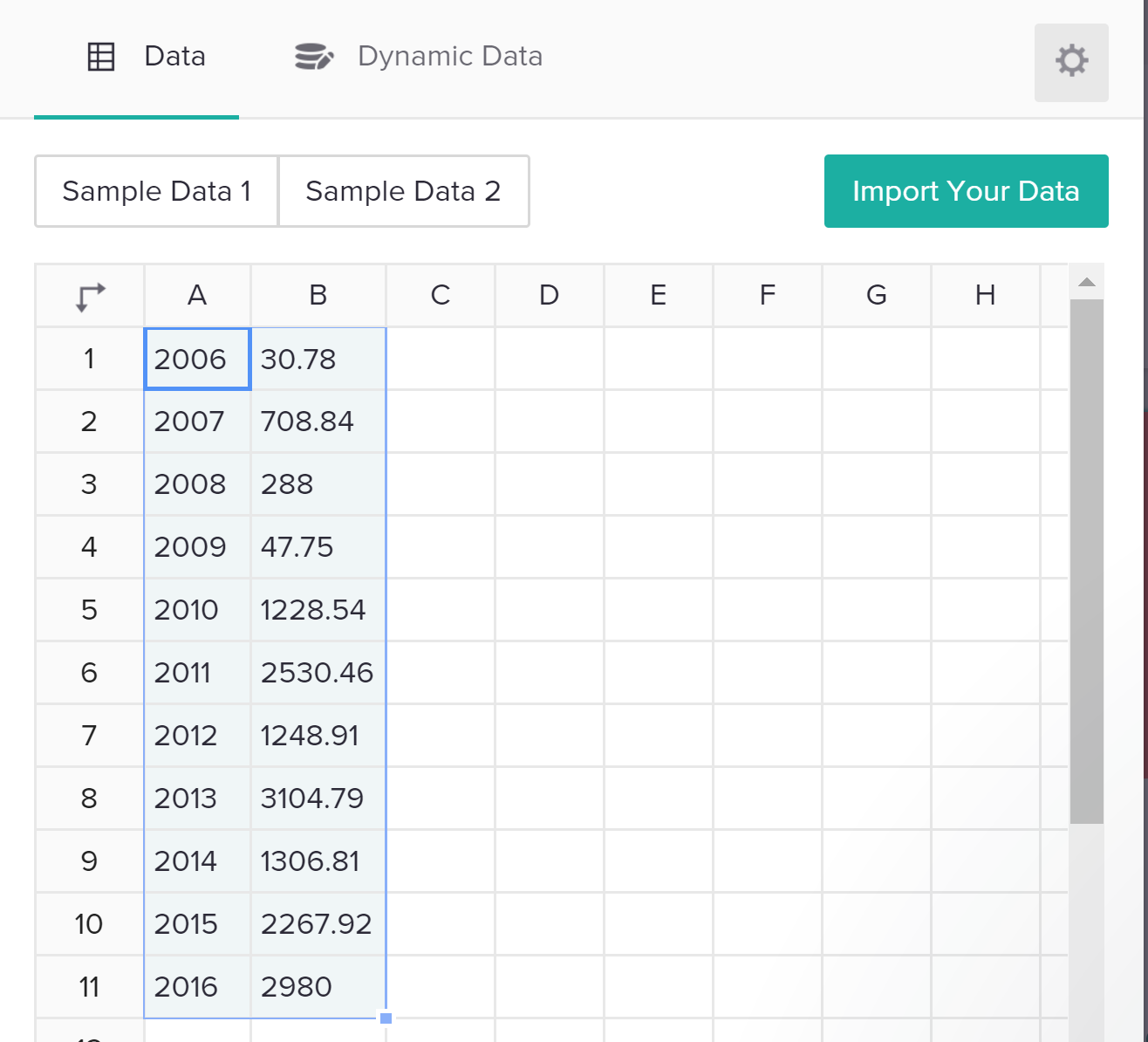
You’ll see the chart area, on the left of the data, animate in real-time with the data you’ve just added. Select the chart type you want (in this case, let’s go with a line chart), and then go ahead and edit any fields you’d like, such as the chart title or axes. I found this process to be easier than in Powerpoint or Excel, which can be a bit tedious when editing these features.
Be sure to take advantage of that little gear icon in the top-right of the data area; this is where you can customize a range of elements like the colors, gridlines, positions, and more. After that, just click “Insert Chart” to see the chart pop into the slide you had selected when you started this process.

Boom! You just made your first online, interactive chart with your own Amazon order history. After taking a minute to bask in your glory, start poking around to see how you can add slides, edit some of the existing content, and change styles like backgrounds.
Finally, like any good interactive chart, you want to be able to share it. There are several easy ways to do that, and they all sit in the “Share” menu option at the top-right of the Piktochart screen. You can share a link directly to the presentation, or export the file to tools like Slideshare. You can also embed the presentation into your website, although this takes a bit of basic familiarity with HTML language. Here’s a good overview of the sharing options. Go show off your data!
Next steps
A data addict’s search for (mostly useless) insights is never over. I’d like to return to this data and see how my item categories evolved over time; I’ve a suspicion my physical book purchases were heavier in my college days, while e-book purchases increased once I finally downloaded a Kindle app a few years ago. If you discover something like this in your data, share in a comment!
I also used Illustrator to design some more visualizations to unlock some other insights from my Amazon history. Check that out here.
If you read this far, you deserve a prize. Kudos.
What does your Amazon history say about you? Have you used Piktochart or other similar tools to visualize this or other info? How was this tutorial? Comment and share!


