Magpi Releases Data Visualization Feature
|
Last week, the mobile data collection service Magpi released its latest addition to the platform: data visualizations. We sat down with the founder and CEO, Dr. Joel Selanikio, to talk about the new feature and what Magpi has in store for the future.
Magpi prides itself in taking the programming out of data collection tasks. As a medical doctor concerned with global health, Selanikio is always looking for ways to add more user-friendly features. He would ask himself, “Wow, we keep taking these things that require programming and taking out all the programming. What else is there we can do?”
The obvious answer was to add an intuitive data visualization layer to Magpi, so that users could easily access, understand, and communicate the data they were collecting.
“Before, we thought that if users wanted to visualize the data, we can just let them export the data and enter it into Microsoft Excel. What we didn’t realize was how time consuming a process this can be for our users, so our new release will allow users to generate beautiful reports instantly,” said Selanikio.
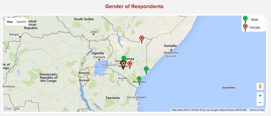
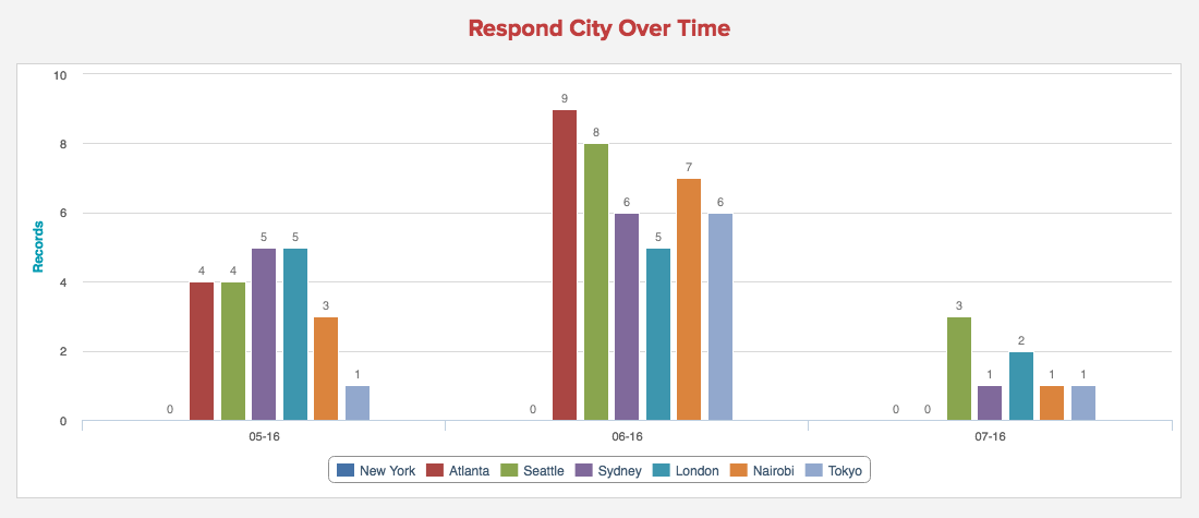
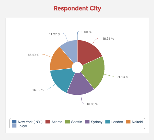
For the past year, the programmers at Magpi have been working hard to make user-modifiable data visualizations which can be easily embedded and shared. Some sample outputs from the new data visualization system are shown below – these graphs can be automatically generated whenever a user creates a report from their data.
“I am super excited to show this to people,” said Selanikio. Users familiar with HTML can also further customize the visualizations, and magpi will be adding more data visualization features based on user feedback.
“We’re making it so that if you’re using Google Sheets, you can add triggers so you can enter data in a Google Sheet and it will automatically update your Magpi report.”
In the future, Magpi is hoping to add features such as video, the ability to read barcodes, and more! Stay tuned for more exciting updates to come!
Next Tuesday, July 26, from 11:00 AM to 12:00 PM EDT, Magpi will be hosting a free webinar on how to use the new reports feature: click here to register.
If you have taken a TechChange course, you know that the participants are all doing amazing things wherever they are...

We're often asked at TechChange why our approach to learning is unique. New clients want to know, what's our ethos...

Katherine (Katie) Perry has recently joined us as a communications and operations associate where she will be key in TechChange's...