We consume and produce data at ever growing rates, aiming to better understand the past, observe the now, and to be better prepared for the future. However, data can only fulfill its purpose when we can make sense of it, generate insights, and put it into action. The process of turning data into insights requires many steps, and doing it effectively involves many strategies.
Step 1: Visualization
One of these key steps is visualization, which is the visual organization of data using various shapes, sizes, colors, and layouts. Visualization creates data charts such as bar graphs, line graphs, scatterplots, and even maps and networks. This step helps us make sense of large volumes of abstract information, without much effort. Effectively using the visual language for data provides a natural, intuitive way to see and understand features and trends in data.
Step 2: Interaction
Another key step is interaction. When you ask questions, focus on certain properties, or change the visual representations, you are engaging in an interactive dialogue with your data. The vast computing capabilities in our digital devices allow us to dynamically filter across categories, resort items, pan map views, retrieve details, and explore alternatives. Together, visualization and interaction with data lets you find the answers you are looking for, and answer the questions that you didn’t know you had!
Step 3: Putting It All Together
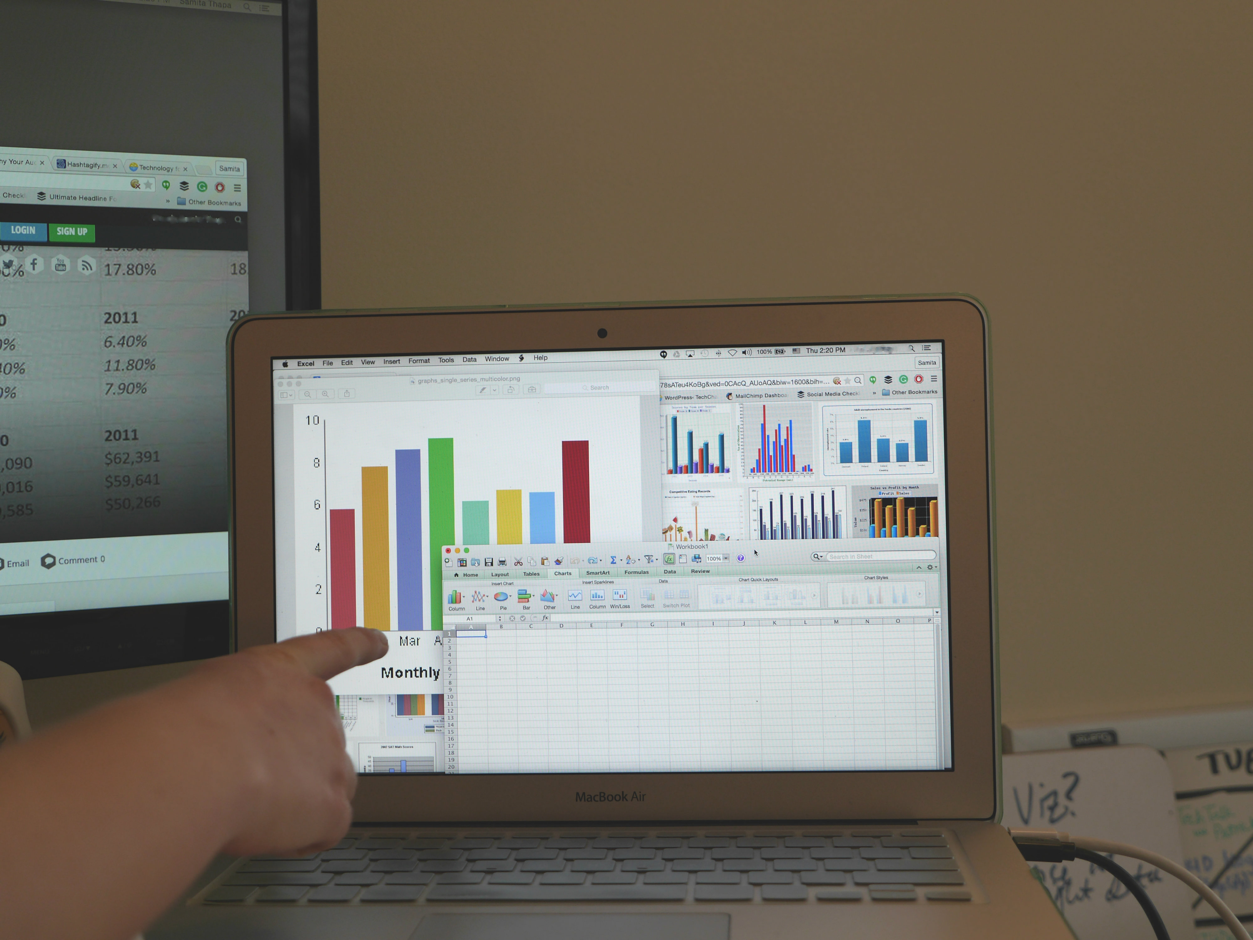
How can you start your data dialogue? There are many tools to help you collect, transform, and visualize data in many different forms. However, with so many options, choosing the best approach based on your needs, your data, and your experience level is not trivial. You may start visualizing your data with tools that offer a graphical interface. This allows you to import a dataset and construct data charts by selecting chart types or mapping data attributes to various visual elements and components (shapes, colors, layouts, x-axis, etc.). Existing graphical charting tools still require training to make effective visualization decisions, or they do not let you easily engage in rich analytical conversations with your data in multiple synchronized perspectives. For customized analysis and design needs, you can use programming based tools, but these require significant technical knowledge to figure out and execute the best strategies. How can you get the most from your data, with the least amount of effort, and in the shortest time?
The Solution: Keshif
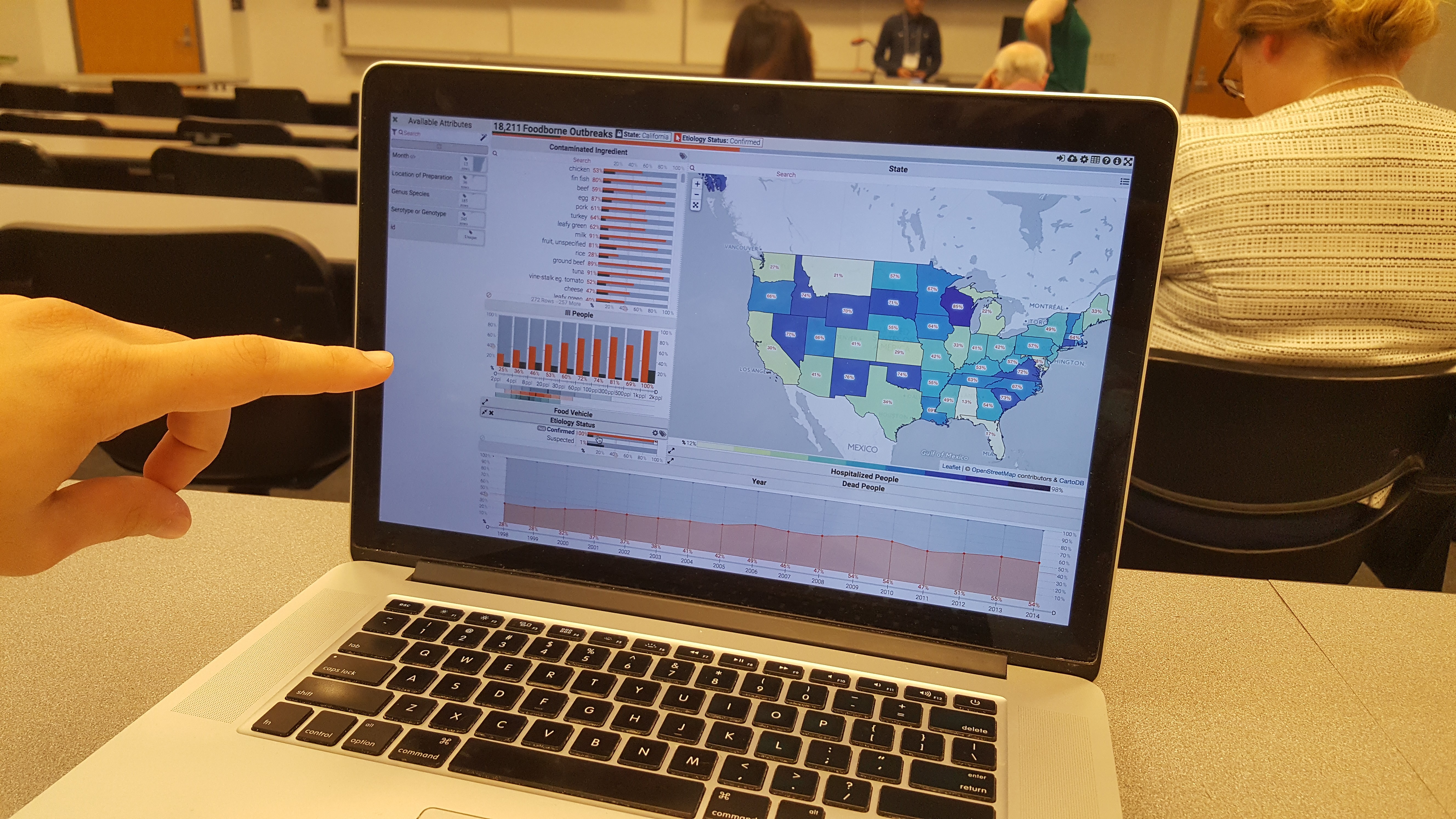
Keshif is a new web-based tool that brings life to your tabular data by converting it into a beautiful interactive visual interface. Unlike other tools, it creates an environment where you focus on interpreting your data, rather than specifying the visualization details and getting lost in the many visual options that may slow you down, or mislead you. Keshif is designed to fit your data exploration needs, the structure of your data, and expands on the best practices. Your categorical data becomes bar graphs, your numeric data becomes histograms, your time data becomes line graphs, all without any effort. For more in depth analysis, you can view your data by percentiles and map regions. Each record of your data can be shown individually in a list, grid, map, or network (if your data supports it).
Everything in a Keshif data browser is connected and highly responsive so that every action is a potential to a new insight. You can highlight to get a quick preview, filter to focus on details, or lock to compare different sections of your data easily. You can import your data to Keshif from Google Sheets, CSV, or JSON files, and decide which attributes you want to explore. This can be done by summarising their characteristics, and manipulating your data in various ways to explore different trends and relations. From journalism to government, transportation to finance, and music to sports, Keshif can be used for data in many different domains. With it’s minimal, yet powerful features, Keshif lets you make sense of your tabular data quickly, analyze it in multiple perspectives, and reach new insights.
Keshif is under active development by Ph.D. candidate M. Adil Yalcin and his advisors Professor Niklas Elmqvist and Professor Ben Bederson at the Human Computer Interaction Lab at University of Maryland College Park. To learn more about Keshif, visit its homepage www.keshif.me, find a topic that interests you across the 150 datasets specially compiled, and watch the short tutorial video.
About the Author:
M. Adil Yalcin, is a Ph.D. candidate at the Department of Computer Science at University of Maryland, College Park. His goal is to lower human-centered barriers to data exploration and presentation. His research focuses on information visualization and interaction design, implementation, and evaluation. He is the developer of Keshif, a web-based tool for rapid exploration of structured datasets. In his previous work, he developed computer graphics techniques and applications.
If you have any further questions, join Keshif’s email list or contact yalcin@umd.edu.


