Why Data Visualization Is Important
|
How do you analyze data you collect from surveys and interviews?
One way to analyze data is through data visualizations. Data visualization turns numbers and letters into aesthetically pleasing visuals, making it easy to recognize patterns and find exceptions.
We understand and retain information better when we can visualize our data. With our decreasing attention span (8 minutes), and because we are constantly exposed to information, it is crucial that we convey our message in a quick and visual way. Patterns or insights may go unnoticed in a data spreadsheet. But if we put the same information on a pie chart, the insights become obvious. Data visualization allows us to quickly interpret the data and adjust different variables to see their effect and technology is increasingly making it easier for us to do so.
So, why is data visualization important?
Patterns emerge quickly
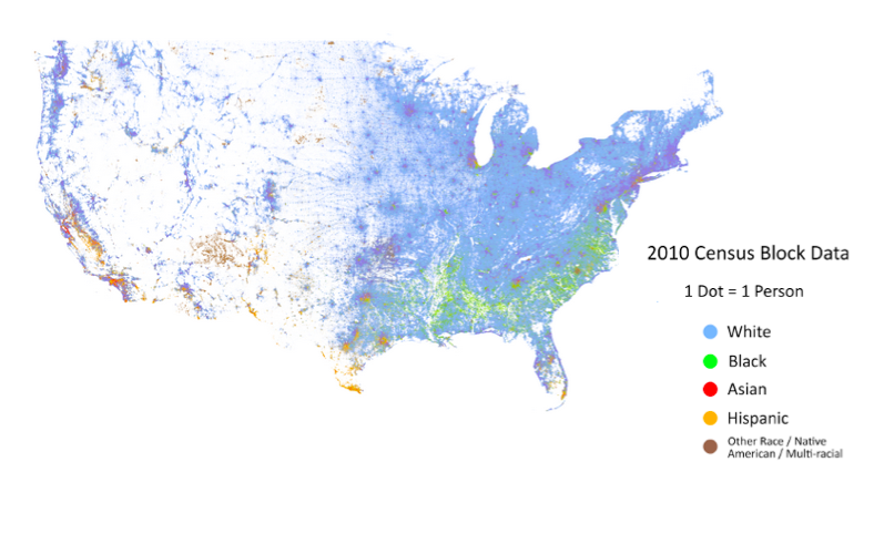
Cooper Center’s Racial Dot Map of the US
This US Census data (freely available online for anyone) is geocoded from raw survey results. Dustin Cable took the 2010 census data and mapped it using a colored dot for every person based on their race. The resulting map provides complex analysis quickly.
It is easy to see some general settlement patterns in the US. The East Coast has a much greater population density than the rest of America. The population of minorities is not evenly distributed throughout the US with clearly defined regional racial groupings.
Exceptions and Outliers are Made Obvious
As you scan through California, an interesting exception stands out just north of San Luis Obispo. There is a dense population of minorities, primarily African-Americans and Hispanics. A quick look at a map reveals that it is a men’s prison. With more data you can see if there are recognizable patterns at the intersection of penal policy and racial politics.
Quicker Analysis of Data over Time
Google’s dynamic visualizations for a large number of public datasets provides four different types of graphs, each with the ability to examine the dataset over a set period of time. It is easy to see patterns emerge and change over time. Data visualization makes recognizing this pattern and outliers as easy as watching a short time-lapsed video.
What are some of your favorite data visualizations examples or tools, tweet at us @TechChange or share in the comments section below.
If you are interested in learning about how to better visualize and analyze data for your projects, join us in our new online course on Technology for Data Visualization and Analysis. The course begins on June 1, so save your seats now!

Natalya recently joined the TechChange team as an Account Manager, where she helps elearning partners leverage the TechChange platform services...
The issue of Internet censorship has cycled throughout headlines, whether it’s Congress interrogating Microsoft and Yahoo! as to why they...

Yohan Perera recently joined TechChange as a Graphic Designer. He received his Bachelor’s degree in Digital Arts & Design from...