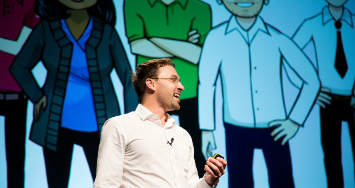
Last week, I was fortunate enough to present at PopTech 2013 and participate in the Poptech Social Innovation Fellowship program along with nine other super inspiring social entrepreneurs. What an amazing experience!
I had the great fortune of getting fantastic training/advice/wisdom from the Poptech faculty on the content of my talk as well as other challenges that we’re facing as an organization. Many thanks to Ken Banks, Michael Duarte, Erik Hersman, Cheryl Heller, Peter Durand, Jim Koch, Chloe Holderness, Kevin Starr, Heather Fleming, Grant Tudor, Lisa Witter, Priti Radhakrishnan, Susan Phillips, and the amazing staff at PopTech: Becky, Andrew, Ollie and Leetha. This group was truly an all-star cast of individuals at the forefront of social innovation. Read about them here.
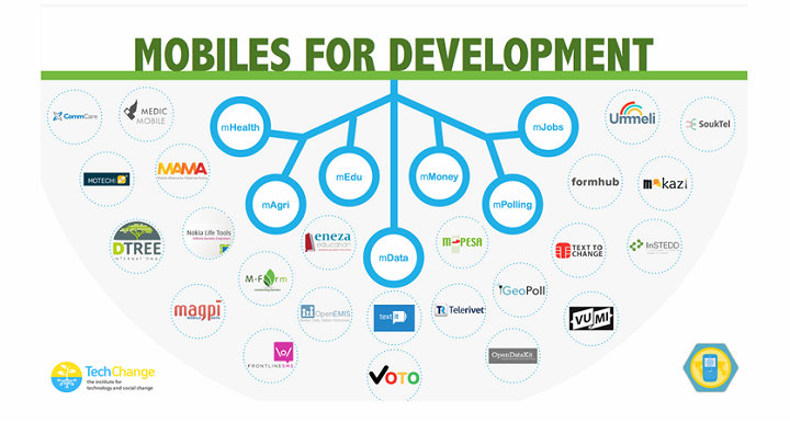
Our Prezi as it appeared for PopTech. Click through and check it out!
After the presentation on Friday, a number of folks asked me about the presentation format. so I decided to share some details about how we made it and the design decisions that went into the process.
1. Unify your presentation with your organizational identity
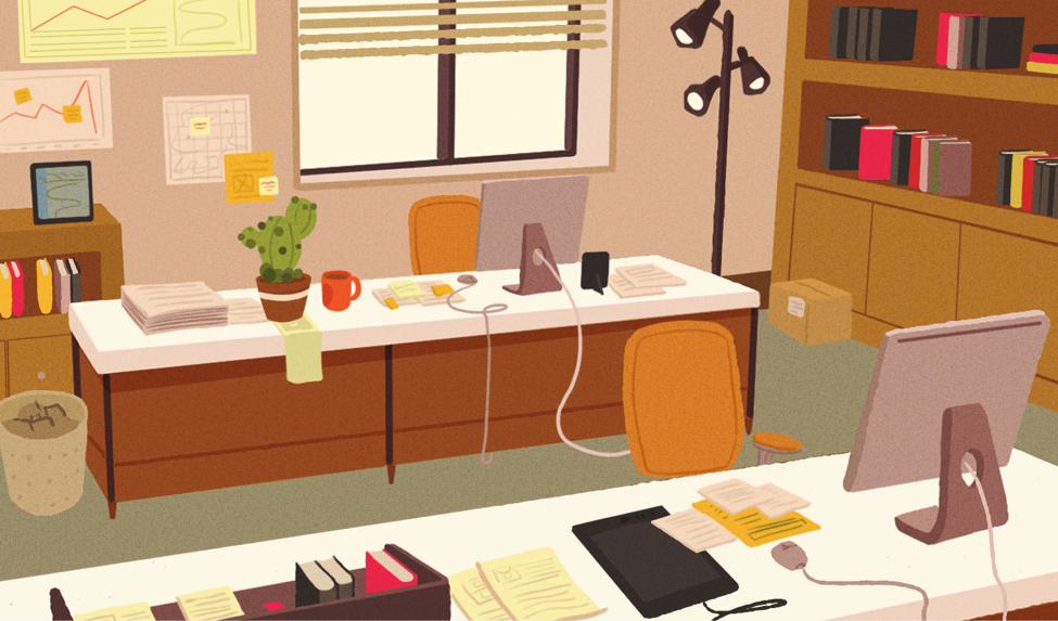
In telling our story, we didn’t just want to read off bullet-point slides. We wanted to bring the audience into our office and show them what we see. We also wanted to take the most literal skeuomorphic approach to our presentation: a map should be represented by a map, a note by a sticky note, a website by a web page, etc. This was partly on the principle that we had the freedom to create our elements and not use pre-existing photos, but also that it reflects much of the design sense we have used in our online learning products. That unity of experience between our learning design and presentation intent was important to us — what you see is what you get. However, using that framework meant that we had to create depth in two-dimensional infinite canvas while still having believable rectangular frames to zoom into — an effect that we created through a fisheye illustration.
2. Bring your Prezi to Life
Since we had dedicated creative time to this project that is passionate about representing our brand well, we wanted to do a good job, but we didn’t want to overdo it either. We looked around for inspiration and we found a few neat ideas around the internet, which used subtle animated gifs to bring an environment to life. Of course, Prezi required that we used SWF instead of animated gifs, but we could achieve pretty much the same looping effect after we inserted the animations into our Prezi.
3. Get feedback and back up everything
The most valuable part of this project wasn’t just the creative team, but the feedback from other PopTech fellows and faculty about distilling information and pacing it. At the end of the day, Prezi is based on Flash. The same problems that led to us treating it as unreliable three years ago exist today. Naturally, the night before our presentation we were unable to download the presentation. Fortunately, we were able to work offline to rebuild our changes and export them for the presentation. The one saving grace of this experience with Prezi is that their online customer support was right on the ball when their product started having trouble. That’s one thing that we consider vital as we approach 10k followers — not just maintaining a product, but building a community.
I’d like to give a special shout-out to my fellow fellows: Esther, Nicole, Donnel, Emily, Alex, Anushka, Nathaniel, Jessica, and Julia – you all are an inspiration! Grateful for this experience and hope to join for PopTech 2014!


