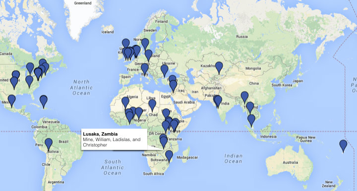
We live in the age of data. Open source software, content aggregation software, GPS and mobile technology have changed the way in which we collect, interpret and analyze the magnitude of data.
While many government agencies, and private corporations use data to make predications and analyze situations – bloggers, activists and NGO’s can use this same information to tell stories. Applications such as Managing News, Map Box and the Ushahidi Platform, help turn data sets into maps and pictorial representations that allow citizens to tell a story.
InterAction, the largest alliance of US based international nongovernmental organizations has been using mapping to tell the story of its community’s response to the earthquake in Haiti.
InterAction also plans to build a map that will represent all its members work worldwide. Visualizations like this will contribute greatly to people’s understanding of not only crisis situations, but it also allows the agencies a visual representation of what is going on and what may need to be improved. Turning a spreadsheet of information into a visual representation makes it much easier for groups and individuals to express their message in simple to understand and interpret ways.
Ushahidi has also been leading the way in the mapping of conflict and crisis situations. The Ushahidi Platform allows anyone to gather distributed data via SMS, email or the web and visualize it on a map or timeline. For Ushahidi, the goal is to create the simplest means of aggregating information from the public at large for use in crisis mapping.
For people looking to create their own visual representations and stories there are some very useful tools out there. Leading the way is Map Box and Managing News. Map Box, a product from Development Seed, provides the user with a suite of open source tools and services for creating custom maps. Built into Map Box is the TileMill tool kit, which will render map tiles on Amazon EC2. And if ever there is a time with no Internet, you can take advantage of Maps on a Stick, which is a self-contained mapping tool that can be distributed via any portable media devise.
If mapping the media is your interest, there is also the news and data aggregator called ManagingNews. Being both a product and a platform, ManagingNews allows the user to customize their experience and visualization.
What this all comes down to, is the ability of the general population to tell stories through mapping and visualizations. With the ample amount of open data, there are as many stories to be told from it, then there are people to tell them. Mapping opens up the visual sphere allowing NGO’s, bloggers, non-profits etcetera, to tell their story in manageable, meaningful ways.


